Imagine you are designing a poster and something is wrong. You can’t quite put your finger on what it is, but then it hits you – it’s the font! That’s right, the best fonts for posters are more than just letters on a page; they are the silent ambassadors of your message. In this vibrant world of design, choosing the right font can determine the success of your poster.
On this journey through the art of typography, we’ll examine how popular poster fonts , from the sleek lines of sans serif to the elegant curves of script fonts , shape viewers‘ perceptions.
We’ll also explore typography trends and how readability is intertwined with aesthetic appeal. Whether it’s a bold advertising poster or a minimalist artistic piece , the right font sets the tone.
By the end of this article, you will not only understand the importance of font readability and design software capabilities , but you will also have mastered the art of matching fonts with the theme of your poster.
Best fonts for posters
| Font name | style | Readability | Best suited for | characteristics |
|---|---|---|---|---|
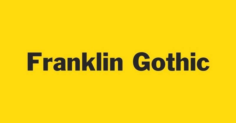
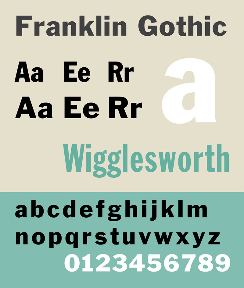
| Franklin Gothic | Sans serif | High | General headings | Bold, strong presence, versatile |
| Helvetica | Sans serif | High | Corporate/modern posters | Classic, clean, professional |
| Future | Geometric Sans | High | Fashion, modern art | Geometric shapes, modernist |
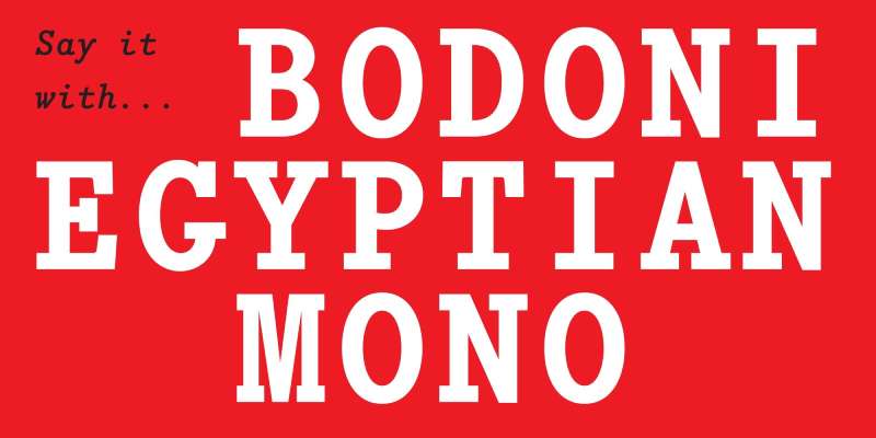
| Bodoni | Serif | Medium | High fashion | High contrast, elegant |
| Coldiac | Serif | High | Luxury items | Stylish, sharp serifs |
| Lavanderia | script | Medium | Casual/inviting themes | Handwritten, casual, three weights |
| Highway Signature | Handwritten | Medium | Authentic feeling | Irregular, personal touch |
| Glamor | Serif | Medium | fashion magazines | Chic, modern serifs |
| Originals | Handwritten | Medium | Unique branding | Quirky, expressive |
| Coret Koas | Handwritten | Low | Artistic posters | Irregular, chaotic style |
| Noiseware | display | Low | Music/band poster | Rough, industrial |
| Bronxos | Sans serif | High | Sports/energetic topics | Bold, dynamic |
| Behemoth | Font with serifs | High | Poster headings | Massive, blocky, impressive |
| Quirky Scandi | Decorative | Low | Nordic style poster | Playful, geometric, minimalist |
| Meowza | display | Medium | Children’s poster | Fun, whimsical |
| League Gothic | Sans serif | High | Vintage/retro posters | Tall, narrow, classic American Gothic |
| Nuttyclash | display | Low | Weird posters | Bizarre, strange |
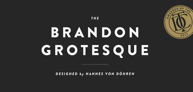
| Brandon Grotesque | Sans serif | High | Modern typography posters | Geometric touch, warm curves |
| Prettywise | Handwritten | Medium | Feminine themes | Light, airy, elegant |
| Aleo | Serif | High | General communication | Soft curves, readable |
| Gilmer | Sans serif | High | Tech/startup poster | Clean lines, modern |
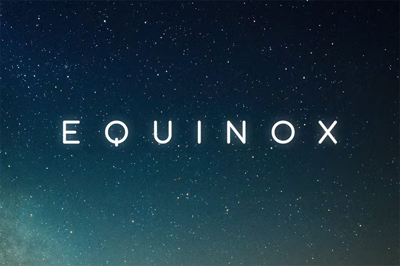
| Equinox | Sans serif | High | Minimalist posters | Slim, futuristic |
| Boldoy | display | Medium | Bold statements | Thick lines, noticeable |
| Smack Queen Font | display | Low | Fashion/Bold Statements | Edgy, modern |
| Davinci Font | Serif | Medium | Artistic/Creative | Classic, reminiscent of handwriting |
| Routerline Poster Font | display | Medium | Music/event poster | Focused on headings, bold |
| Bold Vibes | Display/Handwritten | Medium | Modern/social media | Energetic, contemporary |
| Bristain Rought Font | Handcrafted | Low | Vintage products | Textured, vintage look |
| Malloy Font | Serif | High | Classic publications | Traditional with a modern twist, easy to read |
| Comye Poster Font | Sans serif | High | Modern advertising | Clean, readable at different sizes, versatile |
| Hello Beautiful | script | Medium | Beauty/fashion brands | Smooth, flowing, including a sans-serif accompaniment |
Categories of poster fonts
When it comes to creating an eye-catching poster, your choice of font is like the secret ingredient.
It’s not just about making words look pretty; it’s about setting the right mood, grabbing attention and ensuring your message sticks.
Let’s delve into the world of the best fonts for posters and see what each category brings to the table.
Sans-serif fonts
Sans-serif fonts are the cool kids in the world of typography. They’re clean, modern, and oh-so-readable.
Think of them like your favorite pair of jeans – versatile and always stylish. Some top picks in this category are:
It’s uncomplicated yet effective, perfect for making bold statements.
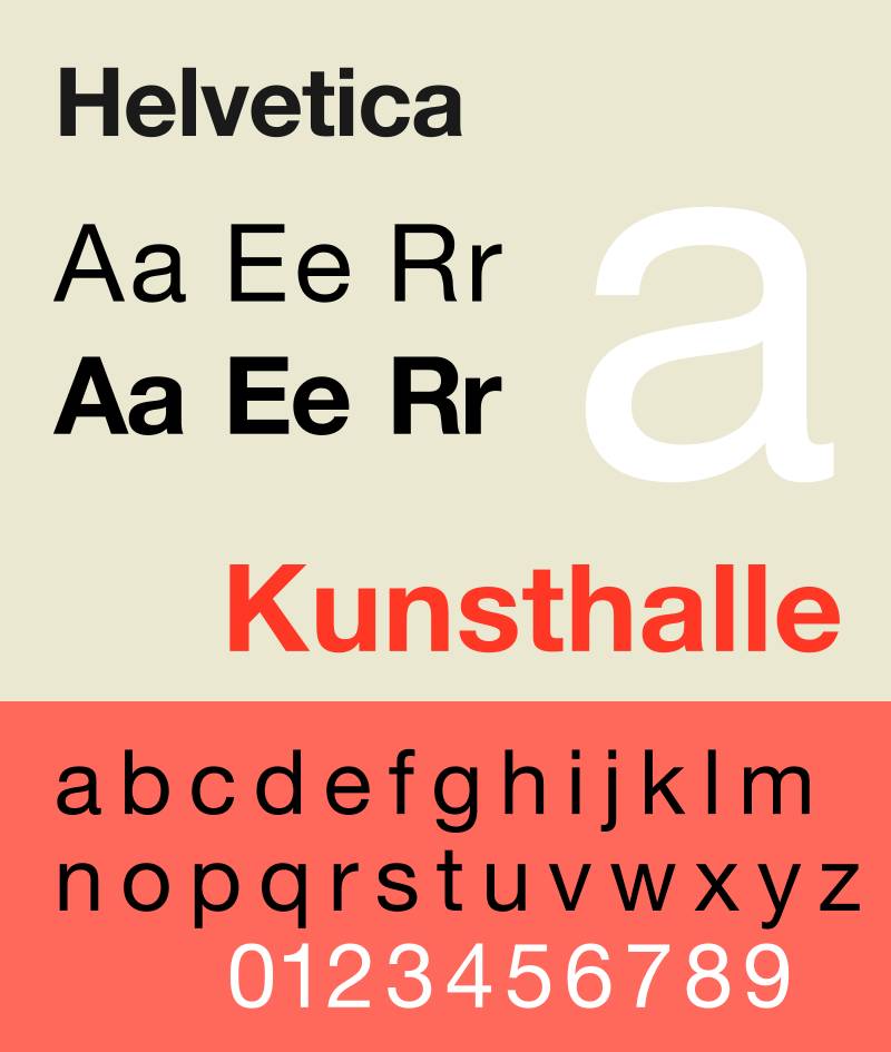
The flagship sans serif, Helvetica is popular for its neutral and professional feel.
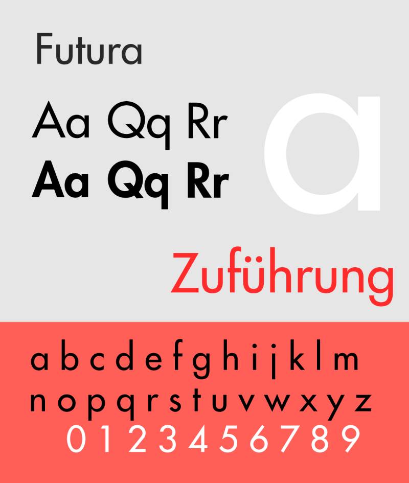
This treasure impresses with its geometric shapes and clean appearance, ideal for modern and minimalist posters.
Serif fonts
Now let’s add some elegance. Serif fonts are like the timeless little black dress of fonts. They bring a touch of sophistication and are great for more traditional or serious themes. Some stars here are:
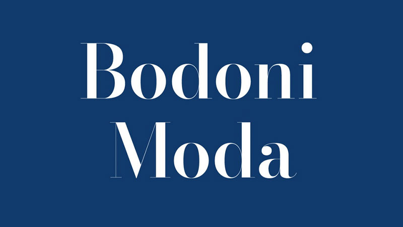
Known for its dramatic contrast between thick and thin lines, Bodoni exudes luxury.

This font screams high-end fashion and is perfect for luxury brand posters.
Cursive and handwritten fonts
This is where personality comes through. Cursive fonts and handwritten fonts are about that personal touch. They range from casual to formal, perfect for evoking emotions and adding a human element. Outstanding examples are:

It’s like a love letter to your audience, with its elegant and flowing cursive.

Ideal for adding a touch of personal flair without losing readability.
Decorative fonts and display fonts
Finally, let’s let our creativity run wild! Decorative fonts are the stars of the show, the ones that make your poster stand out and stand out in the crowd. They are designed to be unique and attract attention. Some favorites are:

As the name suggests, it adds a touch of glamor and sophistication.

This font is a wild card, perfect if you want to stand out and make a statement.
Selection of fonts for different poster themes
Choosing the best fonts for posters is like setting the stage for a great performance. Each theme has its own appeal, and the font you choose can make your poster sing. Let’s discuss topic by topic.
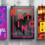
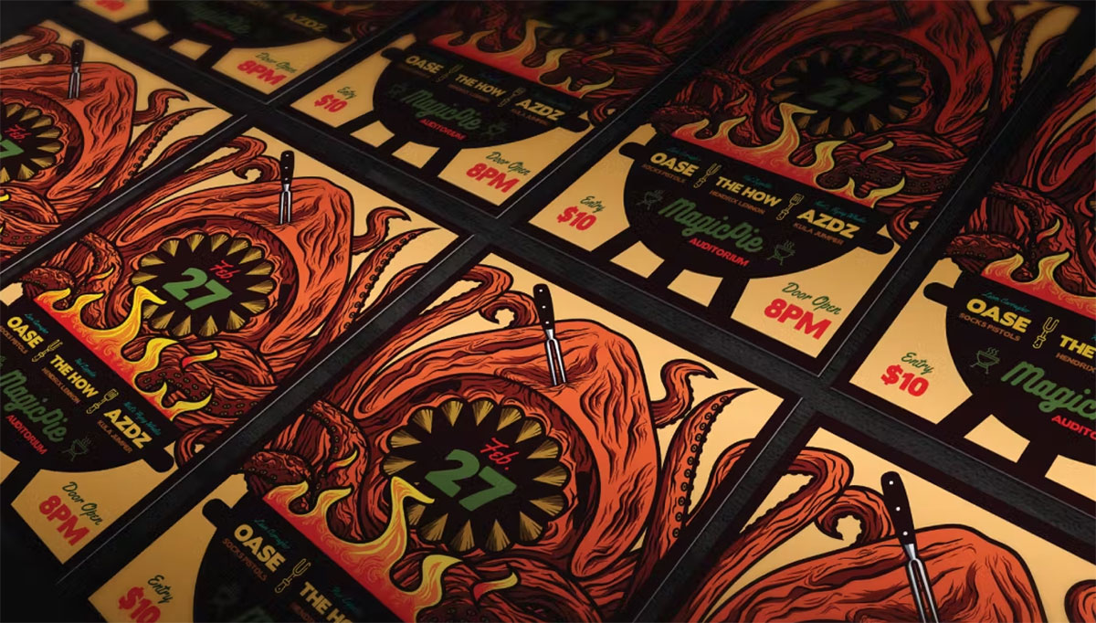
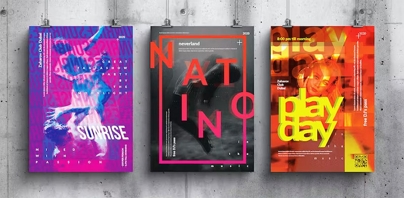
Film and event posters
These posters are about attracting attention and creating excitement. You want something that says „Hey, look at me!“ but in the most stylish way.

It’s bold, it’s dynamic and it screams action. Ideal for the poster of a blockbuster film.

Think of this font as the mysterious, edgy font. Perfect for thriller or indie film posters.

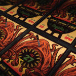
This one is as loud as possible, great for concert or festival posters where you want to convey energy and movement.

It has a raw, urban feel, suitable for city events or edgy art exhibitions.

The name says it all. Use them when you want to go big and bold, making every word count.
Educational and children’s posters
This is about being accessible and fun, but informative at the same time. You want fonts that are easy on the eyes and make you smile.

Just as the name suggests, it’s whimsical and playful, perfect for captivating little ones.

Fun, friendly and a little silly. Ideal for posters that need a touch of playfulness.

This font brings a little seriousness while remaining light-hearted. Great for educational posters that want to be taken seriously, but not too much.

It’s the Joker, funky and unpredictable, great for posters designed to surprise and delight.
Fashion and luxury brand posters
Posters for fashion and luxury brands are about elegance, sophistication and make a statement in style.
Luxurious and stylish, it speaks of high fashion and exclusivity.
This font is as glamorous as it gets, perfect for high-end fashion brands.
It’s modern, it’s chic and it adds a contemporary touch to any luxury brand.
Delicate and sophisticated, it is ideal for brands that want to convey elegance and finesse.
Vintage and retro themed posters
Vintage and retro designs are like time machines. They’re taking you back, aren’t they? So the fonts have to have that old school cult charm.

This font seems like a return to the groovy 60s. It’s perfect for posters that need a bit of that retro flair.

Think classic, think old Hollywood. This font brings vintage elegance to the table.
It is a timeless classic. Ideal if you want that old world feel and luxury.

This font is a bit more modern, but still has a foot in the past. Great for retro but with a contemporary twist.
Modern and minimalist posters
Modern and minimalist posters focus on simple elegance and simplicity. Less is more, right?

Clean lines, no frills. The place to go for an ultra-modern look.
The king of minimalism. Helvetica is perfect for design projects where clarity and simplicity are key.
Their geometric shapes make them a favorite for modern designs that need a touch of sophistication.
Minimalist and yet with its own character. Equinox brings a special touch to minimalist designs.
Artistic and creative posters
Artistic posters are like painting with fonts. You look for something unusual, something that makes people stop and think.

As the name suggests, it is bold. It’s for those moments when you want to make an artistic and unmissable statement.

This font is quirky and fun. It adds a playful touch to creative posters.

It is unconventional, with a hand-drawn feel. Perfect for posters that need a personal, artistic touch.
Bold and impressive posters
When your poster needs to shout loudly from the rooftops, you need fonts with boldness and grit.
It’s like the strong, silent type of writing. Bold, but not overwhelming. Perfect for making a statement without screaming.
As the name suggests, it’s about being fat. Use it when your poster needs to hit.

It’s rough, it’s chewy, and it has texture. Ideal for posters that need a little edge.

Strong and steadfast, Malloy is great when you need to be bold but still want to stay classy.
Elegant and sophisticated posters
Sometimes your poster needs to whisper elegantly rather than scream. That’s where these writings come into play.
It’s sleek, chic and flows like a ribbon. Perfect for a touch of elegance.

It’s understated elegance at its best. Ideal for designs that speak softly but pack a ton of style.

Like a handwritten note from someone special. It’s personal, it’s intimate, and it’s oh-so-elegant.
Font selection considerations
Choosing the best fonts for posters isn’t just about what looks cool. It’s a bit like a puzzle where every piece has to fit exactly. Let’s look at what you need to consider to make the perfect font choice.
target group
First of all, who are you designing for? It’s like choosing a gift – you have to know who it’s for to make it special.
- Age group : If it’s for kids, you could go for something fun like Quirki Scandi . For a more mature audience, something like Coldiac might hit the mark.
- Cultural context : This is hugely important. Different styles resonate differently in different cultures. While Helvetica may be a safe choice in many contexts, sometimes you need something with a bit of local flair.
Readability and visibility
Your font needs to be more than just pretty – it needs to be clear and easy to read. After all, what good is a great message if no one can read it?
- Size and spacing : Think about where your poster will hang. If it’s a street poster, go for something bold like Franklin Gothic . Smaller rooms? A clean font like Futura might work better.
- Color Contrast : This is all about making your text stand out. You don’t want your words to get lost in the background. Contrast is key.
Emotional impact and tone
Fonts have feelings too, you know? The right font can set the mood for your entire poster.
- Font Style and Mood : Looking for something uplifting? Try a fun cursive font like Highway Signature . Do you need something more serious? Bodoni has that classic, authoritarian feel.
- Font Matching the Poster Theme : This ties everything together. For a fashion poster, Glamor could be your first choice. Hosting a tech event? Maybe something modern like Gilmer .
Mixing and matching fonts
Alright, let’s mix things up a bit! Choosing the best fonts for posters isn’t always just about choosing a hero font. Sometimes it’s about creating a dynamic duo or even a trio of fonts that work together like a dream team.
Combining different font styles
Mixing font styles is like creating the perfect playlist. You need a good balance – something that harmonizes but also maintains interest.
- Serif with Sans Serif : This is a classic combination. Pair something like Bodoni (serif) with Helvetica (sans serif) for a contrast that’s both elegant and modern.
- Cursive with Decorative : Want to get a little more adventurous? Combine a script font like Lavanderia with a decorative font like Glamor. It’s like having a lead singer with an amazing backing band.
Balancing font weights and sizes
This is about hierarchy – making sure your audience knows where to look first, second and third.
- Headline vs. Body Text : Your headline should stand out. Go bold with something like Franklin Gothic . For body copy, something lighter and simpler like Gilmer is clear and readable.
- Emphasis and hierarchy : Use different weights (bold, regular, light) of the same font family or complementary fonts to guide the reader’s eye. It’s like putting up signposts on your poster.
Innovative and unique font selection
Immersing yourself in the world of writing is like exploring a new city. Every corner has something new and exciting. And when it comes to the best fonts for posters , sometimes you have to go off the beaten path to find those hidden gems.
Current trends in poster fonts
Just like in fashion, font trends are constantly evolving. Keeping an eye on the latest trends can give your poster a cutting-edge look.
- Futuristic Styles : Think sleek, think technical. Fonts like Equinox bring that sci-fi vibe and are perfect for tech-themed posters.
- Handcrafted Designs : There’s something special about a font that looks hand-drawn. Fonts like Smack Queen Font add a personal, artisanal touch that’s hard to miss.
Unusual font combinations
Pairing fonts is like making a new recipe. You mix different ingredients (fonts) to create something unique and delicious (visually appealing).
- Creative combinations : Have you ever thought of pairing a decorative font like Glamor with a sober font like Helvetica ? It’s like mixing sweet and savory – unexpected but delightful.
- Strong contrasts : Contrast is key. Try combining a heavy, impactful font like Behemoth with a light, airy font like Lavanderia . It’s all about balance.
Practical tips for using fonts in posters
Now we come to the essence of the use of fonts in posters. Is one thing knowing the best fonts for posters , using them effectively? That’s where the magic happens.
Licensing and Accessibility of Fonts
Before you use a font, there is some homework to do.
- Commercial Use Considerations : Some fonts are free for personal use but require a license for commercial projects. Always check licensing to avoid legal issues.
- Online versus offline fonts : Know where your font comes from. Online font libraries often provide clear licensing information, while offline sources may require a little more research.
Font selection software and tools
The right tools can make your writing journey much easier.
- Design software capabilities : Whether you use Adobe Photoshop or Canva, familiarize yourself with your software’s font capabilities. Each tool has its own characteristics and functions.
- Online font libraries : Websites like Google Fonts or DaFont offer a treasure trove of fonts. They’re great for finding something fresh and new.
Frequently asked questions about the best fonts for posters
What are the best fonts for a professional poster?
For professional posters, you should use clean and legible fonts. Helvetica is a classic choice, and Gilmer offers a modern twist.
These fonts convey clarity and professionalism, making them ideal for corporate and academic posters. Remember that readability is crucial in a professional context.
How do I choose a font for a creative poster?
Creative posters require fonts with personality. Try Boldoy or Davinci Font for artistic flair. These fonts add a unique touch while remaining readable. Think about the theme of your poster and choose a font that complements the creative vibe you’re going for.
What fonts are best for event posters?
Event posters have to catch the eye. Noiseware and Bronxos are great for their boldness and energy. They are perfect for concerts or festivals. These fonts grab attention and create a sense of excitement, which is exactly what you want in an event poster.
Are there free fonts that are good for posters?
Absolutely! Sites like Google Fonts offer a number of free options. League Gothic and Quirki Scandi are both solid options available for free. They are versatile and suit different themes, from whimsical to elegant. Always check licensing, even for free fonts.
How do I best combine fonts in a poster?
Combining fonts is like mixing flavors in cooking – balance is key. Combine a bold font like Franklin Gothic for headings with a simpler font like Futura for body text. This creates hierarchy and makes your poster visually interesting without being overwhelming.
How can I make my poster stand out with fonts?
To make your poster stand out, choose a font that fits your message. Behemoth for bold statements or Lavanderia for elegance. Play with sizes and colors for added impact. Remember, font should reinforce your message, not detract from it.
Which fonts should I avoid in poster design?
Avoid overly decorative or difficult-to-read fonts for body text. Fonts like Papyrus or Comic Sans are often viewed as unprofessional in most contexts. Keep readability in mind; If it’s difficult to read at a glance, it’s not suitable for a poster.
Can I use cursive fonts in posters?
Yes, but sparingly. Script fonts like Highway Signature are great for headings or accents, but can be difficult to read in larger blocks of text. Use them to add a personal touch or for emphasis, but combine them with a simpler font for the main text.
How do fonts influence the message of a poster?
Fonts greatly influence how your message is perceived. A font like Coldiac may convey luxury, while Franklin Gothic may suggest respectability. Choose a font that is consistent with the mood you want to convey. The right font can subtly reinforce your poster’s message.
What are the latest trends in poster fonts?
Current trends lean towards bold and minimalist fonts. Equinox offers a sleek, futuristic look, while Brandon Grotesque offers a modern but timeless feel.
Following current trends can give your poster a contemporary edge, but make sure it’s still consistent with your message.
conclusion
So we explored the dynamic world of typography and discovered the best fonts for posters . From the fresh and modern appeal of sans serifs like Helvetica to the timeless elegance of serif fonts like Bodoni , we’ve seen how different styles set the stage for your message.
The art of combining, like pairing Franklin Gothic with Futura , adds depth and interest and shows us that the right mix can take a poster from good to great. And let’s not forget the playful charm of script fonts or the bold statement of decorative fonts .
Remember, the key is to match the font with the purpose and theme of the poster. Whether it’s for a high-energy event, a sophisticated fashion brand or an educational tool, the right font makes all the difference. It’s not just about making words visible; it’s about making them seem alive. So next time you’re designing a poster, think of fonts as the voice of your design and make sure it’s heard loud and clear.
Ihnen hat dieser Artikel über Schriftarten für Plakate gefallen? Dann sollten Sie sich auch den Artikel über Schriftarten für Zitate ansehen.
Außerdem gibt es ähnliche Artikel zu Schriftarten für E-Mail-Signaturen, Schriftarten für Werbung, Schriftarten für YouTube-Miniaturansichten und Schriftarten für Lesen.
Natürlich dürfen auch Artikel zu Schriftarten für Untertitel, Schriftarten für Lebensläufe, Schriftarten für Hochzeitseinladungen, Schriftarten für Newsletter, Schriftarten für T-Shirts, und Schriftarten für Grafikdesign nicht fehlen.
Bekannt für seine Expertise im Logo-Design und visuellen Branding, hat Bogdan eine Vielzahl von Logos für verschiedene Kunden entwickelt.
Seine Fähigkeiten erstrecken sich auch auf das Erstellen von Postern, Vektorillustrationen, Visitenkarten und Broschüren. Darüber hinaus wurden Bogdans UI-Kits auf Marktplätzen wie Visual Hierarchy und UI8 vorgestellt.
- Das Chevrolet-Logo: Die Geschichte, Farben, Schriftart und Bedeutung - Juni 21, 2024
- Das Acura-Logo: Die Geschichte, Farben, Schriftart und Bedeutung - Juni 20, 2024
- Das McLaren-Logo: Die Geschichte, Farben, Schriftart und Bedeutung - Juni 20, 2024