The McLaren Logo stands as one of the most recognized symbols in motorsport and luxury automotive manufacturing. This British brand has built its visual identity around speed, precision and racing heritage since Bruce McLaren founded his racing team in 1963.
The swoosh known as the speedmark first appeared in 1997. It replaced a run of earlier emblems that began with a kiwi crest and included a chequered-flag design by Raymond Loewy.
McLaren has used around eight distinct logo versions in its history, the latest a new wordmark revealed in September 2026. The brand operates across Formula 1 racing and supercar production, so one consistent identity matters for global recognition.
What is the McLaren Logo?
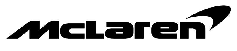
The McLaren logo is the McLaren wordmark paired with the speedmark, a curved swoosh first used in 1997 and compared by McLaren to the vortices off a rear wing. No designer has been publicly credited. In September 2026 McLaren introduced a new wordmark inspired by the sign over Bruce McLaren’s family service station in Auckland.
| Symbol | The speedmark, a swept swoosh, alongside the McLaren wordmark; the Speedy Kiwi remains a heritage emblem |
| Designer/agency | Not publicly credited (speedmark and current wordmark both developed by McLaren) |
| Current version since | September 2026 (new wordmark); speedmark in use since 1997 |
| Colors (hex) | Papaya orange, widely cited as #FF8000 (McLaren publishes no official code); black #000000 for the mono logo |
| Typeface | Custom lettering; McLaren has not named a typeface and no free match is widely known |
| Previous major version | Wide italic McLaren wordmark with a black or papaya speedmark (2017–2026) |
How Has the McLaren Logo Evolved Over Time?
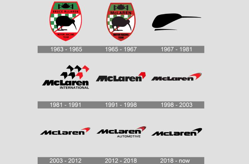
McLaren’s visual identity shifted from a racing-team crest to a refined corporate symbol over six decades.
The dates below follow McLaren’s own history of the marque, published in 2023, plus the 2026 update.
Each change reflected broader shifts in who owned the team and what it wanted to be.
Kiwi Crest (1964–1970)
The first crest was designed in 1964 by Michael Turner, a motorsport artist and friend of Bruce McLaren, for the Bruce McLaren Motor Racing team.
It looked more like a coat of arms than a corporate logo: a shield with a kiwi, the national bird of Bruce’s homeland, New Zealand, set against chequered and coloured panels with the team name.
Speedy Kiwi (1971–1980)
After Bruce McLaren died in a testing accident in June 1970, the team kept his kiwi. Doug Eyre redrew it in 1971 as the “Speedy Kiwi”, a leaner, faster-looking bird, and the lettering changed too.
This era is tied to papaya orange, or “McLaren Orange.” McLaren itself gives two possible origins for the color: a sponsor’s livery or New Zealand’s national racing colours. The look sits well among classic orange logos.
McLaren International Logo (1981–1990)
In 1981 Ron Dennis’s Project Four merged with the team to form McLaren International. The Speedy Kiwi gave way to a new logo designed by Raymond Loewy, the famous industrial designer, as a gift from a sponsor.
It used chevron shapes arranged to evoke a chequered flag, above a McLaren International wordmark. The red was a “rocket red” chosen after testing, because the sponsor’s usual red looked too dark on television.
Single Chevron Logo (1991–1997)
In 1991 the chevrons merged into a single red chevron beside the McLaren wordmark. The lettering became more modern, following minimalist design trends of the time.
Speedmark Introduced (1997–2006)
The streamlined speedmark first appeared in 1997, placed on top of the cars’ side-pods. McLaren compares its shape to the vortices that come off a car’s rear wing.
The italic McLaren wordmark ran underneath, with the swoosh rising from the end of the name.
Chrome Era (2007–2017)
The marque was refined to suit the team’s chrome livery, but the speedmark stayed. McLaren Automotive, launched with the 12C road car in 2011, used the same wordmark and swoosh, sometimes with “Automotive” beneath.
Mono Black Speedmark (2017–2021)
To present “one” McLaren across the group’s businesses, the speedmark switched to mono black. The racing team returned to papaya on its cars in this period.
This is the black McLaren logo many people search for: the black wordmark with a black swoosh, as shown at the top of this article.
Papaya Speedmark (2021–2026)
In 2021 McLaren Racing turned the speedmark papaya to set the team apart, with a slimmer, more modern wordmark refreshed for digital use.
Remuera Wordmark (September 2026–Present)
In September 2026 McLaren revealed an evolved wordmark and identity for both McLaren Automotive and McLaren Racing. The lettering is inspired by the hand-painted sign above the service station in Remuera, Auckland, run by Bruce’s parents, Les and Ruth McLaren. It is where Bruce built the car for his first racing win.
The speedmark and the Speedy Kiwi both remain part of the system, and papaya stays the main color within a wider palette drawn from the company’s history. McLaren said the new wordmark would appear first on its next production cars.
What Do the Design Elements of the McLaren Logo Mean?
The speedmark communicates velocity and aerodynamics through its curved, swept-back form.
McLaren’s own explanation compares it to the vortices created by a rear wing. Some fans also see it as a descendant of the Speedy Kiwi’s sleek outline, but McLaren hasn’t said so.
What Are the McLaren Logo Colors?
McLaren does not publish official color codes. Here is what can be said with confidence:
- Papaya orange: widely cited as #FF8000. McLaren calls it papaya or McLaren Orange and uses it as its main brand hue, but it has not released a hex, Pantone or CMYK value. Screen versions vary; the orange in the font sample below is approx. #E66106.
- Black: #000000, used for the mono wordmark and speedmark.
- White: used for the reversed logo on papaya or dark backgrounds.
- Rocket red: the red of the 1981–1997 logos.
Since 2026, papaya sits within a broader color palette that includes darker tones. Understanding how colors affect perception explains why a loud orange works so well for a racing brand: it is energetic and easy to spot on track and on TV.
What Font Is Used in the McLaren Logo?
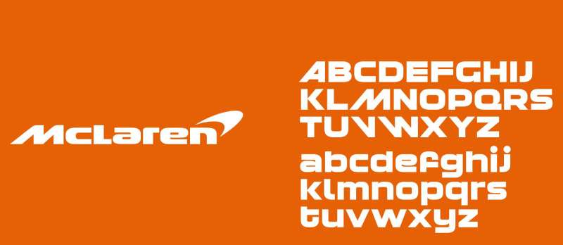
The McLaren wordmark is custom lettering, not a commercial sans-serif typeface. McLaren has never named a font for it.
The 1997–2026 wordmark is wide, heavy and italic, with a raised small “c” after the M. The alphabet in the image above is a lookalike typeface, not an official McLaren font.
The September 2026 wordmark is cleaner and more upright, based on the Remuera sign. The typography has evolved several times while keeping the same name and spelling.
Is There a Hidden Meaning in the McLaren Logo?
The best-documented meaning is McLaren’s own: the swoosh echoes the vortices off a rear wing.
Other readings, such as a hidden kiwi beak, a Nike-style tick or a checkered flag in motion, are fan interpretations. The checkered flag idea fits the 1981 Loewy logo, not the speedmark.
The psychology behind curved shapes explains why the swoosh reads as dynamic.
How Does the McLaren Logo Compare to Competitor Logos?
McLaren’s speedmark takes a different approach than most supercar manufacturers.
Where competitors use heritage crests or animal mascots, McLaren chose abstraction.
This sets the brand apart in showrooms and on track.
The Ferrari logo features the prancing horse. It’s steeped in Italian heritage and racing history.
The Lamborghini logo uses a charging bull. Aggressive and unmistakable.
The Porsche logo incorporates the Stuttgart coat of arms. Old-world prestige.
McLaren went another way. Its kiwi crest still exists, but the swoosh is the face of the brand.
Among British rivals, the Aston Martin logo and Bentley logo both use wing motifs. McLaren’s swoosh is more abstract and less literal.
What Cultural Impact Has the McLaren Logo Had?
The speedmark became familiar to Formula 1 fans from the late 1990s onward.
Drivers such as Mika Häkkinen, Lewis Hamilton and Lando Norris have raced with it on their cars and overalls.
On the road, it appears on cars like the P1 and the Artura. The earlier McLaren F1 road car of the 1990s also helped make the name famous.
In gaming culture, McLaren’s branding features in racing simulators and arcade titles. Younger audiences recognize the speedmark even without knowing its history.
How Does the McLaren Logo Fit Into the Overall Brand Identity?
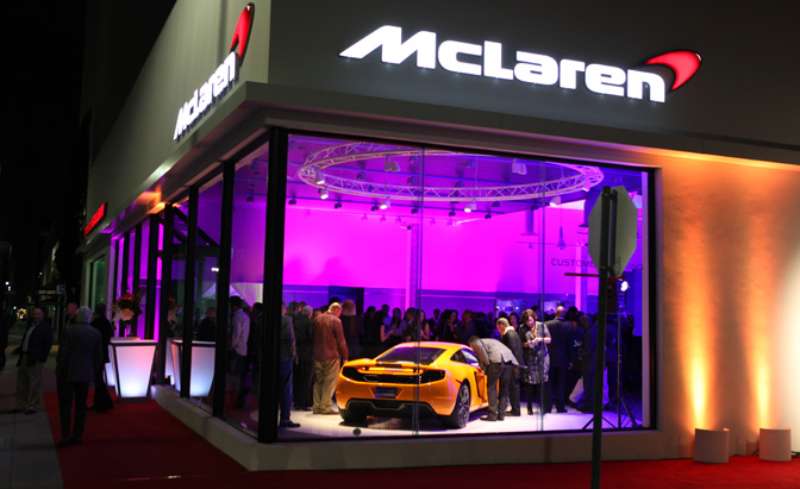
The speedmark anchors a visual system that runs from F1 cars to showroom signs, like the one in the photo above.
McLaren’s internal brand guidelines are not public. What the 2026 update makes clear is the goal: one identity across Automotive and Racing, with the wordmark leading and the speedmark and Speedy Kiwi in support.
This unified approach builds recognition across very different contexts. A fan sees related marks on a road car and on a Formula 1 car.
How Should the McLaren Logo Be Used?
The following is general advice for editorial and design work, not McLaren’s own rules.
- Use the logo as published; don’t stretch, rotate or redraw the speedmark.
- Use clean vector graphics rather than blurry copies.
- Keep the logo on plain backgrounds where it stays readable.
- Don’t imitate the wordmark with a lookalike font for anything that could pass as official.
Trademark Protection: The McLaren name, wordmark and speedmark are registered trademarks. Editorial use is generally fine, but merchandise and other commercial use need permission from McLaren.
FAQ on the McLaren Logo
What Does the McLaren Logo Represent?
The McLaren logo pairs the company name with the speedmark, a swoosh that McLaren compares to the vortices off a rear wing. It stands for speed and aerodynamics. The kiwi in earlier logos honored Bruce McLaren’s New Zealand roots.
Who Designed the McLaren Logo?
No designer has been publicly credited for the 1997 speedmark or the 2026 wordmark. Earlier logos are credited: Michael Turner drew the 1964 kiwi crest, Doug Eyre the 1971 Speedy Kiwi, and Raymond Loewy the 1981 McLaren International logo. Good logo design principles kept the speedmark in use for decades.
What Is the McLaren Logo Called?
The swoosh is called the speedmark. The kiwi emblem, redrawn in 1971, is called the Speedy Kiwi. Both are still part of McLaren’s identity.
When Did McLaren Change Its Logo?
McLaren’s main logo changes came in 1964, 1971, 1981, 1991, 1997, 2007, 2017 and 2021. The most recent update, a new wordmark inspired by the Remuera service station sign, was revealed in September 2026.
What Did the Old McLaren Logo Look Like?
The first McLaren logo was a shield-shaped crest with a kiwi. The 1971 Speedy Kiwi was a sleek bird silhouette. From 1981 the McLaren International logo used red and black chevrons that evoked a chequered flag.
What Are the McLaren Logo Colors?
Papaya orange is the signature color, widely cited as #FF8000, though McLaren publishes no official code. Black and white are used for one-color versions. That hue dates back to the team’s early years.
Is There a Black McLaren Logo?
Yes. From 2017 to 2021 McLaren used a mono black speedmark with a black wordmark across its businesses. Black versions are still used wherever a one-color logo is needed.
Why Did McLaren Choose a Swoosh Shape?
The swoosh creates visual movement. McLaren links it to the airflow vortices off a rear wing, which ties the logo to aerodynamics.
What Font Does McLaren Use in Its Logo?
The wordmark is custom lettering, not a commercial typeface or downloadable font. The 1997–2026 version is wide and italic with a raised “c” and tight kerning. The 2026 version is based on a hand-painted sign.
How Does the McLaren Logo Compare to Other Supercar Brands?
Most competitors use animal mascots or heritage crests. The Bugatti logo and Maserati logo both lean into European prestige. McLaren’s abstract speedmark stands out in any car logos lineup.
Can I Use the McLaren Logo for My Own Projects?
The wordmark and speedmark are registered trademarks. Editorial use is generally fine, but commercial use needs permission. Following a brand style guide doesn’t give you rights to the logo.
Conclusion
The McLaren Logo tells the story of a racing team that became a supercar manufacturer. From Bruce McLaren’s kiwi crest to the speedmark and the 2026 wordmark, every version reflects the company’s evolution.
The design works everywhere. Formula One cars. Showrooms. Digital platforms.
Papaya orange connects today’s brand to its early years. The new wordmark goes back even further, to a family garage in Auckland.
Few automotive emblems balance heritage and modernity this well. The speedmark earns its place among motorsport’s most recognized symbols.
Sources
- McLaren Racing, The story of the marque – https://www.mclaren.com/racing/heritage/the-story-of-the-marque/
- Creative Boom, McLaren evolves its identity with a wordmark inspired by Bruce McLaren’s family garage – https://www.creativeboom.com/news/mclaren-evolves-its-identity-with-a-wordmark-inspired-by-bruce-mclarens-family-garage/
- autoevolution, McLaren’s new wordmark looks back to Bruce McLaren as brand prepares to launch new models – https://www.autoevolution.com/news/mclaren-s-new-wordmark-looks-back-to-bruce-mclaren-as-brand-prepares-to-launch-new-models-275941.html
- Automotive Addicts, McLaren updates logo as supercar brand prepares SUV expansion – https://www.automotiveaddicts.com/122901/mclaren-updates-logo-supercar-brand-prepares-suv-expansion

Renowned for his expertise in logo design and visual branding, Bogdan has developed a multitude of logos for various clients.
His skills extend to creating posters, vector illustrations, business cards, and brochures. Additionally, Bogdan's UI kits were featured on marketplaces like Visual Hierarchy and UI8.
He also wrote in the past years on sites like Design Your Way, WebDesignerDepot, WPDean, Designmodo, Speckyboy, Slider Revolution, and more.
- The LinkedIn Logo History, Colors, Font, and Meaning - 20 November 2026
- How to Design Landing Pages That Convert Visitors into Email Subscribers - 20 November 2026
- Why Quality Assurance is the Backbone of Seamless UI/UX and Web Design - 20 November 2026

Bogdan Sandu is a seasoned designer who has been designing websites since 2008. Renowned for his expertise in logo design and visual branding, Bogdan has developed a multitude of logos for various clients. His skills extend to creating posters, vector illustrations, business cards, and brochures. Additionally, Bogdan's UI kits were featured on marketplaces like Visual Hierarchy and UI8. He also wrote in the past years on sites like Design Your Way, WebDesignerDepot, WPDean, Designmodo, Speckyboy, Slider Revolution, and more.
You Might Also Like