The Zoom font: What font does Zoom use?

Ever zoomed into a virtual space and felt a sigh of relief seeing clear, crisp text? You’re not alone.
The Zoom font isn’t just letters on a screen—it’s the silent facilitator of our digital dialogues. Consider your last online meeting; it’s the typography that orchestrates our comfort or cues the squints.
Now, let’s dive into a designer’s take on this subtle powerhouse. Unravel the threads of visual clarity in screen sharing, explore the backdrops of user experience typography, and shine a light on why the specific typeface is crucial from a user interface (UI) perspective.
By the article’s end, the font on your screen won’t just be a font. It will stand as a testament to design’s role in effective communication.
From the quirks of customization options to the bounds of branding and accessibility, we’ll decode the alphabet jungle one stroke at a time.
Lace up – we’re about to weave through virtual meeting interface design, elevate our UX know-how, and ultimately, enhance our Zoom encounters.
What font does Zoom use?
I see you’ve noticed something snazzy about your Zoom interface. Can’t put a finger on it? Well, let me tell you, it’s all in the font. You’re staring at a masterpiece called Lato.
Created by a Polish designer, Łukasz Dziedzic, Lato’s design ethos is centered on the blending of a corporate feel with an aura of friendliness. It’s as if it’s whispering, “Let’s get down to business, but let’s keep things chill.”
The Charm of Lato
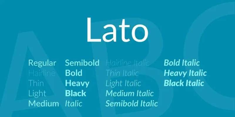
Ever had that experience where something is just so clean, simple, and unassuming, yet it somehow stands out? That’s Lato for you.
It’s like that understated, sophisticated guest at a party, blending in but stealing the limelight when the spotlight hits. At small sizes, it’s cool, calm, and collected. But once you blow it up, it’s all style and character.
Why Zoom Chose Lato
Choosing a font is like choosing a house. It has to reflect who you are. For Zoom, a platform that facilitates everything from board meetings to yoga classes, the font had to walk the tightrope between corporate and casual. And that’s exactly what Lato does.
It sets the perfect stage for Zoom’s audience, serving a dash of professionalism with a sprinkle of warmth.
Alternatives to the Zoom font
Though Lato has its unique charm, the world of fonts is a treasure trove of diversity. So, let’s check out some alternatives.
Open Sans
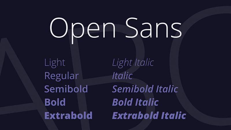
Meet the cousin of Lato, Open Sans. It shares the same genes of simplicity and readability but carries its own distinct character. Designed with an upright stress and open forms, it’s a friendly font, just like our pal Lato.
Roboto
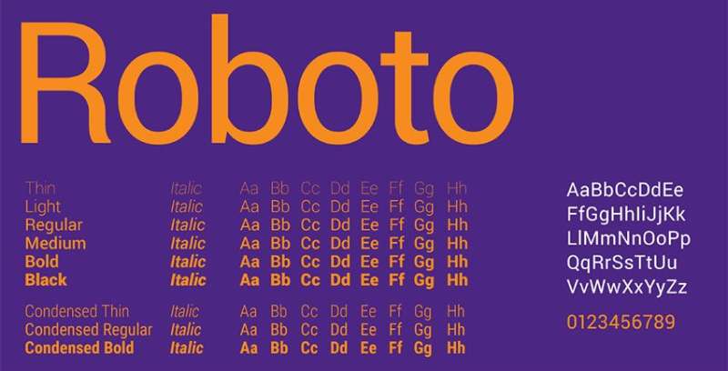
Say hello to Roboto. Its geometric structure gives it a mechanical skeleton, but the curves add a friendly face to it. It’s got a natural reading rhythm, making it perfect for interfaces and text-heavy applications.
Font Aesthetics and Impact
Our interaction with fonts goes beyond just reading words. Fonts have an aesthetic impact, they set the mood, they guide our feelings. It’s like a silent, visual language we’re all speaking. Let’s delve deeper into it.
The Psychology of Fonts
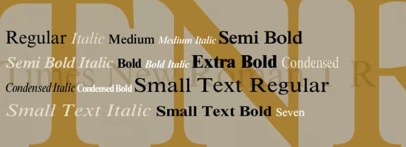
Fonts are like people. Each has its personality. Some are loud and fun, like Comic Sans, while others are serious and authoritative, like Times New Roman.
Lato, the star of our show, strikes that perfect balance – business with a dash of fun. This unique mix makes it an excellent choice for a versatile platform like Zoom.
Font Accessibility
Accessibility is key in design. And when it comes to fonts, readability is the name of the game. Lato’s clean and open characters ensure that even the most complex words are easy on the eyes.
For platforms like Zoom, which are used by people of all ages and abilities, such a font is a godsend.
Exploring Other Fonts in Communication Platforms
Zoom isn’t alone in the quest for the perfect font. Other platforms have their own font story to tell. Let’s hop on their journey.
Microsoft Teams and Segoe

Microsoft Teams uses Segoe, Microsoft’s own signature font. It’s clean and modern, perfect for an interface that wants to promote clarity and simplicity.
Slack and Apple’s San Francisco
Slack, on the other hand, leans on Apple’s San Francisco font. It’s compact and efficient, mirroring Slack’s philosophy of streamlined communication.
In conclusion, fonts are the silent heroes of the design world, telling their own story while helping tell ours. Next time you hop onto Zoom, take a moment to appreciate Lato, the font that subtly enhances your experience. It’s not just letters on a screen, it’s a design masterpiece.
FAQ On The Zoom Font
What font does Zoom use?
Underneath that sleek interface, Zoom’s got some typography secrets. It’s all about Roboto. Why’s it a big deal? It nails readability. Consistency across devices?
Check. Looks clean no matter the screen or the feature, be it chat or screen sharing. It’s like the Swiss Army knife of fonts.
How can I change the Zoom font size?
Alright, diving into settings! On the desktop app, click your profile, hit ‘Settings’, then ‘Accessibility’. See ‘Chat Display Size’? That’s where the magic happens.
Bigger, smaller – tweak to your heart’s content. It’s about making those virtual meetups as comfy as possible for your peepers.
Is the Zoom font customizable for all users?
Customization’s a bit of a mixed bag here. You can scale up font sizes for chat, but when it comes to the whole UI, it’s more of a one-size-fits-all situation. Keep user experience smooth, stay within existing design patterns – that’s the motto Zoom’s rollin’ with.
Does the default Zoom font support non-English characters?
Yep, Roboto‘s a worldly font. It supports a spectrum of scripts. Cyrillic, Greek, you name it. Zoom doesn’t mess around when it comes to accessibility and inclusivity. Every user gets to experience that sleek, legible text, no matter the language they’re zooming in.
How does the Zoom font affect screen readability during meetings?
Let me tell you, a font’s like your meeting’s invisible facilitator. Roboto’s crisp lines? They boost legibility and visual clarity, especially during those screen shares. Because squinting at blurred text while someone walks you through a PowerPoint? That’s a no-go.
Can you adjust the Zoom font for better accessibility?
You bet. It’s not just about aesthetics. Zoom’s cranked up its game for users with impairments. Boost those font sizes or hook yourself up with screen reader compatibility. Software needs to vibe with everyone, accessibility-wise – it’s a core UX principle.
Does changing the font on Zoom affect how others see my text?
Here’s the lowdown: Your font size changes? They’re for your eyes only. Everyone else? They’ve got their own settings. Lets you tune your virtual space, keeps theirs intact. Personalization – it’s key for a solid user experience.
How does the choice of Zoom font contribute to the platform’s branding?
Fonts are like a secret handshake for brands. Zoom’s choice? It says, ‘We’re modern, we’re user-friendly.’
Every time you log in, that Roboto aesthetic whispers ‘Zoom’ without saying a word. And in the branding game? Fonts are unsung heroes, shaping identities silently.
Do specific industries require different Zoom font settings for clarity?
Hey, context is king! Legal eagles may zoom in on details, need those characters extra crisp. Designers? They might love a bit more white space. But the real McCoy is the default settings Zoom offers. They’re versatile enough to straddle industries without breaking a sweat.
What impact do font and typography have on the overall Zoom user experience?
Typography in UI’s not just dressing up, it’s foundational. Good font choice, like Zoom’s, it’s the difference between a smooth ride and a bumpy one.
It’s the subtle art of ensuring instructions, dialogues, and content, they’re not just there, but crystal clear. It’s providing comfort without shouting about it.
Conclusion
So, we’ve traversed the typography terrain of the Zoom font, unwrapped the nuances of Roboto, and why it’s the heartthrob of the UI scene. It’s got the grace, the versatility – a true digital chameleon.
- Fonts, more than ink on screen, they’re the unsung orchestrators of our virtual symphonies.
- Clarity, legibility, accessibility—they’re not just buzzwords; they’re the pillars of our digital house.
- A great font isn’t just a choice; it’s an ally.
And that’s the crux. Whether we’re huddling in a tight-knit webinar or sprawling out in vast, global meetings, our dear friend, the font, keeps the conversation flowing—effortless and strain-free.
Let’s not overlook—the next time you hop on a call, and the words ease off the screen into your retina, doff your cap to Roboto. It’s not just making ‘Zoom’ happen; it’s making it happen with undeniable style.
If you liked this article about the Zoom font, you should check out this article about the WordPress font.
There are also similar articles discussing the Notion font, the WhatsApp font, the DoorDash font, and the Salesforce font.
And let’s not forget about articles on the Duolingo font, the eBay font, the Google Maps font, and the Microsoft Teams font.
Bogdan Sandu, a seasoned designer with 15 years of diverse experience, has been designing websites since 2008.
Renowned for his expertise in logo design and visual branding, Bogdan has developed a multitude of logos for various clients.
His skills extend to creating posters, vector illustrations, business cards, and brochures. Additionally, Bogdan's UI kits were featured on marketplaces like Visual Hierarchy and UI8.
Latest posts by Bogdan Sandu (see all)
- Stylish Shoe Brand Logos Examples to Explore - 3 July 2024
- The Celgene Logo History, Colors, Font, And Meaning - 2 July 2024
- What is Pantone: Decoding the Color Matching System - 2 July 2024