Why Font Trends Are Useless

Imagine this: You’re browsing through the latest design magazines, websites, and portfolios, and there it is – the newest font trend, splashed across every page and screen. It’s modern, it’s fresh, but let’s pause and ask a critical question: why are font trends actually useless?
In the fast-paced world of web design and typography, where the appeal of typeface families and digital typography tools often sets the stage, we’re constantly bombarded with the latest ‘must-have’ styles.
Yet, amid this whirlwind of emerging fonts and graphic design trends, there’s a hidden pitfall – the loss of uniqueness and the essence of branding and marketing.
As we delve deeper, we’ll unravel the façade of font trends. From the fleeting impact of popular typefaces to the overlooked importance of accessibility in typography, you’ll discover how these trends might be doing more harm than good.
We’ll explore the practical limitations and challenges they pose, and why embracing timelessness over trendiness could be the key to impactful design.
Table of Contents
- Understanding Font Trends
- The Illusion of Effectiveness
- The Pitfalls of Relying on Font Trends
- Timeless Fonts vs. Trendy Fonts
- Strategic Approaches to Font Selection
Understanding Font Trends
Definition and Characteristics of Font Trends
Let’s break it down.
What even is a font trend?
Font trends are those styles that suddenly pop up everywhere, from your favorite blog to even those that don’t usually talk about fonts. They’re the cool kids of typography, the modern font styles that everyone seems to be talking about.
But here’s the catch. These trends, while they seem like the next big thing in digital typography, often don’t stick around.
Like that song, they can fade as fast as they appeared. Think about the historical examples of font trends – remember the Comic Sans craze?
Yeah, we all try to forget that one.
The Lifecycle of a Font Trend
Emergence and Popularity

When a new trend hits, it’s like a wildfire. One day, no one’s heard of it, and the next, it’s on every web and print design out there.
This is the emergence. It could be a sleek sans-serif that’s suddenly all over your Instagram or a quirky typeface that’s the talk of every graphic design forum.
Then comes the popularity phase. This is where everyone jumps on the bandwagon.
You’ll see it in branding, on websites, even in UI/UX design. It’s the new ‘it’ thing, and it seems like ignoring it means you’re out of touch.
Saturation and Decline
But here’s where why font trends are useless starts to make sense. After a while, everything starts to look the same. It’s like if every song on the radio had the same beat – boring, right?
This is saturation. Those once-cool fonts are now overused, and the uniqueness they brought is gone.
Finally, there’s the decline. People get tired of seeing the same style. New trends emerge, pushing the old ones into the background.
The once-popular font is now a reminder of a fleeting fad, not the timeless classic we hoped it would be.
The Illusion of Effectiveness
Perceived Benefits of Following Font Trends
Okay, let’s get real for a sec.
We all fall for the shiny new thing now and then, and in the world of design, it’s no different.
Font trends come along, all flashy and new, promising to be the next big thing. They whisper sweet nothings like “staying relevant” and “attracting audience attention.”
It’s like they’re the cool new band everyone’s into, and you don’t want to be the one still listening to last year’s hits.
But here’s the thing: it’s mostly smoke and mirrors. Yeah, jumping on the bandwagon of modern font styles or the latest digital typography tool can give a temporary boost.
Your design might look hip for a hot minute, but ask yourself – is it really you? Or are you just wearing the same outfit as everyone else at the party?
Staying Relevant and Modern
It’s a trap, really.
You think by using the latest typeface trend, your work will scream “modern” and “cutting-edge.”
But when everyone starts doing the same thing (and believe me, they do), that edge dulls pretty fast. You blend into a sea of sameness.
Attracting Audience Attention
Sure, a trendy font might turn heads at first. It’s like seeing someone with a bold new hairstyle – it’s eye-catching.
But if it doesn’t really fit the person, that interest fades quickly. It’s the same with fonts. If they don’t align with your brand identity or message, that initial wow factor won’t last.
Debunking the Myths
Short-Lived Impact
This is the heart of why font trends are useless. Their impact is like a shooting star – brilliant for a moment, then gone.
Remember the rise and fall of font trends like Lato? Everyone loved it, then everyone used it, and now it’s just… there. Not bad, but not special either.
Overshadowing Brand Identity
This is the big one.
Your brand’s voice, its personality, gets lost when you chase font trends. It’s like trying to fit into a group by changing how you talk.
Sure, you might fit in for a bit, but at what cost? Your unique identity, the thing that makes your brand your brand, gets muffled under layers of trendy typefaces.
The Pitfalls of Relying on Font Trends
Compromising Uniqueness and Originality
Loss of Brand Identity
Imagine your brand as a person. Now, imagine this person changing their style every time a new fashion trend pops up.
Sounds exhausting, right?
That’s what happens when you rely too much on font trends. Your brand loses its identity. It stops being that unique voice in a crowd and starts sounding like everyone else.
Remember, in a sea of Comic Sans and Papyrus, it’s the Garamonds and Futuras that stand out. Stick to what makes your brand, well, your brand.
Homogenization of Design
Ever walked down a street where all the houses look the same? That’s what happens with design when everyone jumps on the font trend bandwagon.
Everything starts to blend together. Instead of a rich tapestry of diverse, creative designs, we get a one-size-fits-all look. Where’s the fun in that?
Practical Limitations and Challenges
Accessibility Issues
This is huge and often overlooked. Not all trendy fonts are easy to read, especially for people with visual impairments.
When we prioritize style over substance, we risk alienating a chunk of our audience. It’s not just about looking good; it’s about being accessible to all.
We need to think about how our choices affect the user experience across different platforms. It’s not just about what looks cool; it’s about what works best for everyone.
Timeless Fonts vs. Trendy Fonts
It’s like the classic tale of the tortoise and the hare, but in the world of fonts.
Let’s break down why the slow and steady approach of timeless fonts often wins the race against the flashy, sprinting trendy fonts.
Characteristics of Timeless Fonts
Enduring Appeal

Think of timeless fonts like a classic leather jacket. They never go out of style.
These are the fonts that have stood the test of time.
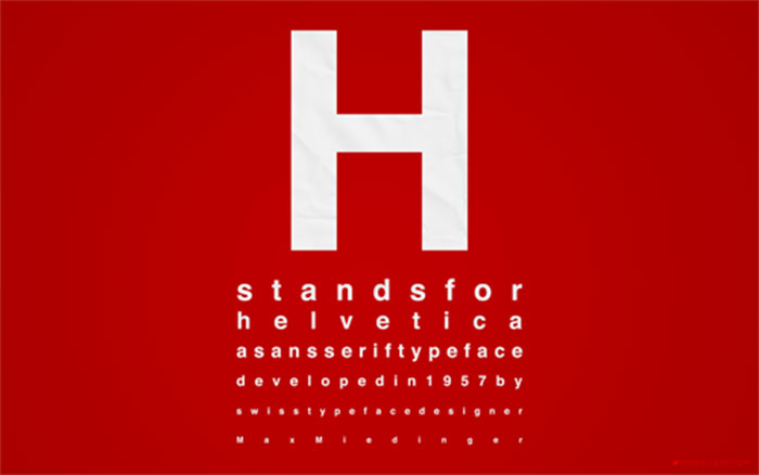
They’re like the Helvetica, Garamond, or Futura of the font world. You see them everywhere – from books to billboards – and they always look good. They’re versatile, readable, and, most importantly, they don’t scream “I’m trying too hard.”
Versatility Across Various Applications
The best thing about these fonts? They work anywhere and everywhere.
Whether it’s a formal report, a funky website, or a chic logo, these fonts adapt.
They’re like chameleons, seamlessly fitting into any design without losing their charm.
Comparing Longevity and Impact
Case Studies of Timeless vs. Trendy Fonts
Let’s take a real-world example. Remember the font ‘Comic Sans‘? When it first popped up, it was everywhere. Now? It’s mostly a punchline.

Compare that to ‘Arial’ – simple, clean, and still going strong. This right here shows why font trends are useless in the long run.
Expert Opinions and Industry Insights
Ask any seasoned designer, and they’ll tell you the same thing: Trends come and go, but the classics remain.
The biggest names in design often lean on these tried-and-true fonts because they know these fonts won’t let them down.
Strategic Approaches to Font Selection
Understanding Brand Identity and Audience
Aligning Font Choices with Brand Values
First things first, your font should match your brand’s personality. If your brand were a person, what would it sound like?
Bold and confident? Elegant and sophisticated? Your font should speak the same language. It’s not just about what’s in vogue. It’s about what feels right for your brand.
Considering Audience Preferences and Needs
Think about who you’re talking to.
Different audiences will vibe with different fonts. For example, a tech-savvy crowd might appreciate a clean, modern sans-serif, while a more traditional audience might resonate with something more classic.
It’s all about knowing your crowd and what speaks to them.
Emphasizing Function Over Fashion
Prioritizing Readability and Usability

Here’s a key point on why font trends are useless: they often forget about functionality.
Your font needs to be easy on the eyes, not just easy on the aesthetics. Think about where your text will be read – on a billboard, on a phone screen, in a long report?
Each scenario demands a font that’s easy to read and works well in that specific context.
Balancing Aesthetics with Practicality
Sure, that fancy script font looks gorgeous, but can everyone read it easily? Remember, the prettiest font is useless if it’s not practical. It’s a balancing act between looking good and being effective.
Conclusion: The Ephemeral Nature of Font Trends
Font trends, with their fleeting appeal, often lead us away from what truly matters in design – timelessness and authenticity.
They’re like those trendy clothes we buy and forget about next season.
Fun for a moment, but not a wise long-term choice.
- How Do I Put My Logo on Clothes? 7 Techniques to Try - 5 July 2024
- What is DPI (Dots Per Inch) in Digital Imaging - 5 July 2024
- The Manchester United Logo History, Colors, Font, And Meaning - 4 July 2024


