


Imagine staring at a vibrant magazine cover, marveling at the interplay of colors—ever wondered what’s behind that striking visual harmony? The magic lies in CMYK, an essential color model in printing.
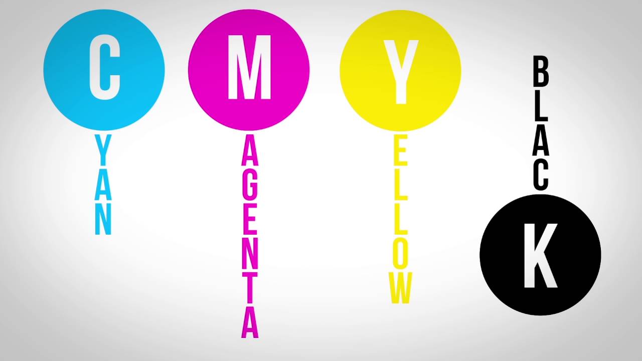
With roots in the printing industry and utilized by giants like HP, Epson, and Canon Inc., CMYK stands for Cyan, Magenta, Yellow, and Key (Black).
Understanding CMYK is indispensable for anyone stepping into the world of graphic design or print media. The colors you’d see on digital screens in RGB color model translate differently onto paper, requiring meticulous color management and calibration.
Throughout this article, you’ll uncover the nuances of four-color process, its role in color separation, and why it’s pivotal for achieving color accuracy in everything from offset printing to your household inkjet printer.
By the end, you’ll have a firm grasp on how CMYK impacts digital printing, color reproduction, and even your favorite print catalogs and marketing agencies.
What is CMYK?
CMYK (Cyan, Magenta, Yellow, Key/Black) is a color model used in color printing. It creates colors by combining varying amounts of these four ink colors. This subtractive model is essential for producing a wide range of colors on printed materials, such as brochures, posters, and magazines.
Understanding the CMYK Process
Let’s dive right into the mechanics of the CMYK process, the unsung hero of the print world.
How CMYK Works
The Subtractive Color Process
The magic of CMYK lies in its ability to subtract colors from white light. It’s like a painter’s palette, but instead of mixing shades on canvas, we subtract wavelengths. Cyan, Magenta, and Yellow – they absorb red, green, and blue light respectively, leaving the rest to create our rich spectrum.
Picture this: white light – all the colors combined – hits a surface. When cyan pigment is laid down, it absorbs red, letting the green and blue pass through. Magenta absorbs green, leaving red and blue. Lastly, Yellow absorbs blue, allowing red and green to shine. Combined strategically, these layers create the full range of colors in print.
Role of Each Color in the Model
Each hue in CMYK plays a pivotal role. Cyan cools things down, giving a serene blue-green. Magenta sparks warmth and vibrancy. Yellow injects a sunny brightness. Pile them together, and you’re orchestrating a symphony of color.
The Role of ‘Key’ (Black) in CMYK
Explanation of ‘Key’ and Its Importance
Now, let’s talk about the heavyweight – the ‘Key’ or Black. Without a robust black anchor, colors appear muddy and lack depth. Black enhances contrast and sharp detail, grounding the other colors for bold, crisp visuals. It’s the backbone of text, line art, and contrast-rich elements.
Historical Context and Origins of the Term
The term ‘Key’ comes from the old printing processes. Black was the “key plate,” holding the detail information, while the other colors filled in the gaps. Imagine early pressmen aligning cyan, magenta, and yellow to the black “key” to ensure everything fell into place.
Without ‘Key,’ colors blend together aimlessly. The shift from CMY to CMYK isn’t just an evolution—it’s a revolution. It democratized print, bringing about consistency and precision that was once unimaginable.
CMYK vs. RGB
Fundamental Differences

Additive vs. Subtractive Color Models
Two worlds. RGB and CMYK – they’re like oil and water, yet both vital in their domains. RGB lives and breathes in the glowing light of your screens; it’s an additive model. Combine Red, Green, and Blue light, and boom – you get white. Take away light, and you see black.
Dive into CMYK, and it flips the script. The subtractive model. Here, we subtract wavelengths from light. Layer Cyan, Magenta, Yellow, and suddenly, black emerges. It’s a different game, a blend driven by ink rather than pixels.
Color Reproduction on Screens vs. Print
Printing this on your laser jet would play out differently than how it lights up your display. RGB’s domain is brilliance and light; you see what emits from your monitor. Every pixel, an artist, drawing with beams of light.
CMYK, though, dances with ink and paper. It’s tactile. Physical. Colors reflect and absorb light, creating the hues you can hold. Screens can’t mimic this fully. Yes, that’s why you see those little blocks of color next to each product image before you hit ‘print.’
Conversion Between RGB and CMYK
Issues with Color Accuracy During Conversion
Now, the trickiest part – flipping between RGB and CMYK. Colors play nice on screens but tend to throw a fit when inked. You got a rich, vibrant red on-screen, but in print?
Not so much.
The gamut – the range of colors – doesn’t fully overlap. RGB has more colors; it’s like trying to squeeze a symphony into a whistle.
Ever wonder why your digital proof looks different from the printed piece? It’s this gamut mismatch. Your deep blues and bright greens get muted. Not every RGB color has an equal in the CMYK world.
Best Practices for Designers
So, how do we dance this dance without stepping on toes? First, always design with the end in mind. If it’s going to print, start in CMYK. Match your colors early on.
Use Adobe Photoshop and Illustrator for precise conversions. Stay wary of bright, neon hues.
They might look stunning on your device but dull when translated to paper. Proof and tweak – a lot – to get as close as possible to your vision. And remember, software for calibration is your best friend in this balancing act.
Halftoning in CMYK
Definition and Importance of Halftoning
How Halftoning Creates Continuous Tone Images
Imagine a world where gradients flow seamlessly on paper—a realm where detailed photos leap out with finesse. Enter halftoning. This technique transforms continuous tones into a tapestry of small dots, achieving what flat ink coverage can’t.
Each dot varies in size and spacing, creating illusions of shades and gradients. It’s pure magic. Tiny dots, from pure cyan to rich black, blend in our eyes, tricking us into seeing continuous tones. Think pointillism but on a microscopic level.
Techniques and Patterns in Halftoning
Halftone patterns aren’t one-size-fits-all. Techniques evolve:
- AM Halftoning where dot size varies but spacing stays constant.
- FM Halftoning flips the script with fixed dot size but varied spacing.
Patterns emerge, from dots to lines to stochastic screens. Playing with shape and grid, printers can influence textures and details like a master chef balancing flavors.
Practical Applications of Halftoning
Use in Detailed Photographs and Artworks
Photographs and detailed artworks need this sorcery to come alive in print. Line screens determine the fineness – more lines per inch means smoother transitions. Complex imagery, from rich shades in portrait photography to meticulous nuances in digital artworks, relies on this technique.
Think of magazines, full of lifelike photos – all thanks to meticulous halftoning. Or those slick marketing brochures, where every image pops with depth.
Line Screens and Their Impact on Print Quality
Let’s talk line screens and their imprint. Higher number = finer detail.
Low number screens, say 65 LPI (lines per inch), are okay for newspapers but fail at finesse. Jump to 150 LPI, and you’re in magazine territory—where images are crisp and every dot plays its part effectively.
However, there’s a sweet spot. Go too high, and the printer struggles, causing issues like moiré patterns – those weird, wavy distortions.
So, balancing print quality involves choosing the right line screen, ink, and paper combo. Precision is paramount.
The Science Behind CMYK
Color Theory and Light Absorption
How CMYK Subtracts Colors from Light
Dive into the enchanting world where ink meets physics. CMYK, our magician with pigments, dances on the stage of light absorption. Instead of adding light like RGB, it takes away.
White light hits printed CMY layers – cyan gobbles up red, magenta swallows green, and yellow absorbs blue. What’s left is the delightful symphony of reflected wavelengths, creating the kaleidoscope we love in print.
It’s subtractive magic. Ink subtracts (or absorbs) parts of the visible spectrum to reveal the final hue. Unlike mixing paints, when inks merge, they manipulate how light interacts with the surface.
Visual Spectrum and Color Mixing
Colors in the visual spectrum – a rainbow foundations of red to violet – play a pivotal role. CMYK color mixing sometimes seems counterintuitive but fits snugly in this spectrum. Cyan, Magenta, and Yellow are cornerstones – they combine to craft secondary colors:
- Cyan + Magenta = Blue
- Magenta + Yellow = Red
- Cyan + Yellow = Green
Each step in this printing ballet ensures every printed piece whispers in hues, ensuring color reproduction reflects the designer’s intent.
Achieving True Black
The Limitations of CMY Alone
CMY alone stumbles when serving a rich, deep black. Theoretically, blending cyan, magenta, and yellow should produce black, but reality differs. The mixture leads to a rather muddy brownish hue.
Three inks pile up, but they don’t cancel out light entirely. Think of using watercolors – adding multiple colors results in a dark splatter, not true black.
Importance of Using Black Ink
Enter ‘K’ in CMYK. Utilizing black ink solves this riddle. Black grounds prints, adding contrast and depth where CMY falters.
Black Ink isn’t an afterthought; it’s essential. It solidifies details, fortifies shadows, and enhances text legibility. An art poster or a company logo stands strong because of its presence.
CMYK in Commercial Printing
Advantages of CMYK Printing
Consistency and Standardization in Print Runs
Step into the world of commercial printing where CMYK reigns supreme. You know why it’s the go-to? Consistency.
Whether you print a thousand business cards or a single poster, CMYK ensures each piece mirrors the other flawlessly. Every tiny dot of cyan, magenta, yellow, and black fills the same space every time.
Standardization makes it a favorite in the industry. Printers around the globe speak the CMYK language, guaranteeing that your vibrant vision looks as intended, no matter where it’s printed.
This global language of print, backed by Pantone Matching System and ICC profiles, ensures uniformity.
Cost-effectiveness and Ink Efficiency
Budget matters. CMYK isn’t just precise but cost-effective too. Four inks, mixed and matched, to create a dazzling spectrum of colors. Efficient? Absolutely.
Think about ink coverage. Instead of stocking up on a plethora of colored inks, one only needs the core four.
This reduces wastage and cuts down on costs. Ink efficiency isn’t about skimping; it’s about making every drop count. It keeps production affordable without compromising on quality.
Common Uses and Applications
Business Cards, Brochures, Large-Format Prints
Let’s talk applications. Business cards – crisp and professional, using CMYK ensures every logo, every slogan pops.
Brochures laden with vivid photos and sleek text. The magic of CMYK shines here. And then there’s the world of large-format prints. Billboard or wall art, the scalability of CMYK keeps colors vivid and consistent across sizes.
Special Printing Techniques (e.g., spot colors, metallic inks)
Beyond the basics, CMYK dives into specialty printing too. Ever seen those prints with a touch of gold or a unique hue? That’s spot colors in action. When standard CMYK can’t capture a specific tone, a spot color jumps in to fill the gap.
Metallic inks? Pure allure. Adding shimmer and shine, these inks can turn an ordinary print into a piece of art. The blend of traditional CMYK with these specialized techniques creates a print that stands out, ensuring that your design is both memorable and impactful.
Technical Considerations in CMYK Printing
Calibration and Color Management
Ensuring Color Accuracy Across Different Printers
It’s all about color accuracy when CMYK transitions from screen to paper.
Ever printed something that looked perfect on your monitor but a disaster on paper? Different printers, different results. Calibration bridges that gap.
Enter the realm of calibration tools and color management systems. These aren’t just gadgets but saviors.
Each printer, whether it’s an Epson inkjet or a Xerox beast, needs its own color profile. Think of ICC profiles as fingerprints, unique to each device. Match the right profile, and your magentas and cyans dance in sync, no matter the printer.
Tools and Software for Calibration
Let’s geek out on tools. Adobe Photoshop and Illustrator are the go-tos for designers, but precision calls for heavy artillery like Datacolor Spyder or X-Rite i1. These gadgets measure light, match profiles, and ensure what you see digitally matches the print.
Software like ColorSync (macOS) or Microsoft Color Management (Windows) ties it all together. They harmonize the profiles, orchestrating the perfect print symphony. With these, color calibration becomes less like voodoo and more like a science.
Practical Tips for Designers
Setting Up Files for CMYK Printing
Ready to set up files for CMYK? Dive into that design software and convert your RGB files to CMYK straight away. Adobe tools come with options to switch profiles and preview in CMYK – use them. Don’t wait until the last minute.
Pick the right color profiles (Fogra, GRACoL) based on your printer’s needs. This ensures color consistency from monitor to paper. Work within the CMYK gamut to avoid unforeseen surprises – neon blues and greens can be dream killers.
Bleeds and crop marks? Non-negotiable. Extend your design beyond the edges and mark where to trim. Errors here can ruin a print job in a heartbeat.
Avoiding Common Pitfalls and Errors
Pitfalls? Let’s dodge them together.
- Overcrowding colors: CMYK can’t handle overly rich blacks. Stick to a balance – 60% cyan, 40% magenta, 40% yellow, 100% black for text and dark elements.
- Ignoring resolution: Your print needs at least 300 DPI (dots per inch) for sharp results. Low res files? Blurry prints.
- Not proofing: Print a proof. Check it, inch by inch. Digital previews can lie. Your eyes don’t.
- Wrong paper choice: Glossy, matte, uncoated – each absorbs ink differently. Test runs can save you heartbreak later.
- Fonts and embedded graphics: Convert texts to outlines, and flatten layers. Ensures compatibility when the file reaches the print shop.
FAQ On What Is CMYK
Why is black called “Key” in CMYK?
In the four-color process, black is termed “Key” because it precisely aligns (“keys”) with the other three colors. It adds depth and detail. Without Key color, prints appear washed out.
Industry staples like Adobe Systems and Canon Inc. ensure high-resolution outputs through key color alignment.
How does CMYK differ from RGB?
CMYK is for print, while RGB color model is for screens. CMYK uses inks and subtractive mixing, reducing light to produce colors. On the other hand, RGB combines varying intensities of light for colors, suited for digital screens like HP monitors and Epson projectors.
Why is CMYK important in printing?
CMYK ensures accurate color reproduction on physical mediums. From offset printing to digital press, using CMYK is crucial for matching color schemes in print media.
It provides consistency, making it invaluable for print magazines, marketing agencies, and print catalogs.
What are the challenges of using CMYK?
CMYK has a limited color gamut, meaning it can’t represent as many colors as RGB. Also, color shifts can occur between monitors and prints.
Professionals use color calibration and color profiles to minimize discrepancies, ensuring a close match between digital designs and printed outputs.
How to convert RGB to CMYK for printing?
Conversion tools in Adobe Systems’ programs like Photoshop simplify this. Import your design, choose “Convert to CMYK” under the color settings. This step is essential for accurate color separation and ensuring color accuracy in final print media projects.
Can CMYK be used in digital formats?
Though CMYK is primarily for print, digital printing on inkjet printers uses it too. However, on screens, colors may appear duller than their RGB counterparts. For digital formats, extensive color management and color calibration can help bridge this visual gap.
Why doesn’t CMYK print green or orange well?
CMYK has a limited color gamut, often struggling with bright greens and oranges. Color specialists use spot colors or Pantone colors to compensate.
This enhances specific hues beyond CMYK’s capabilities, ensuring vivid prints when needed for projects or campaigns.
How are prepress processes related to CMYK?
Prepress involves preparing digital files for printing in CMYK. It includes color separation, aligning process inks, and generating proofs to avoid errors.
This meticulous preparation ensures your graphic design is print-ready, whether it’s for photography, ads, or packaging companies.
What role do printers like Epson and Canon Inc. play in CMYK?
Epson and Canon Inc. lead in producing printers that excel in color reproduction with CMYK. Their advanced printing presses and technology ensure high-quality, consistent results.
From home-based inkjet printers to industrial offset printing, their influence is ubiquitous in the industry.
Conclusion
Understanding what is CMYK—Cyan, Magenta, Yellow, and Key (Black)—is crucial for anyone delving into print and graphic design. It’s not just a color model; it’s the backbone of the printing industry and essential for producing high-quality print media.
By mastering CMYK, you’re equipped to achieve unparalleled color accuracy in any printing project, whether you’re using offset printing, an inkjet printer, or even digital press technologies.
Key Takeaways:
- CMYK is fundamental for accurate color reproduction in printed materials.
- Color separation and color management techniques ensure that prints match the digital designs closely.
- Leading brands like HP, Canon Inc., and Epson play a pivotal role in delivering top-notch printing solutions.
By integrating these principles into your workflow, you elevate the quality of your work and ensure consistency across various platforms. Whether for print catalogs, marketing agencies, or detailed prepress preparations, CMYK remains indispensable. Master it, and you’re on the path to creating visually stunning, professional-grade print projects.


Renowned for his expertise in logo design and visual branding, Bogdan has developed a multitude of logos for various clients.
His skills extend to creating posters, vector illustrations, business cards, and brochures. Additionally, Bogdan's UI kits were featured on marketplaces like Visual Hierarchy and UI8.
- The Chelsea Logo History, Colors, Font, And Meaning - 6 July 2024
- What are Analogous Colors? A Color Theory Guide - 6 July 2024
- The Arsenal Logo History, Colors, Font, And Meaning - 5 July 2024