


In the realm of design, there’s a concept both simple and sophisticated—monochrome colors. Imagine creating a stunning visual masterpiece using only variations of a single hue, playing with shades and tints to craft depth and harmony.
This isn’t just black and white, but a journey through the color wheel where hue variations and saturation levels shape your artistic landscape.
Mastery of monochromatic palettes can elevate your work, making it a favorite among graphic designers and even in web design.
Understanding color theory and the psychology behind uniform color schemes can provide the key to unlocking more cohesive and emotionally impactful visuals.
By the end of this article, you’ll grasp the nuances of monochrome palettes, from creating color tension with subtle contrasts to ensuring design consistency.
Get ready to dive into the intricacies of unicolor designs, grayscale art, and beyond—arms armed with color harmony and balance. Welcome to the world where one hue tells the whole story.
What are Monochrome Colors?
Monochrome colors refer to different shades, tints, and tones of a single color. This palette uses variations in lightness and saturation of one hue to create a cohesive and harmonious color scheme.
Understanding Monochromatic Colors
Color Theory Fundamentals
When diving into the vast ocean of color theory, monochromatic colors offer a unique simplicity and harmony.
Let’s break down this concept piece by piece:

Hue
First, the hue. It’s the pure, unadulterated essence of a color – think of it as the character flavor in a palette’s family.
Imagine a painter’s broad strokes of cerulean blue or the fiery edge of crimson red. Hues define the identity of your color without any bling or dullness. It’s the name tag in our color spectrum.
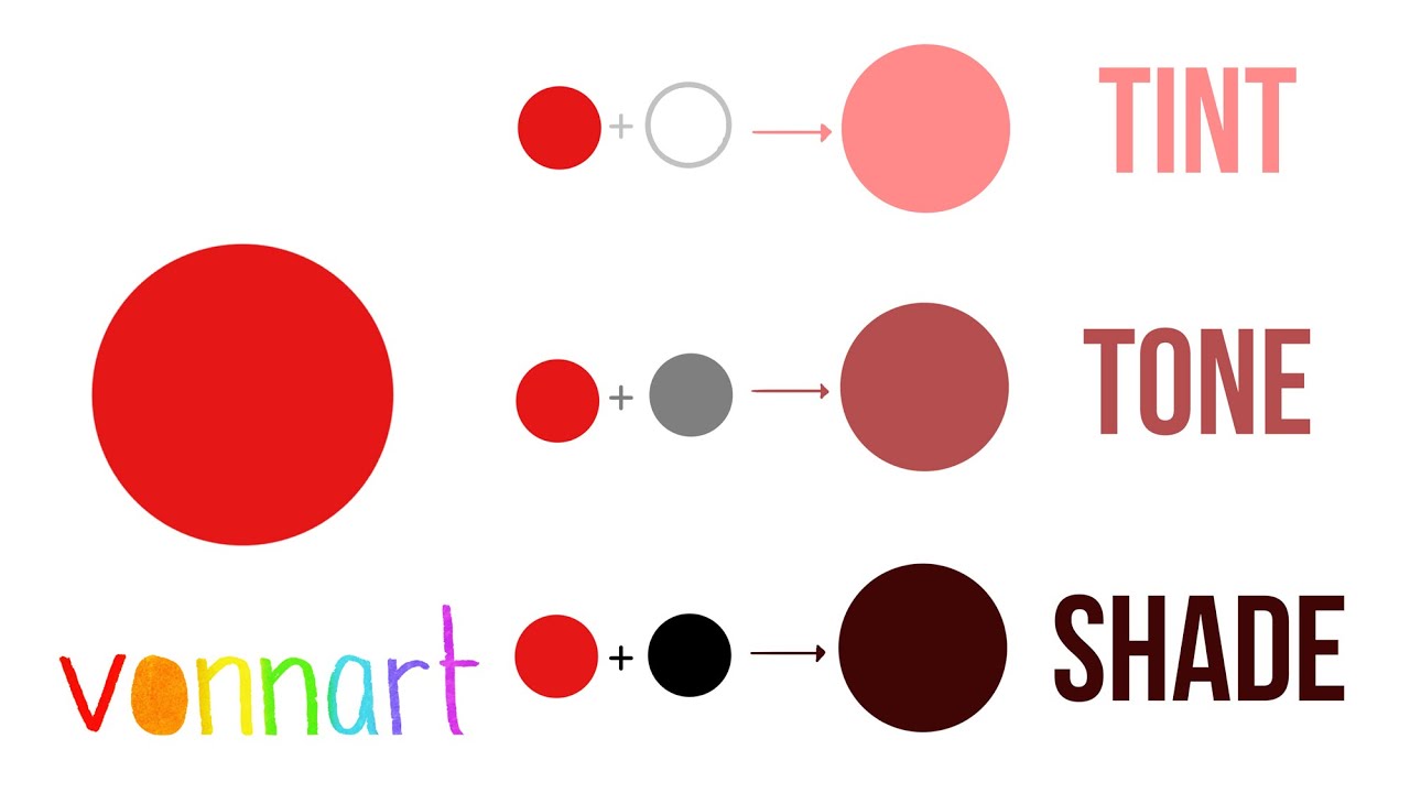
Tint
Next, we talk tints. Tints are like whispers added to your hue, softening it with a brush of white.
It’s akin to adding milk to a strong cup of coffee – the richness is still there, but gentler. Picture a deep blue sky slowly transitioning into dawn’s delicate light.
Shade
Onto shades – the darker siblings in our color narrative. By mixing a hint of black, shades create depth and mystery, transforming bright hues into their more intense, somber versions.
Think nightfall engulfing the day, where the vibrancy of daylight turns into profound shadows.
Tone
Finally, tone. Tones find their balance by adding gray to the hue, blending both black and white.
This balances the color, making it neither too bright nor too dark. It’s the grayish touch in autumn leaves or the muted pastel auras in a watercolor painting.
Variations within a Single Hue
Lightness and Darkness


Monochrome isn’t just about picking one color; it’s about exploring its entire skyline.
Lightness and darkness dance together, creating a spectrum within that single hue. This variation crafts gradients – soft slopes transitioning from sunlight to twilight.
Visual aesthetics revel in this concept, allowing lightness to breathe air and darkness to carve depth.
Imagine a grayscale photograph where every shadow and highlight tells a story, capturing emotion with every gradient.
Saturation Levels
Saturation, the heartbeat of a color, determines its vivacity.
Fully saturated hues scream with vibrancy, while desaturated ones whisper in soft pastels. It’s the difference between a blazing summer sun and a misty morning fog.
In artistic expression, saturation levels control mood and ambiance.
High saturation grabs attention like a neon sign, while lower saturation can soothe like a gentle lullaby. It’s a toolkit for evoking feelings and setting scenes.
Application of Monochromatic Color Schemes
Graphic Design
In the realm of graphic design, monochromatic color schemes hold immense power. It’s not just a limitation; it’s an invitation to explore depth and ingenuity.
Creating depth and dimension
Depth and dimension – that’s where the magic happens. Using different shades and tints, it’s possible to create layers that pull the viewer in.
Imagine a logo, simple yet profound, where each gradient tells a part of the story. With monochromatic schemes, the play between light and dark is your best ally, crafting an almost 3D illusion on a flat surface.
Using contrast effectively


Contrast isn’t about loud clashes; it’s about subtle mastery. In a monochrome palette, using contrast effectively can mean the difference between a flat, boring design and one that pops off the page. This is where understanding tints, shades, and tones becomes crucial.
The play of lightness against darkness, the gentle gradient shifts – it’s all about making the elements stand out yet stay harmonious.
Incorporating texture and pattern
Texture and pattern are the unsung heroes. Incorporate textures, and suddenly, a single-color scheme feels rich and tactile.
Think about the weave of fabric captured in a line drawing or the grain of wood in a minimalist poster.
Patterns break the monotony, adding layers of interest without disrupting the monochromatic harmony. They’re the fine print in the design narrative, adding depth without the noise of multiple colors.
Film and Photography
Ah, film and photography. Monochrome here feels like stepping into a timeless, almost poetic, visual realm.
Black and white films


Black and white films. Classic, dramatic, endless. Stripping away color, focusing purely on light and shadow.
It’s the realm of stark contrasts and underlying subtleties. The absence of color compels the viewer to see the architecture of visual storytelling.
Grayscale photography
Grayscale photography captures the soul. Every shade of gray, from the darkest shadows to the brightest highlights, narrates emotions.
Capturing portraits in grayscale lends an almost ethereal quality, where every wrinkle, every smile, feels profound. It’s about form, expression, and nuance.
Color grading in movies
Color grading in movies is an art. Even within a monochrome framework, grading permits control over mood and atmosphere.
It can shift a scene from soft and romantic to intense and suspenseful simply by tweaking saturation levels and gradients. It’s the director’s way of painting with light.
Digital Media
Let’s navigate to the realm of digital media.
Monochromatic displays
Monochromatic displays bring clarity. In an interface crammed with information, a single-color scheme can be a breath of fresh air.
It simplifies, focusing user attention where it’s needed most. Monochrome isn’t just minimalism; it’s an assurance of clarity and focus.
UX/UI design strategies


In UX/UI design strategies, monochrome is strategic elegance. Using one color family, easing the user experience, and making navigation intuitive.
It’s not about the lack of color; it’s the abundance of nuance. From buttons to background elements, a monochrome scheme ensures that the user’s journey is smooth, engaging, and cohesive.
Steps to Create a Monochromatic Color Scheme


Choosing the Base Color
The base color is the cornerstone. It’s where everything starts. The hue you pick isn’t just a color—it’s the heartbeat of your design.
Importance of the base hue
The importance of the base hue can’t be overstated. It’s the soul of your palette, influencing every tint, shade, and tone. It sets the mood.
Will your creation be warm and inviting, or cool and distant? Picture it: a deep blue evoking calm seas, a vibrant red sparking energy and passion. The base hue defines the essence.
Factors to consider
When choosing, I always weigh brand identity and target audience. If it’s for a brand, the hue should echo the company’s spirit.
A sleek tech firm might lean towards a cool, modern blue, while a playful children’s brand might thrive in bright, cheery tones.
Who’s your audience? Their preferences shape your choices. Millennials might appreciate the subtlety of muted tones, while Gen Z might crave bold, eye-catching colors.
Developing the Color Palette
Once the base hue is locked in, the fun begins: developing the palette. This is where we play with light and shadow, creating variations that add richness without veering off track.
Creating variations
Start by exploring the spectrum: tints, shades, and tones. Tints soften the hue with white, creating lighter, pastel-like versions. Shades deepen it with black, adding mystery and depth.
Tones, balanced with gray, offer middle-ground variations. Each of these inflections tells a different story, adding dimension without breaking the monochromatic spell.
Tools and software for palette creation
To craft these variations, tools and software come in handy.
Adobe Color is a favorite—its intuitive interface helps generate harmonious palettes. Coolors is another gem, quick and user-friendly for whipping up color schemes on the fly. These tools are the modern artist’s palette, digital extensions of creativity.
Implementing the Scheme in Design
Now, with a palette in hand, it’s time to breathe life into the design. This is where theory meets practice, and the monochrome magic unfolds.
Applying the palette to various design elements
Applying the palette to different design elements requires finesse.
Backgrounds might use the darker shades to anchor the space, while lighter tints can highlight key areas, drawing the eye where it needs to go.
Imagine a website: a gradient background flowing from deep to light, with buttons and icons popping in varying tones of the base hue. Each element must sing in harmony with the rest.
Balancing colors for visual appeal
Balancing colors for visual appeal is the art of keeping things cohesive yet dynamic. It’s a dance of contrasts—enough to keep the eye interested but not overwhelmed.
Consider negative space. White and black, though not part of the hue, play critical roles in adding breathing room and contrast.
Think of a minimalist poster: a single-hue design, punctuated by stark blacks and whites.
Mastering Monochrome in Graphic Design
Enhancing Visual Appeal


Monochrome can be an unexpected treasure trove in design – a realm where limitation becomes liberation.
Depth and dimension techniques
Depth and dimension, my friends, are the bread and butter of compelling visuals. When you’re confined to a single hue, you get creative.
Layers emerge through tone variations. Your canvas isn’t flat; it’s a stage, and each shade and tint becomes an actor playing a pivotal role.
Imagine the soft gradation where light meets dark, forming a visual crescendo. Every shadow, every highlight speaks to the next, weaving a story of light and space.
Utilizing white and black for contrast
Let’s talk contrast. Monochrome thrives on the dynamic interplay of white and black. These aren’t mere colors; they’re the pauses and beats in your visual symphony.
White spaces open up the design, inviting breath, while black anchors it, adding depth and drama.
Think of a photograph stripped of its color – suddenly, the stark black lines and bright whites give shape to a narrative of highlights and stark details.
Practical Design Tips
Enough with the theory – let’s dive into the nuts and bolts of practical design. Crafting a monochromatic masterpiece isn’t a mystical art; it’s about applied creativity.
Incorporating textures and patterns
Textures and patterns? They’re the unsung heroes.
When colors are off the table, texture steps in like an underdog, offering tactile richness. Picture a monochrome poster.
Now imagine adding a subtle grain to that backdrop – suddenly, it’s no longer just a color; it’s a tactile surface inviting touch. Patterns, too, break the monotony. Stripes, dots, waves – they infuse rhythm, creating a visual tempo that captivates the eye.
Creating focal points with contrast
Focal points are crucial. In a sea of similar hues, how do you make one element sing louder? Contrast is your answer.
A splash of stark white or deep black amid a flood of grays or blues will naturally draw the eye.
Think of minimalist design: a vast, serene background with a single, striking element standing out. That’s the power of creating focal points with contrast – it’s about guiding the viewer’s journey through your design.
Examples of successful monochrome designs
Examples? Absolutely. Look at branding and identity projects like Apple. Monochrome simplicity – a black logo on a white background – timeless, striking.
In the world of packaging and product design, consider the elegance of high-end perfume boxes. Often monochrome, their luxury whispered through tactile textures and subtle contrasts. Each design becomes a case study in how restraint can speak volumes.
Monochromatic Color Scheme Examples
Branding and Identity


Monochromatic schemes in branding are the understated powerhouses of visual identity.
Consistency in brand visuals
Consistency – it’s crucial. A brand that masters monochrome ensures uniformity across all platforms.
Think about Apple. Every Apple store, product, ad—drenched in a consistent monochromatic elegance. This reinforces the brand’s identity, its minimalism screaming sophistication without uttering a word.
Case studies of brands using monochrome


Take Nike, for example. Their swoosh logo in black and white—simple yet universally recognizable.
It speaks athleticism, power, determination. Monochrome strips away the noise, leaving pure essence. WhatsApp’s green monochrome logo delivers clarity and trust, cutting through the digital clutter.
Artistic Expressions
In the art world, monochromatic schemes serve as a profound canvas for expression.
Monochromatic artwork and installations
Monochromatic artwork? Pure, raw storytelling. Picasso’s Blue Period—a series of haunting, melancholic pieces—all drenched in blue hues.
The unity of color invites the viewer to dive into the emotional depth, undistracted by a riot of colors. Monochromatic installations transform spaces—environments shaped by singular tones, leading to immersive experiences.
Influence in modern art movements
Modern art movements reverberate with monochromatic influence. Minimalism, for example, thrives on stripping down to the essentials.
A single color, a bold statement. Artists like Yves Klein, with his deep blue, creating an infinite, immersive void.
In contemporary galleries, monochrome tells stories, evokes feelings.
Packaging and Product Design


Packaging and product design thrive in the realm of monochrome, balancing elegance and simplicity.
Benefits of monochrome in packaging
The benefits in packaging are vast. Monochrome is sleek, modern, timeless. Imagine a high-end perfume bottle, encased in monochromatic packaging.
It exudes luxury, the simplicity highlighting the product’s high quality. For tech products, monochrome packaging promises sophistication and cutting-edge design.
Case studies of product designs
Look at Chanel. Their packaging—black and white—screams elegance. Or take Muji, a brand synonymous with minimalism.
Their packaging, often monochrome, denotes simplicity, functionality. These designs don’t just stand out—they resonate with the brand’s ethos, creating a lasting impression.
The Psychology of Monochromatic Colors
Emotional and Psychological Impact
Colors aren’t just visual—they’re visceral. They tug at our emotions, whispering secrets to our subconscious.
Subconscious reactions to colors
Subconsciously, we react to colors because they resonate with our primal psyche. Monochromatic schemes simplify this dialogue, stripping it down to the essence.
A singular color can evoke pure, undiluted emotions: tranquility from blues, passion from reds, or the simplicity and cleanliness of whites.
These reactions are instinctual, bypassing the clutter of rational thought to engage directly with our feelings.
Color associations and cultural significance
But context is king. Color associations aren’t universal—they carry cultural significance. In Western cultures, black often signifies mourning, while in Japan, it can embody formality and elegance. White in a monochromatic scheme can suggest purity and peace or emptiness and coldness, depending on the cultural lens.
Visual aesthetics change dramatically as our cultural cues shift.
Utilizing Psychology in Design
Understanding the psyche behind color can transform a design from mere aesthetic to a powerful narrative tool.
Enhancing storytelling through color
Imagine a black-and-white film, where each scene’s emotional charge is heightened through stark contrasts and gentle gradients.
Monochromatic design in UX/UI can subtly guide a user’s journey, creating a seamless, intuitive experience.
The emotional and psychological impact of monochrome can lift your design into the realm of storytelling, where every shade of gray builds suspense, and each tint of blue whispers calm.
Examples from film and advertising
Take Hitchcock’s grayscale photography—a masterclass in suspense and mood, where light and dark aren’t just visual elements but characters in their own right.
Advertising, too, taps into this psychological pool. Think of high-end tech ads—often sleek, monochromatic, exuding innovation and sophistication. A perfume ad drenched in deep, luxurious shades tells a tale of elegance and allure without uttering a single word.
FAQ On Monochrome Colors
Why use monochrome palettes?
Using monochromatic color palettes simplifies design decisions while maintaining design consistency.
It’s a powerful technique for creating visual harmony and focusing the viewer’s attention on other design elements or content rather than on complex color interactions. This is why it’s popular in graphic design and web design.
What is the difference between monochrome and grayscale?
Grayscale is a specific type of monochrome palette that includes only shades of gray, varying from black to white. Meanwhile, monochrome can involve any hue, using saturation levels to create a unified yet diverse color scheme that includes variations in tints and tones.
How do I create a monochrome color scheme?
Start with a base hue. Use color wheel tools or software like Adobe Color Wheel or Pantone to generate shades and tints.
Adjust saturation levels and ensure color balance. This way, you’ll achieve a coherent palette that’s versatile for diverse design applications.
Can monochrome colors include white and black?
Absolutely, black and white can be included as part of a monotone art palette. They provide high contrast and can be used to accentuate other tones within the single-hue spectrum, enhancing visual contrast and focusing viewer attention.
What are some examples of monochrome color schemes?
Examples include black and white photography, uniform color schemes in fashion design, and grayscale sketches. Even the minimalist web design trend often employs monochrome principles, using single-color schemes to create sleek, modern interfaces.
How does monochrome color theory work?
Color theory for monochrome emphasizes unity and depth through a single hue. By manipulating tints, shades, and tones, designers can achieve a plethora of visual effects, leveraging color psychology to evoke specific emotions or focus within art and design.
What are the benefits of using monochrome in design?
Monochrome simplifies color harmony and design consistency, making it easier to achieve color balance.
It also reduces decision fatigue and can be useful for brands seeking a minimalist aesthetic, aiding in the maintainance of a clear, professional look across all design elements.
How do monochrome colors impact user experience?
Monochrome palettes can enhance user experience by reducing visual clutter and focusing attention on key elements.
The simplicity of uniform color schemes ensures readability and clear navigation, particularly in web design and digital art, where user interaction is paramount.
Can I use monochrome colors in branding?
Indeed, many brands successfully use monochrome palettes to create a strong, recognizable identity. It can convey sophistication, uniformity, and clarity.
Using one dominant hue with various shades and tints can distinguish a brand while ensuring design principles are consistently met across diverse media.
Conclusion
Understanding what are monochrome colors reveals a world of design possibilities grounded in simplicity yet rich in depth.
Utilizing single hue palettes draws out color harmony and establishes design consistency, key principles in graphic design and web design. This refined approach channels color theory and masters saturation levels to create effective, aesthetic compositions.
By employing monochromatic color palettes, you venture across the color wheel exploring endless shades and tints. Such palettes ensure visual contrast and uniform color schemes, essential for focusing attention and conveying the desired color psychology.
Whether crafting black and white illustrations or vibrant, unicolor designs, monochrome delivers.
This method offers a streamlined yet versatile approach, accommodating everything from basic designs to intricate digital art.
Incorporating grayscale or vibrant hues, the theory underpins many contemporary design fields, including fashion design and interior design. Monochrome is a timeless choice driving aesthetic clarity and impactful storytelling through single hues.


Renowned for his expertise in logo design and visual branding, Bogdan has developed a multitude of logos for various clients.
His skills extend to creating posters, vector illustrations, business cards, and brochures. Additionally, Bogdan's UI kits were featured on marketplaces like Visual Hierarchy and UI8.
- The Chelsea Logo History, Colors, Font, And Meaning - 6 July 2024
- What are Analogous Colors? A Color Theory Guide - 6 July 2024
- The Arsenal Logo History, Colors, Font, And Meaning - 5 July 2024