


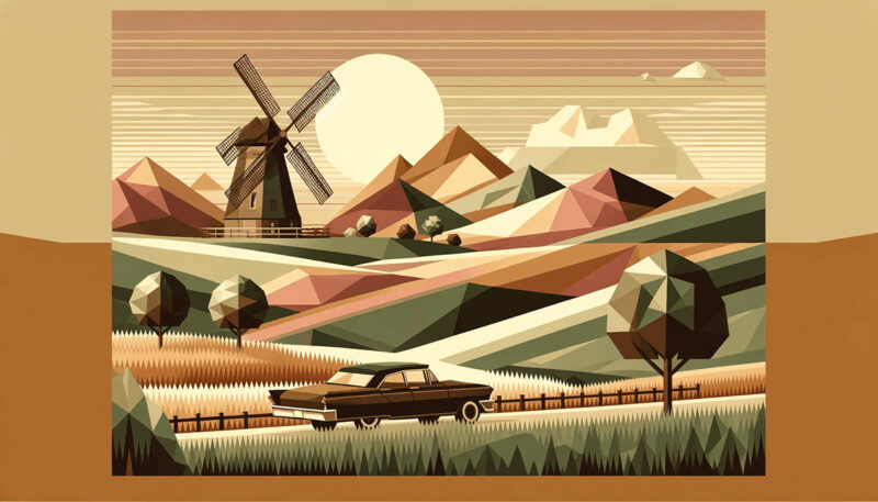
Imagine a canvas where time stands still, captured in hues that echo stories from decades past. Vintage color palettes are more than mere compilations from a bygone era; they are the essence of visual storytelling, harmonizing nostalgia with contemporary design.
With a delicate balance of muted colors, antique shades, and timeless palettes, a nod to history can be woven seamlessly into modern aesthetics.
This exploration is an invitation to unravel the tapestry of color harmony, where retro color schemes and classic color swatches blend to create a rich narrative.
Unearth the secrets of color restoration from the vibrant Art Deco colors to the earthy tones of the Victorian theme. Delve into the essence of design motifs that have weathered the tides of time to remain relevant today.
In this journey, you will discover the alchemy of translating nostalgic hues into contemporary visuals.
Whether you’re a custodian of design, an aficionado of period-specific styles, or simply enchanted by the allure of days gone by, you’ll emerge with a new perspective on how vintage-inspired design can transcend the barriers of time.
Examples of Vintage Color Palettes
| #EEEEEE | #DDDDDD | #76885B | #627254 |
| #FFC374 | #F9E897 | #7F9F80 | #124076 |
| #9CAFAA | #D6DAC8 | #FBF3D5 | #EFBC9B |
| #FFF2E1 | #EAD8C0 | #D1BB9E | #A79277 |
| #EEE4B1 | #8C6A5D | #5F374B | #430A5D |
| #8B322C | #DD5746 | #FFC470 | #4793AF |
| #A1C398 | #C6EBC5 | #FEFDED | #FA7070 |
| #EEEEEE | #76ABAE | #31363F | #222831 |
| #F1EF99 | #EBC49F | #D37676 | #B0C5A4 |
| #AFD198 | #E8EFCF | #ECCA9C | #DBA979 |
| #638889 | #EEA5A6 | #B5C0D0 | #8E7AB5 |
| #EED3D9 | #F6F5F5 | #BED1CF | #E493B3 |
| #B4B4B8 | #9B4444 | #EEEDEB | #9CAFAA |
| #747264 | #9BBC98 | #F2EFE5 | #E0CCBE |
| #3C3633 | #B67352 | #51829B | #C7C8CC |
| #FBF3D5 | #C68484 | #EADFB4 | #F6995C |
| #A3C9AA | #9BB0C1 | #F9EFDB | #E78895 |
| #EEEEDD | #CCD3CA | #B784B7 | #FFE4C9 |
| #FFF7F1 | #ECB159 | #EE99C2 | #8CB9BD |
| #E3E1D9 | #F5E8DD | #0C359E | #FEFBF6 |
| #B2A59B | #EE7214 | #5F8670 | #43766C |
| #7E6363 | #D9EDBF | #B19470 | #C69774 |
| #D2E3C8 | #424769 | #3E3232 | #7077A1 |
| #82A300 | #FF9800 | #FFB996 | #F9E8D9 |
| #B80000 | #CD8D7A | #503C3C | #76453B |
| #FFEFE8 | #2D3250 | #F8DFD4 | #607274 |
| #F6B17A | #739072 | #86A789 | #F8FAE5 |
| #A87C7C | #DBCC95 | #DED0B6 | #F7B787 |
| #4F6F52 | #FDFFAB | #FFCF81 | #EAECCC |
| #C3E2C2 | #637E76 | #527853 | #FAEED1 |
| #4F6F52 | #F6F1EE | #AF2655 | #FECDA6 |
| #5F6F52 | #A3B763 | #FAF6F0 | #B99470 |
| #860A35 | #B3A492 | #776B5D | #A9A9A9 |
| #9FBB73 | #F1EB90 | #F4EAE0 | #C7DCA7 |
| #DADDB1 | #4F4A45 | #739072 | #6C5F5B |
| #F3B664 | #89B9AD | #D6C7AE | #F4DFC8 |
| #FF9130 | #F3EEEA | #FFEBD8 | #FFC5C5 |
| #A9B388 | #F3F3F3 | #EBE3D5 | #ED7D31 |
| #FEFAE0 | #3A4D39 | #EC8F5E | #b0a695 |
| #FF5B22 | #000000 | #ECE3CE | #BFB29E |
FAQ on Vintage Color Palettes
What Defines a Vintage Color Palette?
A vintage color palette draws inspiration from a specific historical period. It’s an array of colors that reflects the aesthetics and cultural influences of that time, often bringing out a sense of nostalgia.
Vibrant Art Deco shades or muted earthy tones from the Victorian era can define such palettes.
How Can You Identify Vintage Colors in Design?
Examine historical references or use tools like the Adobe Color Wheel to match hues from past decades. Look for muted colors, period-specific motifs, and color combinations that seem era-evocative.
Design cues from the Mid-Century or Victorian times can be strong indicators.
Why are Vintage Color Palettes Popular in Modern Design?
Their timeless nature exudes elegance and character. In a world of fleeting trends, these nostalgic hues strike a chord, blending seamlessly into contemporary aesthetics.
They provide a unique, soulful touch to design, distancing it from the generic, and connecting with the audience on a different level.
What Colors are Often Found in Vintage Palettes?
Expect to see a rich tapestry of heritage colors—burnt sienna, dusty rose, deep emerald, navy blue, and muted ochre. These shades bring past memories to the present and are typically paired in ways that stay true to their historical context, such as in retro branding.
How Can I Incorporate Vintage Colors into My Home?
Start with swatch books from different eras for inspiration. Choose wall colors that resonate with a chosen epoch and accent with vintage furniture or art.
Don’t shy away from blending contemporary elements. It’s this dialogue between past and present that truly animates a space.
What is the Significance of Color Theory in Vintage Palettes?
Understanding color harmony is fundamental. Each vintage palette communicates a mood, a time, and a place.
Knowing how to match these hues in proportionate and complementary ways is a craft rooted in the principles of color theory and is essential for accurate period representation.
Can Vintage Color Palettes Work for Digital Design?
Absolutely. Digital design thrives on versatility. Implementing vintage graphics and color schemes can offer a memorable user experience, differentiating a brand with an emotive punch.
Think of websites or apps with a retro look and feel—they have that extra allure, don’t they?
How Do Vintage Color Palettes Influence Fashion?
Fashion cyclical nature makes it a perfect medium for vintage color palettes. Designers often revisit past decades, integrating nostalgic hues into contemporary clothing lines. This brings a fresh narrative to collections, allowing wearables to tell the story of history through color.
What are Some Tips for Creating a Vintage Color Palette?
Dive into color history, explore Pantone’s archives, and study period art. Develop an understanding of which colors define an era, and craft your palette from there.
Frequent use of a Color Wheel can help in visualizing complementary and analogous schemes that resonate with the chosen time period.
How Can Businesses Use Vintage Color Palettes for Branding?
Brands can harness the power of nostalgia. A vintage color scheme in logos, packaging, and marketing materials can evoke emotions and create a distinctive identity.
This allows businesses to stand out and offer a brand experience that’s rich with heritage and storytelling elements.
Conclusion
Weaving a narrative through vintage color palettes is akin to conducting an orchestra; each hue is an instrument playing its part in a grander symphony of design.
Today’s voyage across the color spectrum—dipping into pastels, navigating through muted tones, and emerging into the realm of heritage colors—reaffirms the timelessness of these palettes.
- It is the respect for color harmony,
- The homage to historical color styles,
- And the exploration of design motifs from bygone eras,
that crafts a visual language which speaks, not just to the eyes, but to the soul.
These palettes, rich with history, carry with them the ability to transcend era boundaries, effortlessly fusing elements of nostalgic design and retro branding to modernity.
As you step forth, armed with the knowledge of how nostalgic hues and classic color swatches can be tailored for contemporary use, remember that it is your creativity that will breathe new life into these timeless palettes.
Embrace the past, design for the present, and inspire the future.
If you liked this article about vintage color palettes, you should check out this article about winter color palettes.
There are also similar articles discussing spring color palettes, popular color palettes, neon color palettes, and gold color palettes.
And let’s not forget about articles on light color palettes, dark color palettes, warm color palettes, and cold color palettes.


Renowned for his expertise in logo design and visual branding, Bogdan has developed a multitude of logos for various clients.
His skills extend to creating posters, vector illustrations, business cards, and brochures. Additionally, Bogdan's UI kits were featured on marketplaces like Visual Hierarchy and UI8.
- What are Analogous Colors? A Color Theory Guide - 6 July 2024
- The Arsenal Logo History, Colors, Font, And Meaning - 5 July 2024
- How Do I Put My Logo on Clothes? 7 Techniques to Try - 5 July 2024