


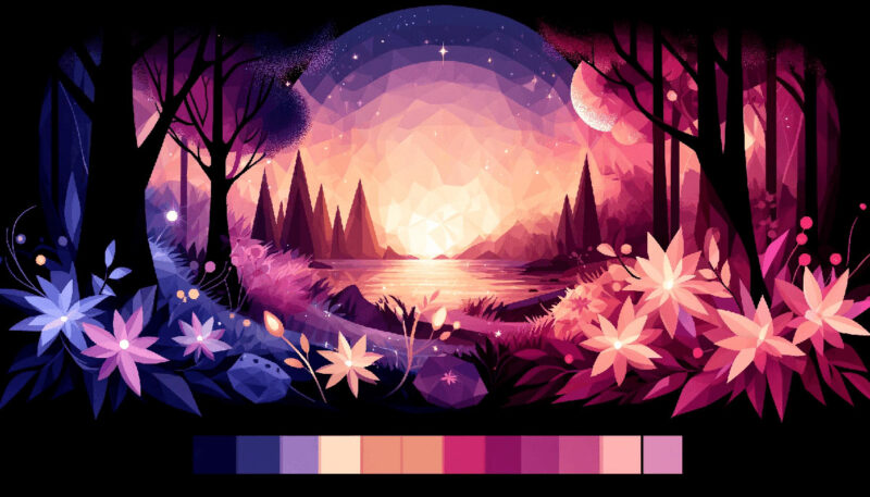
As dawn unfurls its hues, few can deny the captivating allure of the first lavender streaks across the sky. This visual symphony sets a grand stage for exploring the rich spectrum of purple color palettes.
At the heart of every compelling design lies a secret: the strategic use of color, weaving emotion and perspective into the viewer’s experience.
Grasping the essence of the color purple, one finds a blend of calming blues with passionate reds culminating in a harmony that is both regal and relatable.
When we delve into design, be it for a brand’s heart and soul or the inner sanctuary of a home, the choice of color can transcend mere aesthetics.
It speaks, suggesting sophistication or whimsy, luxury or playfulness. This article illuminates how the lavender theme to orchid color variations can transform a canvas, a room, or a digital interface.
By the conclusion, you’ll possess insights into effectively employing violet shades and magenta accents, enriching your projects with visual harmony that resonates on a deeper, more instinctive level.
Prepare to journey through the world of purple, where color theory meets practical application in a dance as old—and as fresh—as time itself.
Examples of Purple Color Palettes
| #7BC9FF | #1C1678 | #8576FF | #FFEBB2 |
| #C4E4FF | #D895DA | #D6589F | #D20062 |
| #BE7B72 | #824D74 | #49243E | #FDAF7B |
| #912BBC | #D875C7 | #E9A89B | #FFFDCB |
| #FB6D48 | #FFAF45 | #673F69 | #D74B76 |
| #86469C | #E59BE9 | #BC7FCD | #FB9AD1 |
| #8C6A5D | #EEE4B1 | #5F374B | #430A5D |
| #8644A2 | #A3FFD6 | #D862BC | #BB8493 |
| #FFCDEA | #DBAFA0 | #704264 | #401F71 |
| #FF8E8F | #FFB38E | #E178C5 | #FFFDCB |
| #6420AA | #FF7ED4 | #FF3EA5 | #FFB5DA |
| #EEA5A6 | #E493B3 | #B784B7 | #8E7AB5 |
| #FFD0EC | #81689D | #474F7A | #1F2544 |
| #337357 | #FFD23F | #EE4266 | #5E1675 |
| #210951 | #15F5BA | #836FFF | #F0F3FF |
| #FF8911 | #FDBF60 | #9F70FD | #7F27FF |
| #AD88C6 | #E1AFD1 | #FFE6E6 | #7469B6 |
| #96E9C6 | #83C0C1 | #6962AD | #6C22A6 |
| #F2F597 | #37B5B6 | #492E87 | #0A1D56 |
| #910A67 | #720455 | #3C0753 | #030637 |
| #FFF | #FFE7C1 | #F2AFEF | #F3CCF3 |
| #67729D | #864AF9 | #AC87C5 | #F3F8FF |
| #332941 | #7360DF | #E9A8F2 | #A367B1 |
| #33186B | #FFD1E3 | #711DB0 | #7B66FF |
| #7071E8 | #F8E559 | #E26EE5 | #5D3587 |
| #756AB6 | #BB9CC0 | #3B3486 | #FFC7C7 |
| #FFA732 | #DC84F3 | #C499F3 | #ED9ED6 |
| #E7BCDE | #7E30E1 | #5FBDFF | #49108B |
| #EF4040 | #FFE5E5 | #C21292 | #96EFFF |
| #392467 | #E0AED0 | #C683D7 | #C5FFF8 |
| #FED9ED | #E26EE5 | #5D3587 | #392467 |
| #E5CFF7 | #9D76C1 | #713ABE | #5B0888 |
| #FFFB73 | #FFA33C | #B15EFF | #3D30A2 |
| #E95793 | #DA0C81 | #940B92 | #610C9F |
| #D0A2F7 | #DCBFFF | #E5D4FF | #F1EAFF |
| #B0578D | #D988B9 | #FACBEA | #FFE4D6 |
| #FFF8C9 | #DFCCFB | #D0BFFF | #BEADFA |
| #C2D9FF | #8E8FFA | #7752FE | #190482 |
| #7743DB | #C3ACD0 | #F7EFE5 | #FFFBF5 |
| #F39F5A | #AE445A | #662549 | #451952 |
| #FFE5E5 | #FF6AC2 | #B931FC | #5D12D2 |
FAQ on Purple Color Palettes
What emotions are evoked by purple color palettes?
Purple is a fascinating hue, often associated with royalty, sophistication, and the mysterious. Depending on the shade, it can convey luxury when darker, or a sense of spirituality and calm in its lighter lavender form. In design, it’s used to create depth and convey creativity.
How does purple fit into modern design trends?
In the realm of design, purple often acts as a bridge between the warmth of reds and the coolness of blues, introducing a contemporary feel. It’s flexible—equally at home in a gradient or as a striking color block, echoing color trends found in digital and print designs.
What color combinations work best with purple?
Harmony prevails when purple is paired with complementary colors like yellow or contrasting hues like teal. Neutrals also marry well, providing a backdrop that allows purple to stand out.
Especially in interior design, pairing with greens or oranges yields a palette full of energy and vibrance.
Can purple color palettes be considered for corporate branding?
Indeed, purple can be quite impactful in corporate branding. It speaks of boldness and creativity. Tech companies, in particular, find it useful for standing out in a sea of blues and greys, while beauty brands use it to signify elegance and allure.
What are the best ways to use purple in web design?
Purple in web design needs to be used judiciously—think CTA buttons, navigation highlights, or even as part of a gradient background.
It grabs attention without overwhelming, especially when used alongside color accessibility principles to ensure readability for all users.
Is there a psychology behind the use of purple in marketing?
Certainly, the psychology behind purple is rich; it’s often seen as luxurious and imaginative. In marketing, especially when aiming to evoke creativity, wisdom, or luxury, purple can be quite effective, as it stands out and yet maintains an air of mystery.
What considerations should be taken when creating a purple color palette for a room?
When creating a purple palette for a room, consider lighting and the room’s size. These two factors influence how the color is perceived—lighter purples can soften a space and make it feel larger, while darker tones create intimacy but can make a small room feel claustrophobic.
Is purple a good choice for a wedding color palette?
Purple has become an elegant and popular choice for wedding color themes. It’s versatile enough to be paired with spring pastels or autumnal oranges and golds. The key is to balance it with complementary or neutral shades to achieve a harmonious color scheme.
How does purple impact the mood of a workspace?
Purple can energize or relax a workspace, depending on the shade. A lilac or lavender can soothe and calm, ideal for a stressful environment, while a vibrant violet might stimulate creativity and innovation. It’s a balance to find the perfect pitch for productivity.
What are the seasonal connotations of purple?
Purple dances through seasons—imagine the fresh lilacs of spring, the deep violets of summer blooms, or the muted mauves of fall. Each seasonal shade carries its promise; spring’s rebirth, summer’s vibrancy, and fall’s reflection.
Winter seldom claims purple, leaving it a warm memory of the year’s color splendor.
Conclusion
In our odyssey through the realm of purple color palettes, we’ve traced the lineage of lavender whispers to the bold proclamations of plum. These hues, steeped in the essence of royalty and the avant-garde, offer an artistic lexicon beyond compare.
- We harnessed the subtlety of mauve for serene ambiances.
- Explored amethyst for its spark of creativity.
- Layered orchid to infuse depth and richness.
Each purple shade, a story; each combination, an emotion evoked. Integrating these with color theory and visual harmony, we’ve sculpted spaces that breathe life and whispered a language of color that’s meant to be felt as much as seen.
As the curtain descends on our chromatic journey, carry forward the inspiration. Let the violet shades and magenta accents unveiled here guide the brush in your hand—be it digital or bristled. Paint your world with the sophistication, whimsy, and profound tranquility that only purple can provide.
If you liked this article about purple color palettes, you should check out this article about brown color palettes.
There are also similar articles discussing pink color palettes, orange color palettes, yellow color palettes, and bright color palettes.
And let’s not forget about articles on beige color palettes, gray color palettes, white color palettes, and Christmas color palettes.


Renowned for his expertise in logo design and visual branding, Bogdan has developed a multitude of logos for various clients.
His skills extend to creating posters, vector illustrations, business cards, and brochures. Additionally, Bogdan's UI kits were featured on marketplaces like Visual Hierarchy and UI8.
- What are Analogous Colors? A Color Theory Guide - 6 July 2024
- The Arsenal Logo History, Colors, Font, And Meaning - 5 July 2024
- How Do I Put My Logo on Clothes? 7 Techniques to Try - 5 July 2024