


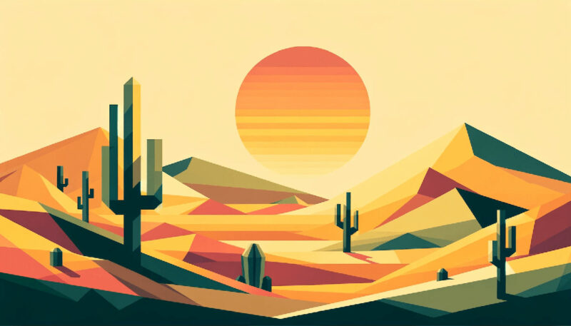
Imagine a canvas, a dance of vivacity where each stroke enlivens the space. This isn’t just about splashes of color; it’s about orange color palettes, a symphony in hues that evoke warmth, creativity, and boundless energy.
Traditionally, orange stands as the audacious midpoint between the fierce reds and the sunny yellows, holding a personality that infuses environments with liveliness.
Within these lines, the secrets of employing orange color palettes effectively unfold. You’ll journey through the nuances of color theory and discover how to manipulate shades, from citrus hues to earthy terracotta.
Understanding the science of color and its psychological impact is pivotal. By the article’s end, you’ll grasp how to leverage warm color schemes to craft spaces that are not just seen but felt.
There’ll be an exploration of how Pantone sets the stage for trend forecasting and the pivotal role color harmony plays in web design.
Embrace the transformative power of orange, a color that’s both a statement and a whisper in the panorama of design.
Examples of Orange Color Palettes
| #90D26D | #2C7865 | #FF9800 | #D9EDBF |
| #AFD198 | #E8EFCF | #ECCA9C | #DBA979 |
| #FFF455 | #FFC700 | #4CCD99 | #007F73 |
| #F2613F | #9B3922 | #481E14 | #0C0C0C |
| #9CAFAA | #D6DAC8 | #FBF3D5 | #EFBC9B |
| #E5C287 | #898121 | #E8751A | #FDA403 |
| #673F69 | #D74B76 | #FB6D48 | #FFAF45 |
| #FFF8DC | #F7C566 | #DC6B19 | #6C0345 |
| #8B322C | #DD5746 | #FFC470 | #4793AF |
| #FDAF7B | #BE7B72 | #824D74 | #401F71 |
| #F6995C | #FFC374 | #FF8911 | #E2BFB3 |
| #F4538A | #7F9F80 | #FFFDCB | #51829B |
| #FF8E8F | #387ADF | #9F70FD | #F57D1F |
| #B67352 | #EBF400 | #E178C5 | #CDFADB |
| #50C4ED | #F5DD61 | #333A73 | #ECB159 |
| #7F27FF | #FFBE98 | #FBA834 | #FEECE2 |
| #59D5E0 | #FFCF96 | #EADFB4 | #F9E897 |
| #F72798 | #000000 | #9BB0C1 | #FFB38E |
| #8CB9BD | #F6FDC3 | #FF8080 | #FDBF60 |
| #FAA300 | #F7DED0 | #FEFBF6 | #124076 |
| #FFFC9B | #FE7A36 | #FDE767 | #7057A1 |
| #0C2D57 | #9A031E | #D9EDBF | #6895D2 |
| #F6B17A | #B7E5B4 | #FFA447 | #FFB0B0 |
| #820300 | #FFBB64 | #F28585 | #EFECEC |
| #280274 | #FFDD95 | #5F0F40 | #3652AD |
| #E36414 | #FF6800 | #B80000 | #FFB996 |
| #FF9843 | #D04848 | #F3B95F | #DCFFB7 |
| #FFEAA7 | #E9F6FF | #FB8B24 | #424769 |
| #5F8670 | #3468C0 | #86A7FC | #2D3250 |
| #FDFFAB | #FFCF81 | #FF6868 | #FC6736 |
| #EE7214 | #BED754 | #FFC47E | #527853 |
| #994D1C | #F5CCA0 | #EA906C | #B4BDFF |
| #F1EB90 | #FFE382 | #F9E8D9 | #C21292 |
| #EF4040 | #FBF6EE | #F3B664 | #9FBB73 |
| #6B240C | #BE3144 | #2B2A4C | #C1F2B0 |
| #711DB0 | #FFE3BB | #FFF78A | #22092C |
| #750E21 | #E3651D | #872341 | #E48F45 |
| #83A2FF | #191919 | #EEE2DE | #B31312 |
| #F7B787 | #FFB534 | #65B741 | #FFA732 |
| #FFAD84 | #F05941 | #FFD28F | #EC8F5E |
FAQ on Orange Color Palettes
What invokes the right mood with an orange color palette?
Warmth. Invigorating like a sunrise, an orange palette breathes life into spaces, stirring feelings of comfort yet vibrant energy.
Home designers love it; they weave pantone colors and warm hues into textiles, walls, even brand logos to spark creativity and enthusiasm without overwhelm.
How can I choose the right shades for my orange palette?
Consider the room’s purpose. Kitchens dazzle with cheerful tangerine; living rooms embrace softer pumpkin tones. Use the color wheel; pair bold oranges with neutral grays for balance or teals for a complementary pop.
What are some trendy orange palette combinations?
Earthy organic palettes reign. Rustic terracotta paired with forest greens, mustard yellows, and deep blues. Such aesthetic color matches reflect nature’s palette, ideal for those seeking a connection with the outdoors, within indoors.
Can an orange palette work in a minimalist design?
Absolutely. Use burnt orange as an accent against stark whites and blacks. This creates a visual anchor point, a hint of visual harmony amidst simplicity. Orange offers warmth in a minimalist scene without cluttering visual space.
How can I incorporate orange into a corporate color scheme?
First, understand the brand’s voice. Orange suggests innovation, approachability. Merge gradient transitions of orange with professional blues or serious grays to balance friendliness with sophistication. Branding with orange color schemes can set a company apart.
Does an orange palette affect the perception of a website?
It does. Orange calls to action; it’s optimistic, commands attention. Web design color accessibility matters; contrast is key. Pair orange with sufficient whites or dark backgrounds to ensure readability and retain visitor engagement.
Can I use an orange palette in seasonal designs?
Seasons change, and so do palettes. Summer bursts with bright citrus orange, while autumn welcomes burnt shades. These colorful graphic design aesthetics echo the seasonal moods, driving thematic marketing campaigns.
What colors work best with orange for a harmonious interior?
Soft neutrals like creams, beiges. Interior design loves adding natural timber elements to enhance orange’s warmth without overpowering. A dash of sage green or navy can add depth, mimicking the sunset’s affair with the night sky.
How does orange interact with lighting in a space?
Lighting can mute or amplify an orange palette. Warm, yellow lighting enhances the cozy ambiance; white lighting retains the color’s true vibrancy. Consider Pantone color systems when planning; remember, natural light changes, affecting perception throughout the day.
What psychology is behind the use of orange in color palettes?
Orange exudes cheer, inviting casual communication. In color psychology, it stimulates appetite, conversation, bridges the gap between the fiery intensity of red and the sunshine playfulness of yellow. Thus, orange finds its way into social spaces, fostering interactions.
Conclusion
As the curtain falls on our exploration of orange color palettes, it’s evident that there’s a profound depth to this vibrant chorus of colors. From the burnt orange reminiscent of autumn leaves to the peach undertones that whisper of spring, these palettes offer a versatility unrivaled by more timid hues.
Delving beyond the surface, these colors are not just seen—they’re felt. They resonate with the heart of color theory, impacting spaces and visuals with their energetic presence. The infusion of warm color schemes into a web designer’s toolbox can elevate a brand, breathe life into a digital landscape, or create a mood board inspiration that resonates with depth and warmth.
In conclusion, whether seeking to invigorate a website color scheme, inspire a fashion color trend, or dictate the ambiance within an interior space, orange color palettes offer a dynamic and adaptable array of options. Imbuing your creations with the essence of orange is to embrace a realm where design meets the audacity of nature’s own canvas.
If you liked this article about orange color palettes, you should check out this article about brown color palettes.
There are also similar articles discussing pink color palettes, purple color palettes, yellow color palettes, and bright color palettes.
And let’s not forget about articles on beige color palettes, gray color palettes, white color palettes, and Christmas color palettes.


Renowned for his expertise in logo design and visual branding, Bogdan has developed a multitude of logos for various clients.
His skills extend to creating posters, vector illustrations, business cards, and brochures. Additionally, Bogdan's UI kits were featured on marketplaces like Visual Hierarchy and UI8.
- What are Analogous Colors? A Color Theory Guide - 6 July 2024
- The Arsenal Logo History, Colors, Font, And Meaning - 5 July 2024
- How Do I Put My Logo on Clothes? 7 Techniques to Try - 5 July 2024