


Nature’s palette unfurls a spectrum of hues that can both soothe the soul and invigorate the mind. Envision the lush greens of a forest; now picture these hues infusing tranquility into a living space.
Color harnesses the essence of the natural world, embedding emotion and energy within each shade and tint.
In this exploration, you will uncover the secrets of nature color palettes. Be it through the waltz of autumn colors or the subtle whispers of coastal color themes, we delve deep into the harmonies that define and shape our perception of color in the world around us.
Drawn from the biome-specific palettes to the seasonal colors that mark time’s passing, we reveal how these organic selections can transform spaces and creations.
By the article’s end, you’ll grasp how chromatic natural beauty can elevate design, narrating stories through color and bringing the great outdoors into every element of creative work.
Discover not only the soothing earthy color patterns intrinsic to biophilic design but also how they can be woven seamlessly into modern aesthetics, subtly shifting the energy of any canvas they touch.
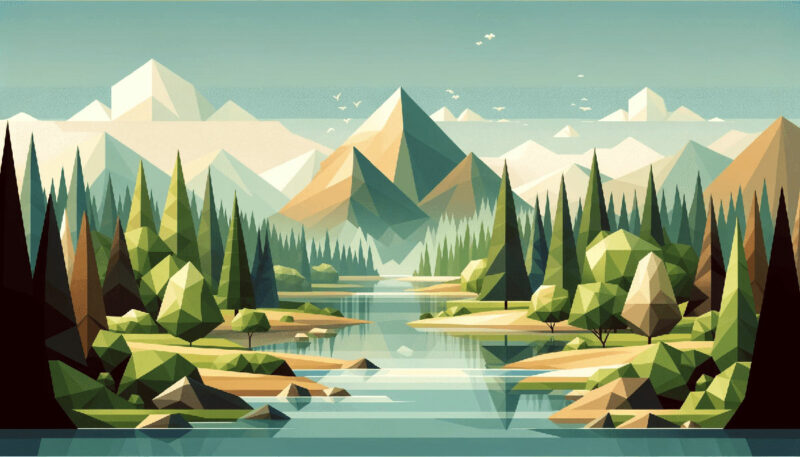
Examples of Nature Color Palettes
| #12372A | #BBC3A4 | #EBC49F | #D9EDBF |
| #F2C18D | #F1F5A8 | #D2D180 | #E5C287 |
| #F1EF99 | #B0C5A4 | #FEFDED | #A5DD9B |
| #E8EFCF | #FA7070 | #A1C398 | #E8751A |
| #F7F6BB | #90D26D | #C6EBC5 | #FDA403 |
| #D37676 | #F6F193 | #C5EBAA | #898121 |
| #FF9800 | #87A922 | #436850 | #E5E483 |
| #B2B377 | #B3A398 | #114232 | #FBFADA |
| #D7E4C0 | #DBA979 | #2C7865 | #ECCA9C |
| #ADBC9F | #AFD198 | #FCDC2A | #C6DCBA |
| #CD8D7A | #789461 | #BFD8AF | #F8FAE5 |
| #43766C | #F1E4C3 | #50623A | #80BCBD |
| #AFC8AD | #DBE7C9 | #294B29 | #FFFFEC |
| #597E52 | #D9EDBF | #D2E3C8 | #EAECCC |
| #163020 | #F2F1EB | #99BC85 | #FFCF81 |
| #739072 | #4F6F52 | #D5F0C1 | #C3E2C2 |
| #EEF0E5 | #88AB8E | #E1F0DA | #B6C4B6 |
| #304D30 | #B19470 | #C6A969 | #D4E7C5 |
| #86A789 | #DBCC95 | #76453B | #AAD9BB |
| #FDFFAB | #FFB996 | #F9F7C9 | #EEE7DA |
| #EE7214 | #FF8F8F | #C1F2B0 | #527853 |
| #F7B787 | #D0F288 | #F3B664 | #F1EB90 |
| #EEC759 | #89B9AD | #F9E8D9 | #DF826C |
| #65B741 | #FFB534 | #A2C579 | #B1C381 |
| #FFEBD8 | #9BB8CD | #FA7070 | #FBF6EE |
| #508D69 | #A6CF98 | #EC8F5E | #C7DCA7 |
| #F2FFE9 | #FFF7D4 | #557C55 | #9FBB73 |
| #61A3BA | #4F6F52 | #8ADAB2 | #ECE3CE |
| #739072 | #D2DE32 | #FFC5C5 | #FFEBD8 |
| #9ADE7B | #F8FFD2 | #FBF3D5 | #FFB534 |
| #555843 | #D0D4CA | #F5EEC8 | #A7D397 |
| #748E63 | #99B080 | #F9B572 | #FAF8ED |
| #D2DE32 | #FFFFDD | #016A70 | #A2C579 |
| #FFD9B7 | #7EAA92 | #9ED2BE | #C8E4B2 |
| #FFBFBF | #FFE5E5 | #F3FDE8 | #A8DF8E |
| #F4EEEE | #FFB7B7 | #FFDBAA | #96C291 |
| #65451F | #765827 | #C8AE7D | #EAC696 |
| #B0D9B1 | #D0E7D2 | #618264 | #79AC78 |
| #FFEEF4 | #E4E4D0 | #AEC3AE | #94A684 |
| #EBF3E8 | #D2E3C8 | #B2C8BA | #86A789 |
FAQ on Nature Color Palettes
What Inspires Nature Color Palettes?
Colors from nature are often inspired by the organic hues and earth tones that we see in our surroundings. These could range from the deep blues of the ocean to the vibrant reds and oranges seen in autumn leaves.
Designers and artists frequently draw from these natural elements to create palettes that resonate with the outdoors.
How Do I Create a Nature-Inspired Color Palette?
To create a nature-inspired color palette, start by observing the environment. Capture photographs of natural landscapes, or consider using color palette generators that focus on capturing natural colors.
Then, extract key tones and harmonize them based on color theory to reflect the natural color balance you desire.
Can Nature Color Palettes Be Applied to Modern Design?
Absolutely. Nature color palettes blend seamlessly into modern design by invoking a sense of serenity and connectivity with the environment.
Sustainable color selection and biophilic design principles are increasingly being integrated into contemporary aesthetics, making nature palettes more relevant than ever.
Are There Tools to Help Identify Nature Colors?
Certainly, tools like Adobe Color CC and various online color palette generators enable designers to identify and collect colors directly from nature photographs.
These tools can analyze images and suggest a set of complementary nature colors, helping to build cohesive and attractive color schemes.
What Are the Benefits of Using Nature Color Palettes?
Utilizing nature color palettes can enhance well-being and connectivity to the natural world – principles at the heart of biophilic design.
Additionally, these color schemes often evoke a timeless beauty that can blend with numerous design styles, giving designs an adaptable and organic color aesthetic.
How Do Seasonal Changes Influence Nature Color Palettes?
Seasonal shifts bring about a dynamic change in coloration, offering a fresh set of color inspiration every few months.
From the soft pastels of spring to the rich, earthy tones of fall, seasonality can guide the mood and tone for projects, informing palettes with a temporal narrative.
What Are Some Common Mistakes When Using Nature Color Palettes?
A common misstep is overlooking color harmony rules and instead choosing colors that are too similar or too clashing, leading to a lackluster or jarring palette.
Another mistake is not considering the contextual use of the palette, which can result in colors that don’t quite fit the intended application or audience.
How to Match Nature Colors for Different Uses?
Finding the right match depends on understanding the psychology of color in nature and its intended use.
For interiors, soothing natural colors might be best, while marketing might demand more vibrant foliage tones. There’s no one-size-fits-all; it’s about matching the palette to the mood, purpose, and function.
What Role Does Lighting Play in Nature Color Palettes?
Lighting can dramatically affect the perception of colors. Natural light brings out the true vibrancy and depth of nature color palettes, while artificial lighting can alter how these colors are perceived.
Consider both the source and quality of light when applying these colors in physical spaces.
Can Nature Color Palettes Influence Brand Identity?
Indeed, brands often harness the power of nature color palettes to convey messages of sustainability or to evoke a natural, earth-friendly vibe.
Companies are increasingly aware that enviro-color branding can help resonate with audiences who value environmental conservation and a more organic approach to life.
Conclusion
Embarking on this chromatic journey, enveloped in nature color palettes has, I hope, been an excursion that transcended the mere selection of shades. It has been about crafting connections, threading the essence of the natural world through every swatch and stroke. We’ve traversed from the biophilic design colors that speak the language of the earth beneath our feet, to the seasonal colors painting the cycle of life around us.
In harnessing these palettes, it’s my aspiration that you’ve unearthed a newfound respect for the natural shades that are often, regrettably, overlooked.
- You now have the vision to see beyond the mere greens of forests or blues of waters.
- You possess the understanding to wield these palettes as powerful tools for storytelling within your designs.
- There’s a recognition of the palpable pulse of the world’s tapestry in each palette selection.
Closing this chapter, remember that the most compelling narrative woven by these hues is one that remains untold—your personal tale, eager to be told through the natural beauty of colors you choose.
If you liked this article about nature color palettes, you should check out this article about summer color palettes.
There are also similar articles discussing happy color palettes, earth color palettes, night color palettes, and space color palettes.
And let’s not forget about articles on rainbow color palettes, gradient color palettes, sunset color palettes, and sky color palettes.


Renowned for his expertise in logo design and visual branding, Bogdan has developed a multitude of logos for various clients.
His skills extend to creating posters, vector illustrations, business cards, and brochures. Additionally, Bogdan's UI kits were featured on marketplaces like Visual Hierarchy and UI8.
- The Liverpool Logo History, Colors, Font, And Meaning - 3 July 2024
- Stylish Shoe Brand Logos Examples to Explore - 3 July 2024
- The Celgene Logo History, Colors, Font, And Meaning - 2 July 2024