Modern Color Palettes for Contemporary Designs

Imagine your space reborn—a canvas where bold strokes of vibrant color mixes breathe new life into the very essence of design. Modern color palettes stand as the testament to an ever-evolving narrative of aesthetic expression, a narrative I’m immersed in daily.
Against the backdrop of minimalist color selections and bold contrasts, there’s an allure to the synergy between colors and our perception of contemporary spaces.
Delving into this article unveils the secret alchemy of color theory in modern design, decoding more than hues but emotions they stir within us.
What will unfold are not just color palette inspirations but also practical insights into their mesmerizing applications—all sculpted to elevate your design lexicon.
From earthy tones and Pantone Color of the Year to the subtlety of pastel shades, each segment will enrich your understanding, empowering you to wield color with newfound confidence.
As hues blend, watch the transformative power of color redefine the mundane, and let this knowledge become the cornerstone of your design philosophy.
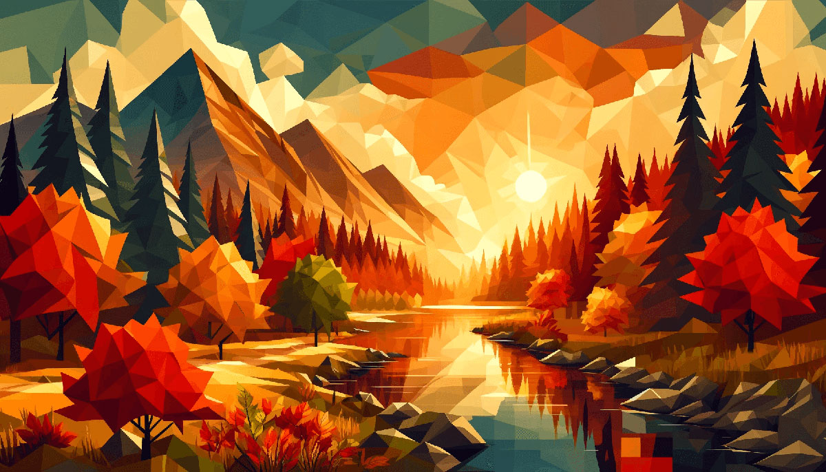
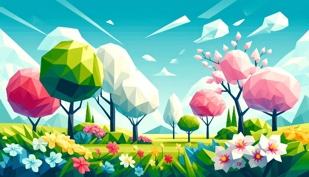
Examples of Modern Color Palettes
| #E63946 | #2A9D8F | #606C38 | #FFB703 | #FFC8DD |
| #264653 | #219EBC | #FF006E | #CCD5AE | #FFAFCC |
| #E76F51 | #F4A261 | #D62828 | #457B9D | #A2D2FF |
| #FB5607 | #FAEDCD | #DDA15E | #283618 | #FB8500 |
| #14213D | #BC6C25 | #E9EDC9 | #FCA311 | #FFBE0B |
| #BDE0FE | #003049 | #8338EC | #8ECAE6 | #F77F00 |
| #6D6875 | #A8DADC | #FEFAE0 | #CDB4DB | #1D3557 |
| #FCBF49 | #E9C46A | #D4A373 | #EAE2B7 | #FFFFFF |
| #FFB4A2 | #023047 | #3A86FF | #B5838D | #000000 |
| #E5989B | #F1FAEE | #E5E5E5 | #FFCDB2 | #023047 |
| #CAD2C5 | #84A98C | #52796F | #354F52 | #2F3E46 |
| #D8E2DC | #FFE5D9 | #FFCAD4 | #F4ACB7 | #9D8189 |
| #DAD7CD | #A3B18A | #588157 | #3A5A40 | #344E41 |
| #22223B | #4A4E69 | #9A8C98 | #C9ADA7 | #F2E9E4 |
| #EF476F | #FFD166 | #06D6A0 | #118AB2 | #073B4C |
| #006D77 | #83C5BE | #EDF6F9 | #FFDDD2 | #E29578 |
| #F6BD60 | #F7EDE2 | #F5CAC3 | #84A59D | #F28482 |
| #2B2D42 | #8D99AE | #EDF2F4 | #EF233C | #D90429 |
| #FFB5A7 | #FCD5CE | #F8EDEB | #F9DCC4 | #FEC89A |
| #F72585 | #F4978E | #EFD3D7 | #335C67 | #FED9B7 |
| #EDEDE9 | #E56B6F | #0077B6 | #F08080 | #B56576 |
| #90E0EF | #FFBF69 | #E09F3E | #00AFB9 | #3D5A80 |
| #EE6C4D | #F5EBE0 | #D6CCC2 | #7209B7 | #CAF0F8 |
| #540B0E | #6D597A | #E3D5CA | #CBC0D3 | #293241 |
| #FFF3B0 | #FFDAB9 | #00B4D8 | #E0FBFC | #D5BDAF |
| #DEE2FF | #355070 | #03045E | #EAAC8B | #98C1D9 |
| #4361EE | #F07167 | #9E2A2B | #8E9AAF | #FBC4AB |
| #2EC4B6 | #FF9F1C | #0081A7 | #F8AD9D | #FEEAFA |
| #CBF3F0 | #4CC9F0 | #3A0CA3 | #FDFCDC | #FFFFFF |
| #E36414 | #003566 | #3C6E71 | #FB8B24 | #A9DEF9 |
| #FDF0D5 | #E71D36 | #02C39A | #00F5D4 | #00A896 |
| #028090 | #001D3D | #FF99C8 | #463F3A | #E4C1F9 |
| #9A031E | #FFD60A | #D0F4DE | #5F0F40 | #FEE440 |
| #F15BB5 | #284B63 | #8A817C | #FFC300 | #A7C957 |
| #669BBC | #000814 | #353535 | #00BBF9 | #9B5DE5 |
| #C1121F | #0F4C5C | #6A994E | #BC4749 | #D9D9D9 |
| #F4F3EE | #05668D | #011627 | #FFFFFF | #F2E8CF |
| #780000 | #2EC4B6 | #FDFFFC | #BCB8B1 | #386641 |
| #E0AFA0 | #FF9F1C | #FCF6BD | #F0F3BD | #003049 |
FAQ on Modern Color Palettes
What Defines a Modern Color Palette?
A modern color palette reflects current trends and echoes the zeitgeist.
It’s a medley of harmony in game color palettes, fresh hues that resonate with contemporary aesthetics, often leaning towards bold, minimalist or earthy tones that capture the design philosophy of being clean, functional, and impactful.
How Do I Choose a Suitable Color Palette for My Brand?
Selecting colors demands strategic thought. Consider brand values, the psychological effects of colors, and market position.
A blend of vibrant gaming hues and mood-setting game colors can form a unique identity that’s both appealing and reflective of the brand’s essence, setting it apart from competitors.
Can Color Palettes Impact User Experience?
Undoubtedly. Colors influence emotions and behaviors significantly. By weaving a tapestry of interactive design palettes, you create a user experience that’s not only visually delightful but also intuitive and effective.
This is fundamental for engaging user interfaces where each hue serves a purpose.
What Are the New Trends in Color Palettes for Digital Design?
Current trends revolve around gradients, muted colors with splashes of bright accents, and dynamic lighting and color. The shift toward color customization in gaming reflects in digital design too; versatility and personalization are key to staying ahead.
How Can I Make My Color Palette Inclusive and Accessible?
Inclusivity is paramount. Adhere to Color Accessibility Standards, choosing hues that differentiate well and cater to color-blind users.
Tools like Adobe Color can simulate various forms of color blindness, ensuring accessibility color options are baked into your design from the get-go.
Are There Universal Color Schemes That Are Visually Pleasing?
Certain schemes, like complementary, triadic, or analogous, are universally harmonious. Yet, aesthetic palettes for games remind us that context is king. Universally pleasing is subjective; it’s about resonating with the intended audience and purpose of the design.
How Often Should I Update My Color Palette?
Evolve with intention. A considered refresh can reinvigorate a brand—think game art color trends—but avoid constant change which can confuse.
Reassess when your brand’s message shifts or your audience’s taste changes but always ensure transitions are on-brand and compelling.
What Role Do Cultural Differences Play in Color Palette Selection?
Considerably big. Different cultures assign different meanings to colors. When designing cross-culturally, be well-versed in these nuances. What is calming in one region could be disturbing in another.
It’s about cultural sensitivity and research, much like crafting emotional impact of color in gaming.
How Do Sustainability and Eco-Friendly Trends Influence Color Choices?
Sustainability shapes palettes towards natural, earthy tones and retro gaming palette inspirations that evoke a sense of eco-friendliness.
This shift mirrors society’s growing environmental consciousness, with brands aligning color choices to reflect eco-centric values and responsible messaging.
What Is the Best Way to Test a Color Palette’s Effectiveness?
Simulated environments and A/B testing are your allies here. Apply your color schemes to mock-ups or user interface color design samples.
Gather feedback, consider color psychology gaming, and be meticulous in observing how users interact with your design. Data-driven decisions lead to color choices that not only look good but perform effectively.
Conclusion
Stepping back, the canvas of our discussion—a rich tapestry we’ve woven with modern color palettes—brings a final flourish to the forefront. A palette, after all, isn’t just about the hues themselves; it’s a reflection, a statement, an invocation of emotion and intellect that captures the contemporary zeitgeist.
- Brushed with the shades of minimalist color selection…
- Infused with Pantone’s Color of the Year inspirations…
- Grounded in the psychological undercurrents that tug subtly at the beholder’s psyche.
Each element of design, from the earthy tones that ground to the vibrant color mix that captivates, is a vital chord in the symphony of visual communication. May this palette—the ideas and applications explored—serve not as a static decree but as the beginning of a vivid journey, where the colors chosen become a dynamic extension of one’s own vision and narrative.
Forge ahead, emboldened by these insights, and paint the world with the rich, imaginative strokes it yearns for.
If you liked this article about modern color palettes, you should check out this article about fun color palettes.
There are also similar articles discussing map color palettes, portfolio color palettes, gaming color palettes, and vivid color palettes.
And let’s not forget about articles on forest color palettes, magenta color palettes, saturated color palettes, four color palettes, pastel color palettes, and cyan color palettes.
Bogdan Sandu, a seasoned designer with 15 years of diverse experience, has been designing websites since 2008.
Renowned for his expertise in logo design and visual branding, Bogdan has developed a multitude of logos for various clients.
His skills extend to creating posters, vector illustrations, business cards, and brochures. Additionally, Bogdan's UI kits were featured on marketplaces like Visual Hierarchy and UI8.
Latest posts by Bogdan Sandu (see all)
- EM to PX Converter - 27 June 2024
- The Vertex Logo History, Colors, Font, And Meaning - 26 June 2024
- Decoding Teams: Full Outsource vs Team Augmentation in Dedicated Software Development - 26 June 2024