Map Color Palettes for Cartographic Design

Imagine navigating a world devoid of color—merely shades of grey marking territories and boundaries. Now, infuse that canvas with the artistry of map color palettes; suddenly, each region dances with a specific identity, and complex data becomes an accessible story.
Colors wield the power to transform a simple map into an insightful journey.
Within the realm of cartography and GIS, color is more than mere decoration; it’s a language. The hues chosen for a thematic map can illuminate patterns, highlight contrasts, and guide observers through spatial narratives.
This article unfolds the secrets of crafting compelling visual map data representation through sophisticated color schemes.
As we delve into the elements of color theory in mapping, you’ll learn the nuances of effective map color choices that prioritize readability and inclusivity for all, including individuals with color blindness.
Brushstrokes of knowledge await, as we unveil techniques to select and apply color with intention, making every geographic visualization an exquisite tapestry of information.
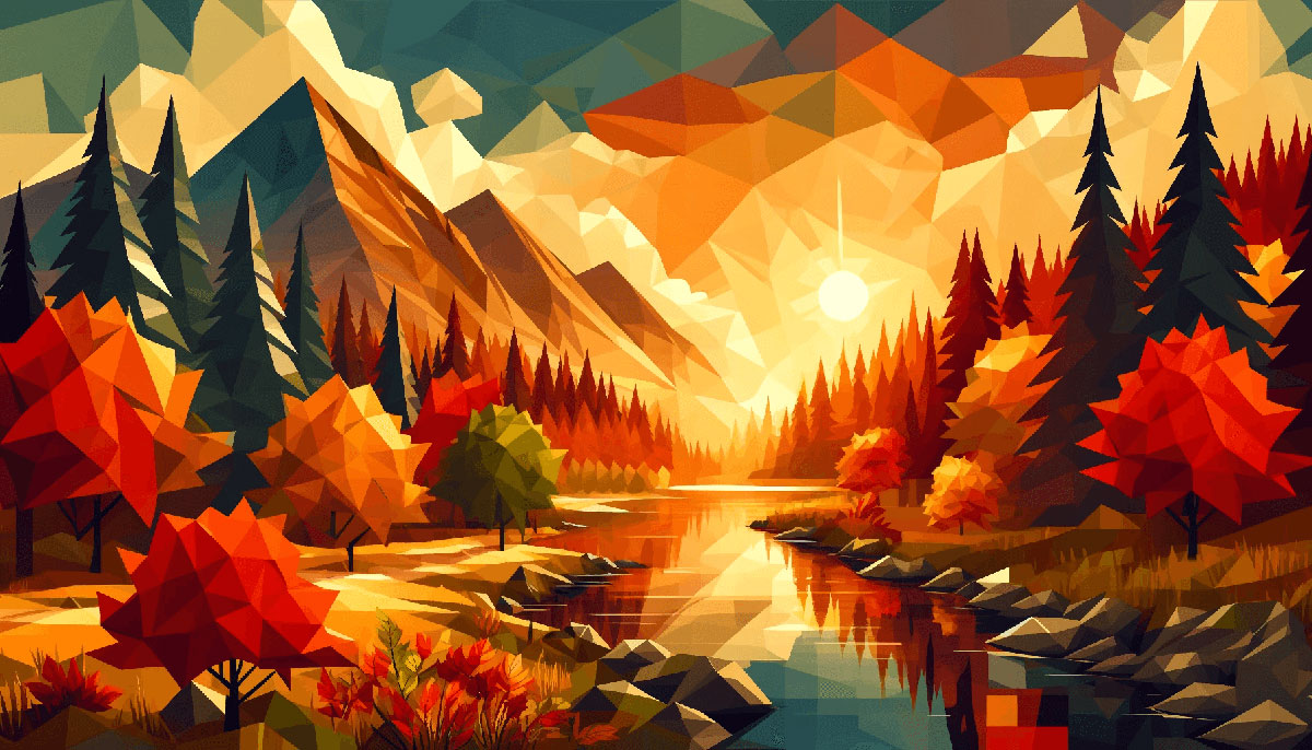
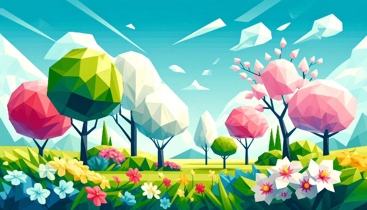
Examples of Map Color Palettes
| #000000 | #14213D | #FCA311 | #E5E5E5 | #FFFFFF |
| #606C38 | #283618 | #FEFAE0 | #DDA15E | #BC6C25 |
| #264653 | #2A9D8F | #E9C46A | #F4A261 | #E76F51 |
| #CDB4DB | #FFC8DD | #FFAFCC | #BDE0FE | #A2D2FF |
| #E63946 | #F1FAEE | #A8DADC | #457B9D | #1D3557 |
| #FFCDB2 | #FFB4A2 | #E5989B | #B5838D | #6D6875 |
| #CCD5AE | #E9EDC9 | #FEFAE0 | #FAEDCD | #D4A373 |
| #003049 | #D62828 | #F77F00 | #FCBF49 | #EAE2B7 |
| #8ECAE6 | #219EBC | #023047 | #FFB703 | #FB8500 |
| #FFBE0B | #FB5607 | #FF006E | #8338EC | #3A86FF |
| #E07A5F | #DAD7CD | #EDF6F9 | #EF476F | #D8E2DC |
| #EF233C | #354F52 | #9A8C98 | #118AB2 | #FFDDD2 |
| #3D405B | #84A59D | #81B29A | #FFD166 | #F2CC8F |
| #344E41 | #9D8189 | #83C5BE | #52796F | #F2E9E4 |
| #CAD2C5 | #C9ADA7 | #588157 | #06D6A0 | #073B4C |
| #E29578 | #8D99AE | #84A98C | #F4F1DE | #F7EDE2 |
| #FFF5A7 | #3A5A40 | #F5CAC3 | #A3B18A | #D90429 |
| #F28482 | #22223B | #4A4E69 | #F6BD60 | #2F3E46 |
| #2B2D42 | #FEC89A | #F4ACB7 | #FCD5CE | #FFE5D9 |
| #FFCAD4 | #F8EDEB | #EDF2F4 | #F9DCC4 | #FFB5A7 |
| #FBC4AB | #90E0EF | #F5EBE0 | #FFBF69 | #335C67 |
| #3D5A80 | #00B4D8 | #E3D5CA | #DEE2FF | #EFD3D7 |
| #98C1D9 | #EDEDE9 | #D5BDAF | #F72585 | #4CC9F0 |
| #03045E | #FED9B7 | #E56B6F | #355070 | #7209B7 |
| #FEEAFA | #FFF3B0 | #8E9AAF | #CBF3F0 | #540B0E |
| #00AFB9 | #E0FBFC | #6D597A | #9E2A2B | #4361EE |
| #B56576 | #F4978E | #F8AD9D | #F07167 | #0077B6 |
| #293241 | #EE6C4D | #E09F3E | #2EC4B6 | #FFDAB9 |
| #FDFCDC | #FF9F1C | #F08080 | #D6DAC8 | #3A0CA3 |
| #0081A7 | #D6CCC2 | #CBC0D3 | #EAAC8B | #CAF0F8 |
| #011627 | #FDFFFC | #2EC4B6 | #E71D36 | #FF9F1C |
| #000814 | #001D3D | #003566 | #FFC300 | #FFD60A |
| #463F3A | #8A817C | #BCB8B1 | #F4F3EE | #E0AFA0 |
| #5F0F40 | #9A031E | #FB8B24 | #E36414 | #0F4C5C |
| #FF99C8 | #FCF6BD | #D0F4DE | #A9DEF9 | #E4C1F9 |
| #780000 | #C1121F | #FDF0D5 | #003049 | #669BBC |
| #353535 | #3C6E71 | #FFFFFF | #D9D9D9 | #284B63 |
| #05668D | #028090 | #00A896 | #02C39A | #F0F3BD |
| #9B5DE5 | #F15BB5 | #FEE440 | #00BBF9 | #00F5D4 |
| #386641 | #6A994E | #A7C957 | #F2E8CF | #BC4749 |
FAQ on Map Color Palettes
Why are map color palettes important?
Map color palettes are the foundation of clarity and readability in cartography.
They ensure that information is communicated effectively, with colors acting as distinct signals for differentiating between regions, data points, or themes, enhancing the map’s utility and user experience.
How do you choose the right color palette for a map?
Embrace color theory fundamentals and consider the contrasts and saturation levels. The palette must reflect the data’s tone and purpose, with accessibility in mind. Tools like the Adobe Color Wheel can aid in creating a cohesive and aesthetically pleasing scheme.
What are the best practices for map color palettes in UX design?
Prioritize consistency and simplicity. Limit the number of colors to what’s necessary, use shades to indicate hierarchy, and ensure your choices adhere to UX design standards for readability. Incorporate color psychology to enhance the user’s navigational experience.
Can color palettes affect the perception of a map’s data?
Absolutely. Colors carry psychological implications and cultural connotations. The right choices can highlight key information and set the desired mood, while poor choices can lead to misinterpretation or overlook crucial data.
What are accessible map color palettes?
Accessible palettes are designed with inclusivity, ensuring that those with color vision deficiencies can still interpret the map. Utilize tools and guidance, such as WCAG, to test for accessibility standards adherence.
What is the role of color harmony in map design?
Color harmony can convey a seamless flow and structure, guiding the eyes through the map effortlessly. Balancing colors using schemes like triadic or analogous can achieve a visually comfortable and understandable map.
How does cultural context influence map color palette choices?
Colors signify different meanings across cultures. For example, while white often represents purity in some cultures, it may mean mourning in others. Tailoring palettes to cultural contexts affirms respect and improves communication.
What are the most common mistakes when selecting map color palettes?
Ignoring color blind-friendly design, using a high number of colors causing confusion, and neglecting the importance of contrast are common pitfalls. Also, overlooking the palette’s impact on the map’s emotional tone can diminish effectiveness.
How can technology help in choosing map color palettes?
Technology, like color pickers and palette generators, can automate the creation of harmonious palettes. Software solutions can also simulate how people with color vision deficiencies perceive your map, assisting in creating accessible designs.
What is the difference between qualitative and quantitative color palettes for maps?
Qualitative palettes are for categorical data, using distinct colors to denote different categories without implying order. Quantitative palettes convey progression, using a color gradient to reflect the scale or intensity of data values, like temperature or population density.
Conclusion
As we draw the final pixel on this exploration, let’s reiterate the profound impact that well-chosen map color palettes can have on our visual narratives. It’s a journey through a kaleidoscope where each hue selected constructs a larger story, transforming raw data into a tapestry rich with insight and engagement.
- Color coding for maps isn’t just aesthetic; it’s a key that unlocks understanding.
- The palette for GIS mapping you choose breathes life into the otherwise static figures.
- Utilizing color theory elevates your digital cartography from informative to immersive.
A meticulous blend of science and soul, these palettes are not merely decorative elements but vital storytellers in their own right. May the colors chosen on today’s digital canvas inspire clarity, inclusivity, and perhaps a bit of wonder, as every map unfurls its hues to whisper the secrets of the landscapes they represent. With these artistic tools at our disposal, we craft not just maps, but experiences.
If you liked this article about map color palettes, you should check out this article about fun color palettes.
There are also similar articles discussing portfolio color palettes, modern color palettes, gaming color palettes, and vivid color palettes.
And let’s not forget about articles on forest color palettes, magenta color palettes, saturated color palettes, and cyan color palettes.
Bogdan Sandu, a seasoned designer with 15 years of diverse experience, has been designing websites since 2008.
Renowned for his expertise in logo design and visual branding, Bogdan has developed a multitude of logos for various clients.
His skills extend to creating posters, vector illustrations, business cards, and brochures. Additionally, Bogdan's UI kits were featured on marketplaces like Visual Hierarchy and UI8.
Latest posts by Bogdan Sandu (see all)
- Inch to PX Converter - 29 June 2024
- The Boehringer Ingelheim Logo History, Colors, Font, And Meaning - 28 June 2024
- EM to REM Converter - 28 June 2024