Gaming Color Palettes: Best Picks for This Year

Imagine a world dipped in grayscale—void of the vivacity that tints our reality. Now, flood it with the most exuberant hues; suddenly, it pulsates with life, resonating with our every emotion.
Such is the transformative power of gaming color palettes in the digital universe we craft and inhabit. As architects of virtual experiences, we grasp the palette and brush to convey every narrative’s heartbeat through thoughtful chromatic choices.
Within this mosaic of pigments, we uncover a symphony of color theory, mood-setting shades, and aesthetic harmony pivotal to immersive universes.
Colors are the silent narrators of our digital odysseys, influencing the player’s journey without utterance a word. This article unfolds the spectrum of knowledge, from vibrancy’s pull on player immersion to the subtle nuances of color accessibility.
You will delve into the essence of gaming aesthetics and emerge with an enriched understanding of interface design, emotional impact, and the meticulous balance essential in curating the perfect visual appeal.
Discover the color stories that captivate and enchant in the realm of pixels and polygons.
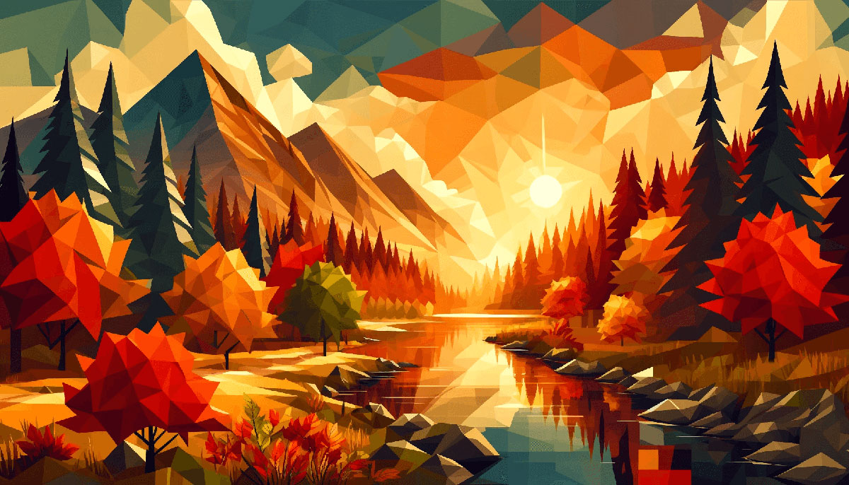
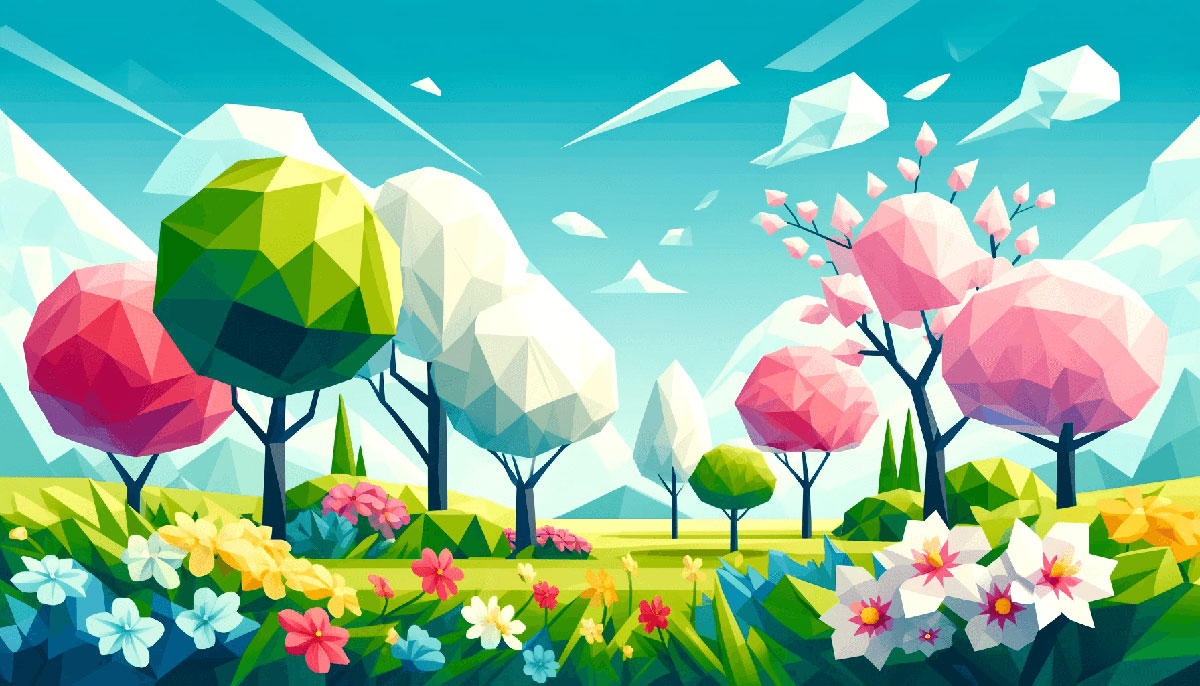
Examples of Gaming Color Palettes
| #8ECAE6 | #606C38 | #FFAFCC | #003049 | #FFBE0B |
| #2A9D8F | #E63946 | #CDB4DB | #F77F00 | #14213D |
| #219EBC | #E9C46A | #D4A373 | #EAE2B7 | #FFC8DD |
| #6D6875 | #283618 | #CCD5AE | #D62828 | #BDE0FE |
| #FCA311 | #A2D2FF | #FB5607 | #E5E5E5 | #E9EDC9 |
| #E76F51 | #9CAFAA | #FF006E | #FFB703 | #BC6C25 |
| #F4A261 | #FAEDCD | #000000 | #A8DADC | #FB8500 |
| #8338EC | #FFB4A2 | #F1FAEE | #FFFFFF | #3A86FF |
| #264653 | #B5838D | #FCBF49 | #E5989B | #457B9D |
| #DDA15E | #FEFAE0 | #1D3557 | #023047 | #FFCDB2 |
| #588157 | #9A8C98 | #F6BD60 | #E07A5F | #2B2D42 |
| #81B29A | #354F52 | #F7EDE2 | #8D99AE | #DAD7CD |
| #83C5BE | #F2CC8F | #EDF6F9 | #84A59D | #F4ACB7 |
| #06D6A0 | #4A4E69 | #118AB2 | #E29578 | #073B4C |
| #EDF2F4 | #F4F1DE | #FFB5A7 | #F5CAC3 | #D90429 |
| #344E41 | #FFCAD4 | #EF233C | #FFD166 | #3D405B |
| #22223B | #F28482 | #9D8189 | #F9DCC4 | #FEC89A |
| #52796F | #F8EDEB | #FFDDD2 | #2F3E46 | #EF476F |
| #CAD2C5 | #A3B18A | #84A98C | #F2E9E4 | #D8E2DC |
| #FCD5CE | #3A5A40 | #006D77 | #FFE5D9 | #C9ADA7 |
| #00AFB9 | #F5EBE0 | #0081A7 | #D5BDAF | #E56B6F |
| #FBC4AB | #E3D5CA | #03045E | #EDEDE9 | #3A0CA3 |
| #E0FBFC | #90E0EF | #E09F3E | #FED9B7 | #2EC4B6 |
| #F8AD9D | #FFBF69 | #FFF3B0 | #F4978E | #D6CCC2 |
| #EE6C4D | #B56576 | #FDFCDC | #335C67 | #F07167 |
| #3D5A80 | #9E2A2B | #0077B6 | #6D597A | #EFD3D7 |
| #4CC9F0 | #293241 | #FFDAB9 | #98C1D9 | #540B0E |
| #DEE2FF | #F08080 | #7209B7 | #8E9AAF | #CBF3F0 |
| #CAF0F8 | #355070 | #EAAC8B | #4361EE | #00B4D8 |
| #CBC0D3 | #FEEAFA | #FFFFFF | #FF9F1C | #F72585 |
| #5F0F40 | #00A896 | #FFC300 | #463F3A | #003566 |
| #F2E8CF | #FFD60A | #FB8B24 | #9B5DE5 | #00BBF9 |
| #003049 | #F15BB5 | #FEE440 | #D0F4DE | #780000 |
| #E4C1F9 | #386641 | #001D3D | #E71D36 | #9A031E |
| #FDF0D5 | #A7C957 | #8A817C | #FBF6BD | #E36414 |
| #0F4C5C | #A9DEF9 | #6A994E | #FF9F1C | #BC4749 |
| #C1121F | #F0F3BD | #02C39A | #BCB8B1 | #669BBC |
| #D9D9D9 | #284B63 | #353535 | #011627 | #FFFFFF |
| #05668D | #000814 | #3C6E71 | #2EC4B6 | #FDFFFC |
| #F4F3EE | #028090 | #FF99C8 | #E0AFA0 | #9CAFAA |
FAQ on Gaming Color Palettes
What dictates a good gaming color palette?
Answer
The heartbeat of a compelling gaming palette is contrast and player immersion. Vivid hues paired with deep shadows ensure elements pop.
Consistency with the game’s genre and emotional tone is key—whether conveying the bleakness of dystopia or the lush environments of a fantasy realm. It’s a dance between harmony and functionality.
How do I choose colors that enhance gameplay experience?
Engagement in gameplay is maximized with intuitive colors. Use warm colors to guide actions, cool hues for calm moments. Saturated colors signal importance, while muted tones create background depth.
Thematic colors tie into the game’s aesthetics, and a strong color theory framework helps maintain visual coherence throughout the gaming interface.
Can gaming color palettes affect gamer emotions?
Absolutely. Colors wield psychological power—reds evoke excitement, blues soothe, and greens rejuvenate. Color transitions can mirror narrative arcs, nurturing empathy and suspense.
A well-chosen palette in a user interface design not only conveys the game’s ambiance but also taps into the player’s emotional responses for a deeply resonant experience.
What’s the role of color accessibility in game design?
Inclusivity is paramount. Pantone choices should cater to those with color blindness by avoiding problematic color pairings. Employ high-contrast palettes for clear visibility and use patterns or symbols as additional differentiators.
Ensuring accessibility broadens your audience and heightens usability—a win-win for designers and gamers alike.
How do color palettes affect in-game branding?
Like a flag under which your gamers rally, your palette becomes synonymous with your game’s identity.
Distinct colors can make a game recognizable, becoming part of its signature—think of the specific blues and purples in “Fortnite.” Such branding helps in marketing and establishing a loyal player base.
What are tips for testing color palettes in games?
Iterative testing under various conditions is crucial. Examine your palette across different monitors and settings. Gather feedback from diverse players. Look especially at areas where color is critical to gameplay; ensure clarity and impact.
Aesthetic color design evolves through player interaction, ensuring reliability and appeal.
How crucial is keeping up with color trends in gaming?
While iconic games set trends, keeping an eye on Pantone color system trends can make a title feel current. Yet, the context is king; trends should align with the game’s appeal and not be followed blindly.
Striking a balance between contemporary and classic ensures longevity.
What makes a color palette ‘immersive’ in gaming?
An immersive palette is seamless—it enhances the game world without overshadowing gameplay. It should feel intrinsic to the environment, allowing players to slip into the realm you’ve created.
Subtle gradations, atmospheric lighting effects, and thoughtful color placement all contribute to immersion.
How should a gaming color palette adapt for mobile platforms?
Mobile platforms demand clear, legible palettes even on small screens. Higher contrasts and simpler palettes work best due to varied lighting conditions where devices are used.
Mobile games benefit from palettes optimized for quick comprehension, catering to shorter play sessions common with on-the-go gaming.
Can I use the same color palette across different in-game elements?
Uniformity has its place, but nuance brings depth. UI elements, for instance, should be obvious yet not overpowering. Relegate core gameplay elements to your palette’s vivid sector, hobby actions to less dominant hues.
Distinct palettes for different elements reinforce their purpose and player interaction.
Conclusion
Embarking on the vibrant quest through gaming color palettes has been nothing short of a chromatic odyssey. The hues selected aren’t merely splashes on a canvas; they are the silent narrators of extraordinary tales and the unseen tour guides through myriad virtual landscapes.
- Aesthetic harmony, achieved through meticulously curated palettes, transcends mere appearance, influencing emotions and user immersion.
- The principles of color theory in games have taught us that each shade weaves its own psychological thread within the player’s experience.
- Leveraging tools like Adobe Color or COLOURlovers has proven essential in crafting player immersion colors that resonate and reflect the intended ambiance.
As we conclude, remember that these palettes act as the pulse for each digital adventure—vital for the heart of gaming artistry. May the understanding gleaned inspire the creation of environments that both dazzle the visual senses and evoke the intended emotional resonances. May the pixels painted glow with purpose and poise.
If you liked this article about gaming color palettes, you should check out this article about fun color palettes.
There are also similar articles discussing map color palettes, portfolio color palettes, modern color palettes, and vivid color palettes.
And let’s not forget about articles on forest color palettes, magenta color palettes, saturated color palettes, and cyan color palettes.
Bogdan Sandu, a seasoned designer with 15 years of diverse experience, has been designing websites since 2008.
Renowned for his expertise in logo design and visual branding, Bogdan has developed a multitude of logos for various clients.
His skills extend to creating posters, vector illustrations, business cards, and brochures. Additionally, Bogdan's UI kits were featured on marketplaces like Visual Hierarchy and UI8.
Latest posts by Bogdan Sandu (see all)
- The Takeda Logo History, Colors, Font, And Meaning - 29 June 2024
- Inch to PX Converter - 29 June 2024
- The Boehringer Ingelheim Logo History, Colors, Font, And Meaning - 28 June 2024