Fun Color Palettes for Dynamic Designs

Imagine a world draped in the mundane—a bleak canvas lacking vibrancy. Now, envision infusing life into this canvas with fun color palettes that not only pop but dance to the rhythm of creativity. Such is the power of selecting the perfect symphony of hues.
With each shade carrying its own emotional weight and visual impact, there’s no denying the significant role color plays in design.
Whether it’s the bold color mix found within web design palettes or the mood-enhancing colors that dictate the aura of interior spaces, mastery over this spectrum is non-negotiable.
By the close of this discussion, anticipate unlocking the secrets of eye-catching color schemes. Prepared to unpack the elements of color theory in design, this article is your key to transforming bland to grand.
Delving into trendy color themes and their application across various creative disciplines, from UI/UX design to interior decorating colors, be ready to wield color with confidence.
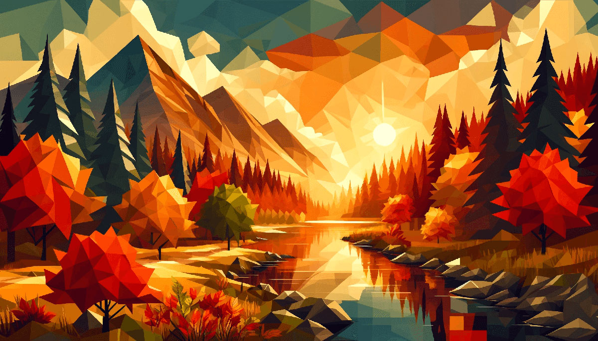
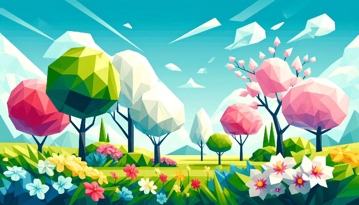
Examples of Fun Color Palettes
| #FEE440 | #4281A4 | #EDE7B1 | #E71D36 | #FFBE0B |
| #F7FFF7 | #FF8A5B | #75E696 | #25CED1 | #F15BB5 |
| #011627 | #3A86FF | #FF9F1C | #01FDF6 | #995FC3 |
| #A9DEF9 | #E6B89C | #D3F8E2 | #4ECDC4 | #FF006E |
| #540D6E | #0EAD69 | #F694C1 | #FFD23F | #160D42 |
| #8338EC | #FB5012 | #E4C1F9 | #00F5D4 | #00BBF9 |
| #FDFFFC | #E9DF00 | #9B5DE5 | #9CAFB7 | #FF6B6B |
| #FB5607 | #FE938C | #EA526F | #2EC4B6 | #1A535C |
| #EAD2AC | #FFFFFF | #03FCBA | #FCEADE | #EE4266 |
| #CBBAED | #FFE66D | #E8D2DE | #FAFD7C | #3BCEAC |
| #2F2F2F | #F8FFE5 | #06D6A0 | #EFA9AE | #E55381 |
| #2274A5 | #F75C03 | #F1C40F | #CEDFD9 | #D90368 |
| #0D1821 | #FFCFD2 | #FFAFC5 | #F4D35E | #E0479E |
| #47D1FF | #DC7F2E | #CC2936 | #F4F73B | #FFB7C3 |
| #D9F4C7 | #E5C1BD | #5A7684 | #395B50 | #00120B |
| #60435F | #BCE7FD | #C492B1 | #D7FFAB | #FCFF6C |
| #AE3E64 | #147F79 | #A5EEE7 | #FBEE7B | #F7D2E3 |
| #EF3D60 | #F4A83E | #2BB673 | #2176AE | #FDFFFC |
| #C9F0FF | #EAFFFD | #0D0630 | #F36A68 | #6B5E62 |
| #E5C2C0 | #197278 | #D1603D | #6CAE75 | #D0E37F |
| #ECCBD9 | #152614 | #DD9296 | #692137 | #6E59D9 |
| #EB5E55 | #452AC9 | #FEC59A | #377771 | #27187E |
| #A5C213 | #781313 | #B72193 | #76818E | #FF8600 |
| #F0E100 | #E1EFF6 | #C6D8D3 | #FECFE1 | #83BCFF |
| #F9A5B7 | #731963 | #F2B7C6 | #338EC5 | #291785 |
| #7C8F1B | #C78283 | #DDD9B4 | #4281A4 | #FFAAAA |
| #4B7113 | #C1ABA6 | #FFBBDD | #48A9A6 | #755BFD |
| #4CE0B3 | #EF6F6C | #55A292 | #35CE8D | #C94088 |
| #027CA6 | #555555 | #B72193 | #FF5567 | #213F63 |
| #342D5F | #853B7A | #BCD8B7 | #173753 | #EFCB68 |
| #764248 | #BBE5ED | #90DDF0 | #006989 | #F7996E |
| #F8829B | #F3BC19 | #599CE5 | #386A83 | #AC7A1C |
| #584450 | #B483A3 | #CB919F | #EABCC5 | #F3C1C6 |
| #6F3E80 | #9C90B8 | #C3DB87 | #A0E1D9 | #43968E |
| #C7AC92 | #06D6A0 | #DE639A | #00A1E4 | #071013 |
| #FFA69E | #8B575C | #0A014F | #E9E3B4 | #61988E |
| #0E0312 | #3F1756 | #553577 | #B90103 | #E4A64D |
| #3FACC1 | #ED7FB4 | #BD8B9C | #FFFBC1 | #639707 |
| #8787BD | #B14D71 | #F96450 | #9FAE4F | #454442 |
| #57485B | #B23A56 | #969971 | #934A63 | #763851 |
FAQ on Fun Color Palettes
How Do I Choose a Fun Color Palette?
Dive into a world where color theory serves as your map. Start with a base hue that reflects the vibe you’re shooting for. Splash in complementary colors for harmony or opt for contrasting shades for a dash of excitement.
Let your thematic intent be the compass. Tools like Adobe Color help visualize and fine-tune your ensemble.
What Makes a Color Palette ‘Fun’?
Fun palettes tap into the playful side of visual map data representation. They feature unexpected combinations, vibrant contrasts, and a certain boldness that captures attention.
Integrating whimsicality and a daring spirit, these colors invite viewers into a realm of joyful visual experiences.
Can Fun Color Palettes Be Professional?
Absolutely. Effective map color choices matter here—think “vibrant” over “vivid.” A dash of color livens up even the most staid graphic visualizations.
It’s about balance; integrating brighter shades with neutral backgrounds or accents can convey a professional yet lively aesthetic.
Are There Trends in Fun Color Palettes?
Of course! Just like in fashion, colors ebb and flow on the wave of popularity. Right now, retro hues and pastels are having a moment, bringing a cozy nostalgia to the forefront.
Yet, futuristic neons hint at a bold leap into what’s next. Staying attuned to such shifts keeps your designs user-friendly and current.
How Many Colors Should Be in a Fun Palette?
Less is often more. Three to five colors should suffice—think of it as a choropleth map’s legend: concise but informative. A core color paints the mood, while one or two complementary or contrasting hues and perhaps a neutral shade round out the palette elegantly.
What Are Some Fun Color Palette Combinations?
Electric blue with sunny yellow for a striking zest, or pastel pink with mint green for a soft, sweet playfulness. For a touch of warmth, burnt orange pairs nicely with a subtle teal. The possibilities stretch as far as the imagination wanders.
How Do I Test My Fun Color Palette?
Mock it up! Apply your palette to various geographic data presentations or sample designs. Seek feedback—fresh eyes catch nuances you might miss.
Tools exist that simulate color blindness, a vital check for inclusivity. Observe how your colors perform in different lights and on various devices.
How Important are Color Trends?
They’re the whispers of the collective mood. Pay attention, but don’t be shackled by them. Trends are a starting point, a source of inspiration. Your creative voice and the message intended to be conveyed hold sway.
Digital cartography thrives on innovation, as should your palette selections.
What Should Be Avoided in Selecting a Fun Color Palette?
Sidestep clashes that could cause visual discomfort or diminish legibility. Avoid overcomplicating—too many hues might lead to a cacophony rather than cohesion.
Pass on colors that are overused unless they’re perfect for your narrative—rely instead on visual map data representation to breathe uniqueness into your work.
How Can a Fun Color Palette Influence Mood?
Like a chef’s precise flavoring, colors set the emotional tone. Vibrant hues bring an energy boost, pastels soothe and calm. Colors whisper subtle psychological cues, and the palette converses with the viewer’s subconscious.
Use your color choices to sculpt the atmosphere within your designs.
Conclusion
Stepping back, it becomes clear that fun color palettes are more than mere ornamentation. They are the silent narrators of stories untold, emotional bridges connecting the visual with the visceral.
- Within each hue dawns the possibility of a fresh perspective.
- Each blend proffered here promises not just to brighten spaces, but to illuminate ideas.
- The playful interaction of tones can transform the bland into a visual symphony.
This exploration of vibrant color combinations and dynamic color contrasts has not only aimed to serve as inspiration but as a gateway to a more profound understanding of color’s impact. Harnessing creative color ideas elevates experiences, shapes perceptions, and, true to its intent, infuses a touch of whimsy into the fabric of the everyday.
The journey through aesthetic color designs subsides here, leaving behind the invitation to explore, experiment, and express. After all, the palette of the world is open, ready for each to leave their mark with strokes of vibrance and creativity. And so, armed with insight and inspiration, the canvas awaits.
If you liked this article about fun color palettes, you should check out this article about map color palettes.
There are also similar articles discussing portfolio color palettes, modern color palettes, gaming color palettes, and vivid color palettes.
And let’s not forget about articles on forest color palettes, magenta color palettes, saturated color palettes, and cyan color palettes.
Bogdan Sandu, a seasoned designer with 15 years of diverse experience, has been designing websites since 2008.
Renowned for his expertise in logo design and visual branding, Bogdan has developed a multitude of logos for various clients.
His skills extend to creating posters, vector illustrations, business cards, and brochures. Additionally, Bogdan's UI kits were featured on marketplaces like Visual Hierarchy and UI8.
Latest posts by Bogdan Sandu (see all)
- Inch to PX Converter - 29 June 2024
- The Boehringer Ingelheim Logo History, Colors, Font, And Meaning - 28 June 2024
- EM to REM Converter - 28 June 2024