The Duolingo font: What font does Duolingo use?

Picture this: the shapes and curves dancing across your screen aren’t just characters; they’re the unsung heroes behind the curtain of communication, especially when they come as distinctive as the Duolingo font.
We’re not merely talking about aesthetics—this fusion of design meets user experience propels language learning into a realm of clarity and identity.
Here’s the scoop. Typography shapes perception. It’s the unsung backbone of visual communication, but when you’re navigating the universe of an app as vibrant as Duolingo, the typeface isn’t just wearing a practical hat—it’s also donning a grand cape of brand identity and cultural dialogue.
By the end of our deep-dive, you’ll be versed in the nuances that set the Duolingo typeface apart.
From font psychology to multilingual support, we’ll decode the intricacies that make a typeface not just readable but relatable.
Lock in—by article’s end, you’ll discover the secret sauce of typographic decision-making that both enlightens and engages across alphabets and ligatures alike.
What Font Does Duolingo Use

Feather: The Duolingo Signature
Feather. Simple, neat, and resonant with charisma. Yes, we are talking about the custom typeface of the language-learning app that has won millions of hearts worldwide – Duolingo.
This font, named after the softest touch of the brand’s mascot, Duo the Owl, emulates the playful and lively character that Duolingo injects into language learning.
Feather is Duolingo’s headline choice. You’ll see it grace your screen every time you open the app, setting the stage for your language-learning journey. It feels light and whimsical, mirroring the app’s goal of making learning fun and accessible.
Open Sans: The Unsung Hero
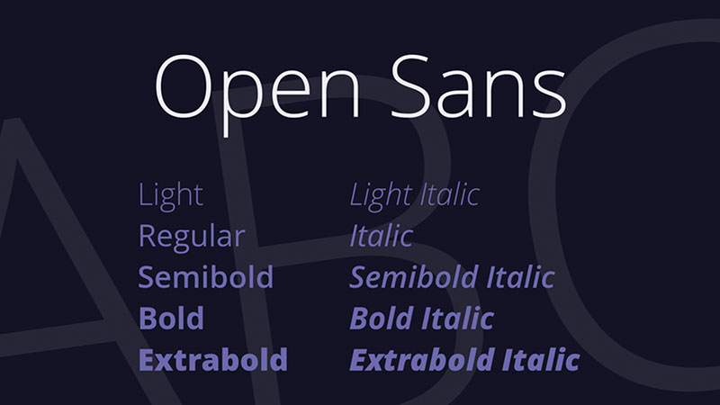
While Feather might be the showstopper, the real workhorse in the Duolingo family of fonts is Open Sans. It’s the font you encounter in the body of text, the little snippets and explanations that come along the way in your learning process.
Created by the talented Steve Matteson, Open Sans is a humanist sans-serif typeface. It’s friendly, open, and exceptionally easy to read. The simplicity of this typeface makes it a perfect companion to Feather, playing the essential role of providing information clearly and efficiently.
Alternatives to the Duolingo Font
Roboto: Versatility in Simplicity
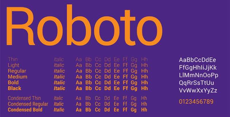
When it comes to alternatives to Feather and Open Sans, Roboto stands out. Google’s brainchild, Roboto, has a mechanical backbone with a friendly exterior.
It carries the simplicity of Open Sans but adds a little more character, making it a perfect alternative to both Feather and Open Sans.
Lato: Elegance and Warmth
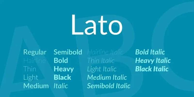
Lato is another fantastic alternative, merging the elegance of Feather and the warmth of Open Sans. It’s a sans-serif typeface, like Open Sans, but carries a certain elegance that’s closer to Feather.
The Inspiration: Duo the Owl

Duo: The Guiding Spirit
The playful character of Feather, Duolingo’s custom font, draws its inspiration from Duo, Duolingo’s green owl mascot. The owl’s light-hearted and friendly demeanor has made language learning a fun journey for millions, and its essence is rightly captured in Feather.
Feather: A Reflection of Duo’s Spirit
Just like Duo, Feather is friendly, engaging, and soft. It invites you into the world of languages with open wings, encouraging you to step out of your comfort zone and embrace the learning process.
The Perception of Fonts
Fonts: Beyond the Aesthetics
The fonts a brand uses do more than just make the text readable. They set the tone, convey emotions, and contribute significantly to how users perceive the brand.
Duolingo, with its custom font Feather and its dependable companion Open Sans, creates an environment that’s both playful and educational.
The Duolingo Font Experience

In this sense, the Duolingo font experience perfectly aligns with its mission of making language learning accessible and enjoyable. Feather and Open Sans pair to create a friendly, engaging, and informative interface that millions across the globe appreciate.
So, the next time you’re on Duolingo, pay a little attention to the fonts. You might just feel that subtle charm they add to your learning journey.
FAQ On The Duolingo Font
What font does Duolingo use?
They’ve crafted their own, a one-of-a-kind typeface. Custom, made from scratch. This isn’t a font you can just pluck from the web.
It’s built to simplify and beautify, all while keeping those language neurons firing without friction. It’s the visual voice of their brand identity, speaking volumes without uttering a sound.
Is the Duolingo font available for public use?
No dice. This typography is proprietary, part of their visual communication toolkit. Think of it like a secret ingredient; they don’t share it. If you need something similar, you’re veering into look-alike territory, but remember: the real deal is off-limits.
How is the Duolingo font designed for readability?
Ah, readability, that golden ticket. Each character is meticulously crafted with legibility in mind. Generous spacing, clear-cut edges—every letter stands out.
It’s all about ensuring learners don’t stumble, maintaining a fluid experience whether you’re deciphering French or fumbling through Japanese.
What impact does the typeface have on Duolingo’s brand?
Huge. It’s like their outfit, picked out to impress at every encounter. Gives off a vibe of fun, yet it’s dead serious about learning. It’s this blend of curves and lines that embrace you, a visual hug saying, “Hey, learning’s a joyride, hop in!”
Can the Duolingo font support multiple languages?
Bingo. It’s a globetrotter—multilingual support is baked right in. Duolingo chats in a babel of tongues, and its typeface keeps pace. Accents, umlauts, tildes; it’s got them in the bag. Essential when your users span the globe.
How does typography contribute to Duolingo’s user experience?
Flashy features aside, the font’s the silent worker bees of UI. Good typography’s invisible, they say, but poor type screams. Duolingo’s font smooths the path, like a friendly guide holding your hand as you meander through the language maze.
What are the challenges in creating a font for a language app?
Oh boy, where do I start? It’s a tightrope walk. Font creation here isn’t just art—it’s a psychological tango. Each stroke, a stroke of genius. Then there’s consistency, adaptability, appeal across cultures. Plus, it’s gotta play nice with web fonts stuff too. Tricky business.
How does the Duolingo font aid in the learning process?
By being predictably unpredictable. It’s familiar enough to feel like home yet distinctive enough to etch those vocab gems in your memory. It turns the routine of drilling words and phrases into a visual treat, easing the path to fluency.
Does the choice of font affect the speed of language learning on Duolingo?
Indirectly, sure. If your eyes are happy, your brain’s happy. Less squinting, less strain equals more brainpower for the nitty-gritty of verb conjugations and syntax. Plus, a happy, unstressed brain’s a sponge for new words. Speed? Maybe. Efficiency? Absolutely.
How does Duolingo’s typography differ from other educational apps?
It dances to its own tune. While others might pull from standard font libraries, Duolingo goes bespoke. It’s a visual storyteller, setting the scene for each new language adventure.
From font psychology to user interface typography, it’s cut from a different cloth, telling you learning’s not only necessary—it’s fun!
Conclusion
So, we’ve journeyed through the ins and outs of the Duolingo font, unearthing its role as the linchpin of user engagement and as a trusty sidekick to language learners.
In closing, we grasp how this bespoke typeface isn’t mere ink splashed on a virtual page—it’s a pivotal touchpoint in the user interface typography, a silent partner in the language-learning fiesta that Duolingo throws. It’s that unseen hand guiding users along their path to fluency, with strokes and curves tailored to soothe the eye and, ever so subtly, speed the mind.
As the spotlight dims on our exploration, let’s tip our hats to those unspoken heroes—the typeface designers—for weaving such visual poetry. Duolingo’s typeface stands as a testament to the power of typography in branding, learning, and connecting. As the curves and lines fade into the backdrop of subconscious recognition, remember—sometimes the smallest characters play the grandest roles.
If you liked this article about the Duolingo font, you should check out this article about the WordPress font.
There are also similar articles discussing the Notion font, the WhatsApp font, the Zoom font, and the DoorDash font.
And let’s not forget about articles on the Salesforce font, the eBay font, the Google Maps font, and the Microsoft Teams font.
Bogdan Sandu, a seasoned designer with 15 years of diverse experience, has been designing websites since 2008.
Renowned for his expertise in logo design and visual branding, Bogdan has developed a multitude of logos for various clients.
His skills extend to creating posters, vector illustrations, business cards, and brochures. Additionally, Bogdan's UI kits were featured on marketplaces like Visual Hierarchy and UI8.
Latest posts by Bogdan Sandu (see all)
- The Johnson & Johnson Logo History, Colors, Font, And Meaning - 30 June 2024
- PT to CM Converter - 30 June 2024
- The Takeda Logo History, Colors, Font, And Meaning - 29 June 2024