


Imagine this: You’ve nailed every word on your Google Slides presentation, but somehow, it still feels like it’s missing pizzazz. That’s where the alchemy of typography waltzes in, turning standard slides into stunning visual narratives.
No magic wand needed here — just the right selection of fonts that command attention and bolster your message.
Here’s the deal: Whether it’s the understated elegance of sans-serif or the formal flair of serif, the typography you choose can make or break the viewer’s experience.
It’s not just about pretty letters; it’s about enhancing readability, ensuring accessibility, and encapsulating your brand’s persona, all while painting your ideas in the best light.
By the final punctuation mark of this article, you’ll be equipped with the best fonts for Google Slides that guarantee your presentations pack a punch.
Dive deep into the realm of Google Slides design tips, with insights into pairing, sizes, and legibility that will elevate your content from good to extraordinary.
Ready to transform your slides from bland to brilliant?
Let’s talk type.
The Best Fonts for Google Slides
| Font | Readability | Style | Versatility |
|---|---|---|---|
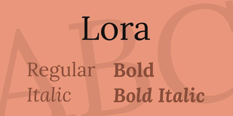
| Lora | High | Serif | High |
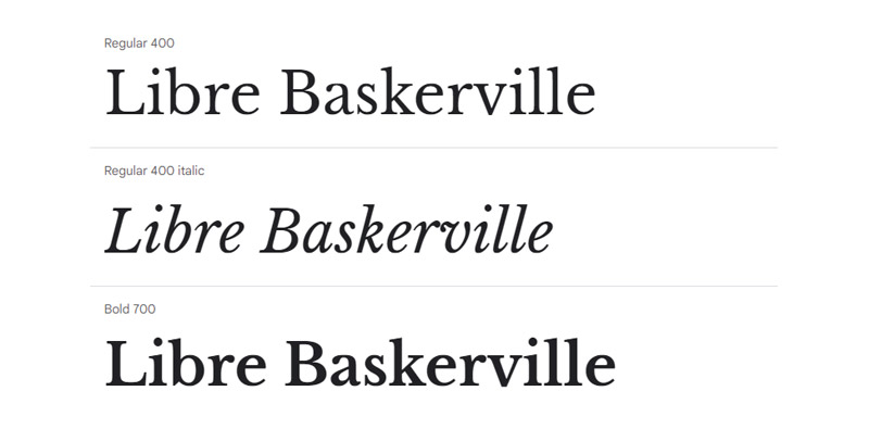
| Libre Baskerville | High | Classic Serif | Medium |
| Cormorant | Medium | Elegant Serif | Medium |
| Playfair Display | Medium | Display Serif | Medium |
| Spectral | High | Serif | High |
| Merriweather | High | Serif | High |
| Alegreya | High | Serif | High |
| PT Serif | High | Serif | High |
| Inknut Antiqua | Medium | Serif | Low |
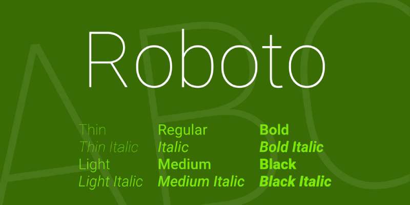
| Roboto | High | Sans-serif | Very High |
| Open Sans | Very High | Sans-serif | Very High |
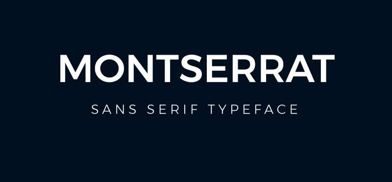
| Montserrat | High | Sans-serif | High |
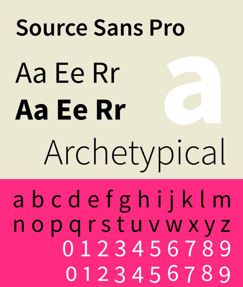
| Source Sans Pro | Very High | Sans-serif | Very High |
| DM Sans | High | Sans-serif | High |
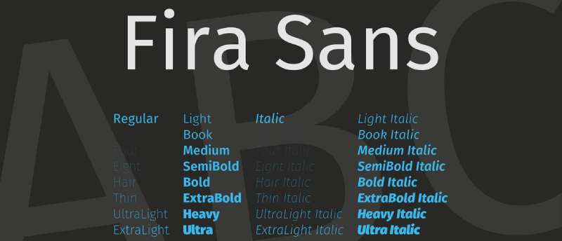
| Fira Sans | High | Sans-serif | High |
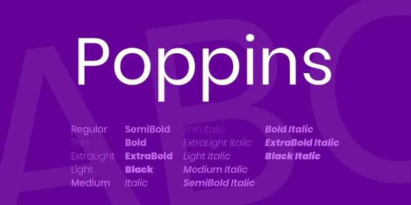
| Poppins | High | Sans-serif | High |
| Work Sans | High | Sans-serif | High |
| Noto Sans | Very High | Sans-serif | Very High |
| Inter | High | Sans-serif | High |
| Dosis | Medium | Sans-serif | Medium |
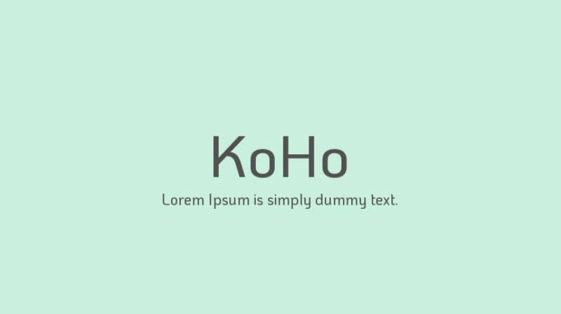
| KoHo | Medium | Sans-serif | Medium |
| Abril Fatface | Medium | Display Serif | Low |
| BioRhyme | Medium | Serif | Low |
| Syne | Medium | Mixed Styles | Medium |
| Chivo | High | Sans-serif | High |
Best Serif Fonts
Let’s talk about the best fonts for Google Slides, especially if you’re into that classic, elegant vibe. Serif fonts, with their little feet, make your slides look like they just walked out of a fashion magazine. They’re not just fonts; they’re a statement.

It’s like that little black dress – timeless, versatile, and oh-so-elegant. It’s perfect for those moments when you need your slides to speak sophistication.

It’s like the old soul in the world of fonts. Ideal for those history-themed presentations or when you want to add a touch of the classic without going full-on vintage.

Oh, that’s the showstopper. It’s the font that turns heads. Use it when you want your slides to scream “luxury” without saying a word.

This one’s like a fine wine. It gets better every time you use it. It’s perfect for artistic or cultural topics, adding a refined touch to your slides.


It takes a different route. It’s like that smart, sleek look you go for in a business meeting. Professional yet not too stiff.

Merriweather with its slightly condensed letters, is like that friend who’s always there to make your slides look good, no matter the topic. It’s reliable and looks great on screens.


It adds a twist of quirkiness to the serif world. It’s like wearing funky socks with a suit – professional but with a hint of fun.

Think of it as the all-rounder. It works with just about anything, making it a safe yet stylish choice for your slides.

This one’s for when you want to make a bold statement. It’s like the bold, confident stroke of a pen, perfect for titles and headers.
Best Sans Serif Fonts
Alright, let’s switch gears to the sleek, modern world of sans serif fonts. These are the go-to when you’re aiming for that clean, contemporary look in your Google Slides. No fuss, just straight-up style.
It’s like that smart-casual outfit that never fails. Perfect for almost any presentation, it’s modern yet approachable. Great for when you want your slides to be easily digestible.
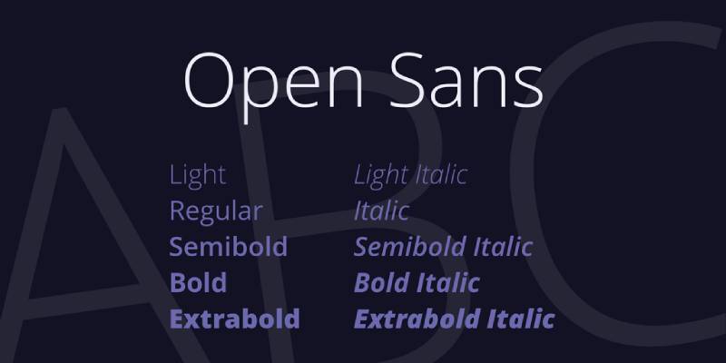
Imagine a friendly handshake – that’s Open Sans for you. It’s friendly, legible, and just plain nice to look at, making your content feel more inviting.

It brings a bit more character. It’s like that bold accessory that adds a pop to your outfit. It’s great for making statements, especially in headings and titles.

This one’s like your dependable work attire – professional but not stiff. Ideal for business or academic presentations where clarity is key.
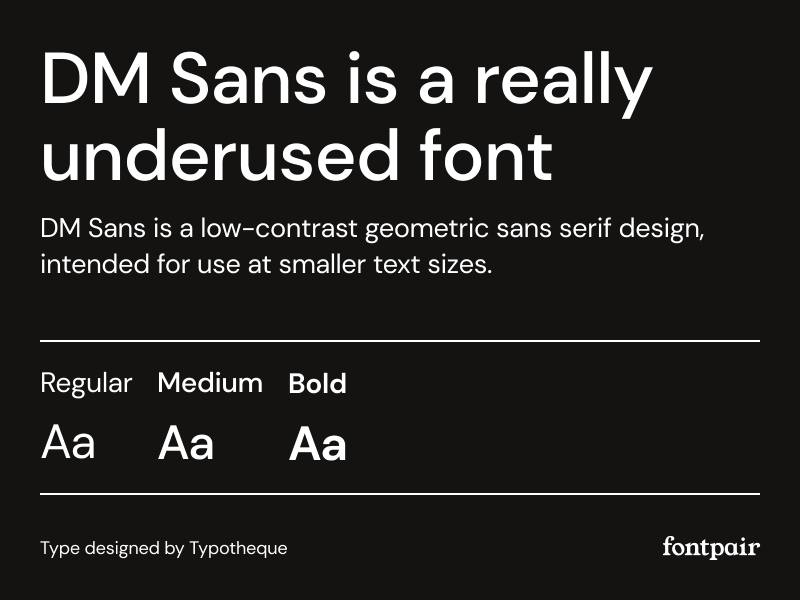

DM Sans with its clean lines, is like that minimalist watch – sleek, simple, yet impressive. It’s perfect for contemporary themes, giving your slides a fresh, modern vibe.

This is for those moments when you want a bit of techy sleekness. It’s like wearing smart glasses – adds a bit of an edge to your overall look.
It is a bit more on the playful side. Think of it as a casual Friday – relaxed but still on point. Great for less formal or more creative presentations.
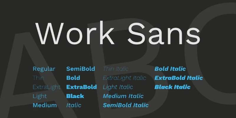
Work sans think of it as your go-to jeans – reliable, comfortable, and fits just right. It’s versatile and works well in almost any type of slide.
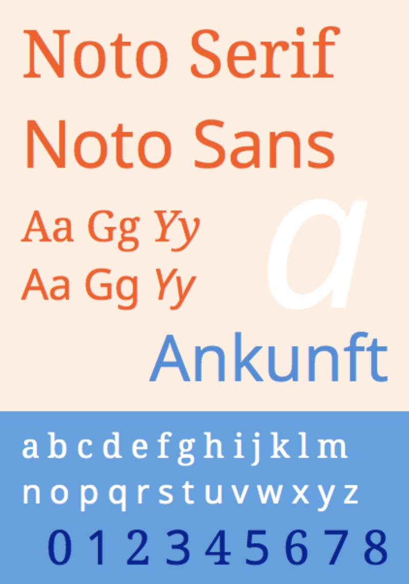

Noto is all about universal appeal. It’s like that one outfit everyone loves. It’s designed to look great in any language, making it perfect for diverse audiences.

It’s like that smart gadget you can’t live without. Designed for computer screens, it ensures your text looks crisp and clear on any device.
Unique and Stylish Fonts
Now, let’s talk about adding some flair. When you want your slides to stand out, these fonts add that extra oomph.

It’s like that quirky art piece in your living room. It’s fun, it’s unique, and it definitely makes a statement. Perfect for when you want to break the monotony.

It offers a subtle uniqueness. It’s like opting for an offbeat color instead of the usual black and white. Great for when you want to add personality without going overboard.

This font is all about the drama. Think bold, think big. It’s like wearing a statement piece that turns heads. Use it for impact and to grab attention.

It expands your stylistic range. It’s like having a versatile accessory that complements any look. It’s varied, adaptable, and adds a touch of class.

This font is for those who dare to be different. It’s like that avant-garde fashion choice – not for every occasion, but perfect when you want to push boundaries.

It’s like that edgy graphic tee – casual yet packs a punch. It’s fun, it’s fresh, and it brings an energetic vibe to your slides.
Specialized Fonts for Specific Purposes
When it comes to best fonts for Google Slides, one size definitely does not fit all. Just like you wouldn’t wear flip-flops to a formal dinner, you wouldn’t use playful fonts in a serious business presentation. Context is king.
Fonts for Professional and Business Presentations
Picture this: You’re in a sleek, modern office, about to deliver a key business presentation. You need fonts that mean business – clean, sharp, and professional. Source Sans Pro and DM Sans are like your tailored suits – they show you mean business. Then there’s Noto Sans, the equivalent of a firm handshake – it’s reliable and universally understandable. They’re perfect for getting your point across with clarity and authority.
Fonts for Creative and Informal Presentations
Now, let’s flip the script. You’re doing a creative pitch or a casual talk. You want fonts that are the sneakers and graphic tees of the typography world – relaxed, creative, and fun. KoHo is like that splash of color in a sea of grey – it’s fun and stands out. Abril Fatface makes your slides pop like a bold piece of art. And don’t forget Playfair Display – it’s like that vintage tee that’s always cool. These fonts make your presentation not just seen, but felt.
Font Pairing and Combination Strategies
Pairing Serif and Sans Serif Fonts
It’s like mixing and matching outfits. Pair a serif font with a sans serif and watch the magic happen. Think of Lora with Roboto – the classic with the modern. It’s like pairing a vintage jacket with sleek sneakers. This combo balances formality with approachability, making your slides both engaging and easy on the eyes.
Balancing Font Weights and Styles
It’s all about harmony. Mix a bold header font like Abril Fatface with a lighter body font like Open Sans. It’s like having a bold accessory with a simple dress. The key? Don’t let one overpower the other. Keep it balanced, keep it chic.
Examples of Effective Font Pairings
Imagine Merriweather and Fira Sans together. It’s like a coffee table book – visually interesting yet easy to dive into. Or pair Playfair Display with Source Sans Pro. It’s like that perfect coffee blend – rich yet smooth. These pairings ensure your slides are not just read, but remembered.
Criteria for Selecting Fonts
Readability and Legibility
First things first. Can your audience read what’s on the screen without squinting? That’s where readability and legibility come in. You want your words to flow like a smooth conversation. No hiccups. No “wait, what does that say?” moments.
Compatibility with Presentation Tone and Brand Identity
Your font should match your voice. Is your presentation bold and edgy or subtle and professional? The best fonts for Google Slides aren’t just about looking good. They’re about feeling right. A font like Poppins might scream creativity, while something like Roboto whispers professionalism.
Font Classification and Suitability
Here’s where the real game begins. Serif or sans serif? Each has its own vibe. Serif fonts like Playfair Display add a touch of sophistication. Sans serif fonts, think Noto Sans, bring a clean, modern feel. It’s like dressing your words for the occasion.
Best Practices for Using Fonts in Google Slides
Ever felt overwhelmed by all the font choices out there? Don’t sweat it. Here’s the lowdown on how to nail the font game in your Google Slides. It’s like finding the perfect rhythm in a song – when it’s right, you just know.
Limiting the Number of Fonts per Presentation
Imagine a pizza with every topping on it. Overwhelming, right? Same goes for using too many fonts. Stick to two or three fonts max. It’s like a well-curated playlist – each song complements the other, no jarring transitions. This keeps your slides clean, cohesive, and easy on the eyes.
Considering Font Size and Color for Readability
Size and color matter. Like, a lot. You wouldn’t wear neon green to a job interview, right? Same principle. Choose font sizes and colors that are easy to read and suit the mood of your presentation. Bigger fonts for headlines, smaller for details. And colors? Keep them legible and harmonious.
Adhering to Accessibility Standards
Think of your audience – all of them. Make your slides accessible. Use high-contrast colors and legible fonts like Noto Sans or Roboto. It’s like making sure everyone at the party gets a slice of cake. Everyone should be able to enjoy your awesome presentation, right?
Additional Resources and Tools
Websites and Tools for Font Selection
Now, where to find these stylish fonts? There are cool online tools and websites where you can play around with different fonts. Think of them as your virtual font fitting room. Experiment, compare, see what works.
Guides for Font Pairing and Typography Trends
And to keep your font game strong, check out guides and articles on the latest typography trends. They’re like those trendy magazines you flip through for style inspiration. Stay updated, stay stylish.
FAQ On The Best Fonts For Google Slides
What Makes a Font “Good” for Google Slides?
Good fonts for Google Slides marry both aesthetics and functionality. They need to be clear, readable, maintain visual impact, and ensure that your audience stays hooked without squinting. It’s about making sure that each slide delivers your story effortlessly, without design elements stealing the show.
How Can I Access More Fonts in Google Slides?
Access a wider font selection by clicking on the font dropdown. Hit ‘More fonts’ at the top to unearth a treasure trove from Google Fonts. Be ready to transform those Slides with fresh options that reflect your presentation’s tone, whether it’s professional or playful.
Are Custom Fonts Supported in Google Slides?
Absolutely. By installing fonts to your computer and using the Extensis Fonts add-on, you can introduce custom fonts into your Slides. Remember though, if you’re presenting on a different machine, those custom typefaces need to come along for the ride.
Does Font Choice Really Impact Presentation Engagement?
Like the right soundtrack for a movie, fonts set the emotional tone. They either draw your audience in or push them away. The key? Strike a balance between personality and clarity. A well-chosen typeface will support your message, making engagement a seamless affair.
What Are Some of The Best Sans-serif Fonts for Readability in Google Slides?
Sans-serif fonts are a hit for on-screen readability. Think Arial for its classic appeal, Lato for a modern twist, or Roboto for that Google-native look. These heroes stand out for their clean, crisp lines, making your text easy on the eye, screen after screen.
Can Font Choice in Google Slides Reflect My Brand?
Count on it. Your font choice is a megaphone for your brand’s identity. Using consistent branding with your typeface choices across all Slides asserts a cohesive narrative. It’s like your brand’s signature; make it memorable, but also legible.
What Are the Top Serif Fonts for Google Slides Presentations?
When elegance speaks, serif fonts reply. Times New Roman reigns with classic poise, while Georgia presents a softer touch. For a dash of sophistication, Garamond doesn’t just show up, it shows off – a serif that sings tradition with every keystroke.
How Do I Ensure My Font Is Accessible to All Audiences on Google Slides?
Prioritize font accessibility. Stick to a size that’s visible from the back of the room, consider color contrast for those with visual impairments, and choose fonts that are distinguishable for dyslexic viewers. In a nutshell, make sure everyone can come to the party.
Is It Important to Use Different Fonts for Headings and Body in Google Slides?
Variety spices up life, and Slides too. Mix it up with a font pairing that differentiates yet harmonizes. Your headings could don a bold sans-serif, while the body text settles in something lighter. It’s a visual hierarchy thing – helps guide the audience right where you want them.
Does the Number of Different Fonts Used in My Presentation Matter?
Less is more, rule applies here as well. Two, maybe three fonts max should do the trick. Cohesion and consistency trump variety. Otherwise, you risk turning your presentation into a typographic salad, and trust me, that’s one salad nobody wants a bite of.
Conclusion
Wrapping this up, pinpointing the best fonts for Google Slides doesn’t just boil down to personal style. It’s about striking a chord, visually communicating your narrative, and crafting slides that aren’t just seen but felt.
- Legibility? Check.
- Fonts that dance well with your brand persona? Check.
- A dash of flair to keep eyes glued? Double-check.
Consider this a typographic toolkit; packed with sans-serifs that don’t just whisper, but roar, serifs that elevate the discourse, and custom picks that make your slides undeniably yours.
Moving forward, launch into your next Google Slides quest armed with these insights. The mastery of presentation design and readable typefaces now in your realm, the stage is set. Let those slide decks sing with a voice that’s authentically, unforgettably, unmistakably yours. With every click, may your words—and fonts—echo with clarity and style.
If you liked this article about the best fonts for Google Slides, you should check out this article about the best fonts for accessibility.
There are also similar articles discussing the best fonts for children’s books, the best fonts for neon signs, the best fonts for academic papers, and the best fonts for vinyl lettering.
And let’s not forget about articles on the best fonts for invitations, the best fonts for mobile apps, the best fonts for blogs, and the best fonts for magazines.
Also, you can check here the version of this article about fonts for Google Slides in German.


Renowned for his expertise in logo design and visual branding, Bogdan has developed a multitude of logos for various clients.
His skills extend to creating posters, vector illustrations, business cards, and brochures. Additionally, Bogdan's UI kits were featured on marketplaces like Visual Hierarchy and UI8.
- What are Analogous Colors? A Color Theory Guide - 6 July 2024
- The Arsenal Logo History, Colors, Font, And Meaning - 5 July 2024
- How Do I Put My Logo on Clothes? 7 Techniques to Try - 5 July 2024