


Imagine this: you’ve crafted the most compelling brand story, but it falls flat. Why? Often, it’s the unsung hero of branding – the font.
Step into the world of strategic branding and you’ll find that font choice is no accident. It’s the cloak that drapes your brand, whispering character and intent without a sound.
With every curve, line, and weight, fonts possess the subtle power to evoke emotion and convey your brand’s personality.
In this deep dive, we’ll unveil the best fonts for branding.
From the timeless elegance of a serif to the clean simplicity of a sans-serif, each typeface tells a story. Sharpen your brand’s edge with typography that stands the test of time and trends.
You’re set to journey through a curated collection of font pairings, explore typeface psychology, and unlock the secrets of visual identity.
Make no mistake; these are not just fonts – they are the embodiment of your brand’s voice, resounding in the minds of your audience.
The Best Fonts for Branding
| Font Name | Type Style | Characteristics |
|---|---|---|
| Helvetica | Sans-serif | Classic, neutral, widely used |
| Proxima Nova | Sans-serif | Modern, geometric, web-friendly |
| Avenir | Sans-serif | Elegant, humanist, good for text and display |
| Mont | Sans-serif | Contemporary, geometric, versatile |
| Kiona | Sans-serif | Minimalist, modern, versatile |
| Bebas Neue | Sans-serif | Display, all caps, clean |
| Garamond | Serif | Classic, elegant, excellent readability |
| Lucy Rose | Sans-serif | Unique, feminine, soft curves |
| Recoleta | Serif | Retro, soft, contemporary |
| Walk On | Sans-serif | Modern, geometric, wide-ranging weights |
| Playfair Display | Serif | High contrast, stylish, good for headings |
| Victoria | Script | Elegant, cursive, decorative |
| Paperchaser Calligraphy | Script | Handwritten, decorative, artistic |
| Opulent | Script | Luxurious, elegant, cursive |
| Honest Designers | Unknown | Unknown |
| Rochester | Script | Elegant, cursive, good for invitations |
| Futura | Sans-serif | Geometric, modernist, highly legible |
| Gotham | Sans-serif | Modern, geometric, popular in branding |
| Bauhaus | Sans-serif | Geometric, artistic, Bauhaus-inspired |
| Franklin Gothic | Sans-serif | Sturdy, traditional, good legibility |
| Univers | Sans-serif | Wide typeface family, clear and functional |
| Rockwell | Slab serif | Strong, geometric, good for headlines |
| Courier | Monospaced | Typewriter style, uniform spacing |
| Roboto Slab | Serif | Functional, friendly, good for web and mobile |
| Lobster | Script | Quirky, dynamic, good for display |
| Pacifico | Script | 1950s American surf culture, casual |
| Abril Fatface | Serif | High contrast, stylish, for headlines |
| Times New Roman | Serif | Classic, formal, ubiquitous in word processing |
| Baskerville | Serif | Sophisticated, high contrast, good for books |
| Didot | Serif | Elegant, high contrast, fashion industry staple |
| Gill Sans | Sans-serif | Humanist, clean, British public signs |
| Verdana | Sans-serif | Legible at small sizes, wide and tall |
| Frutiger | Sans-serif | Readable, clear, for signage and text |
| Brush Script | Script | Informal, calligraphic, for advertising |
| Lucida Handwriting | Script | Informal, recognizable, good for digital |
| Papyrus | Handwritten | Distinctive, antiqued, thematic uses |
| Agentur | Unknown | Unknown |
| GT America | Sans-serif | Versatile, American and European influences |
| Separat | Sans-serif | Unknown |
| Whyte Inktrap | Serif | Contemporary, features ink traps |
| Noe Display | Serif | High contrast, refined, for editorial uses |
| Raleway | Sans-serif | Elegant, lightweight, good for headings |
| Cormorant | Serif | Very high contrast, refined, display-focused |
| Lato | Sans-serif | Humanist, clear, corporate-friendly |
Types of Fonts for Branding
Modern Sans Serif Fonts

Hey there! Let’s chat about Modern Sans Serif Fonts. These guys are like the cool, minimalist decor in a trendy cafe. Clean lines, no serifs (those little feet on letters, you know?), giving off a super contemporary vibe. They’re like the jeans and white tee of the font world – simple but oh-so-chic. Brands love them for their crisp, clean look that screams modernity.
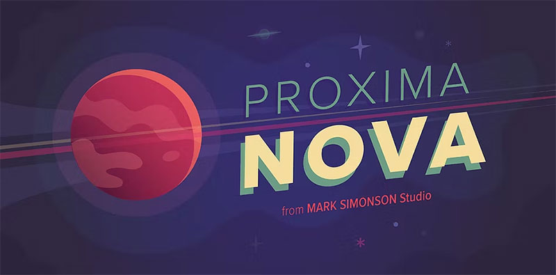
Think Helvetica now, a classic, right? It’s like the little black dress of fonts. And Proxima Nova, oh boy, that one’s a hit with its sleek appearance. Avenir and Mont? They’re the fonts you’d take home to meet your parents – reliable and smart. And don’t get me started on Kiona and Bebas Neue – they’re the bold ones in the family, making sure your message stands out.
Elegant Serif Fonts

Moving on to Elegant Serif Fonts. These are your grand, historical novels; full of traditional elegance and decorative details. They’re like that vintage wine – gets better with time. Serif fonts are old souls that bring a touch of class and sophistication to your brand.
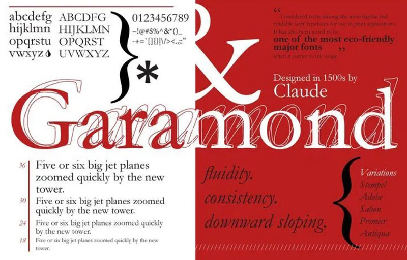
Cue Garamond, the Shakespeare of fonts, steeped in history and full of character. Then there’s Lucy Rose, adding a modern twist to the classic feel. Recoleta? Think of it as a bridge between the old and the new. Walk On and Playfair Display are like the aristocrats of the font world, making everything look refined and graceful.
Romantic Script Fonts


And now, let’s swoon over Romantic Script Fonts. These are the handwritten love letters of the font universe. They’re all about fluid strokes and calligraphic styles, perfect for when you want to add a personal, artistic touch.
Victoria – it’s like that elegant, handwritten invitation to a posh event. Paperchaser Calligraphy takes it up a notch with its bespoke feel. Opulent? Just as its name suggests, it’s luxurious and full of flair. Honest Designers offer a more down-to-earth, heartfelt script, while Rochester is the epitome of old-world charm.
Geometric Fonts


Alright, let’s talk Geometric Fonts. Imagine fonts as shapes – circles, squares, triangles, you name it. That’s what geometric fonts are all about. They’re like the modern art in the font world, where symmetry and simplicity reign supreme. These fonts are super cool for brands that want to look sleek, techy, and ultra-modern.
Take Futura, for instance. It’s like the Elon Musk of fonts – futuristic and ahead of its time. Gotham, now that’s a font that stands tall, confident like a skyscraper. And Bauhaus? It’s the quirky one, playing with shapes like a kid with Legos.
Grotesque and Neo-Grotesque Fonts
Next up, Grotesque and Neo-Grotesque Fonts. Don’t let the name fool you; there’s nothing grotesque about these. They’re the OGs of the sans serif family. Picture the bold headlines of a newspaper or the classic street signs in a bustling city. They’re straightforward, no-nonsense kind of fonts.
Franklin Gothic? It’s the sturdy, reliable one. Helvetica is like the bread and butter of this group – so popular, it’s everywhere! And Univers – think of it as Helvetica’s cousin, just a bit more refined and laid-back.
Slab Serif Fonts
And then, we have Slab Serif Fonts. Imagine a weightlifter in the font gym. These fonts are robust, sturdy, with thick, block-like serifs. They scream strength and are perfect for making a bold statement. If your brand wants to come across as strong and assertive, these are your go-to fonts.
Rockwell – it’s like the rock star of fonts, bold and unapologetic. Courier has that typewriter vibe, a bit nostalgic but with a ton of character. And Roboto Slab? It’s the modern twist on the classic, blending old-school charm with a contemporary feel.
Display and Decorative Fonts
Let’s dive into the world of Display and Decorative Fonts. Picture the loud, extroverted friend at a party. That’s these fonts. They are all about being unique and grabbing attention. Perfect for logos, headlines, or anywhere you want your words to pop and make people go, “Wow!”
Now, Lobster? It’s like that one font that knows how to make an entrance. Swirly, fun, and just can’t be ignored. Pacifico brings those chill, beachy vibes, making everything feel like a sunny day. And Abril Fatface, it’s like the bold fashion statement of fonts – unmissable and stylish.
Transitional and Modern Serifs

Moving on to Transitional and Modern Serifs. These are like the fonts that have evolved, growing up from their serif roots but still holding onto that classic charm. They’re the bridge between old and new, mixing tradition with a dash of modern flair.
Times New Roman – everyone knows it, right? It’s like the reliable, smart one in the group. Baskerville is more of the refined, sophisticated type. And Didot? It’s the high-fashion model of fonts, elegant and high-end.
Humanist Fonts


Finally, let’s chat about Humanist Fonts. Imagine a font that’s like your best friend – easy to read, friendly, and approachable. That’s them. They’re all about readability, with a touch of warmth and familiarity, making them perfect for long reads or user-friendly websites.
Gill Sans is your go-to pal, clear and versatile. Verdana? It’s like the font next door, super readable even at small sizes. And Frutiger – it’s the globetrotter, designed to be legible from airport signs to book text.
Calligraphic and Handwritten Fonts


Alright, let’s dive into the world of Calligraphic and Handwritten Fonts. These fonts are like the personal touch in a digital world. They’re all about adding that human element, you know? It’s like your brand is reaching out for a friendly handshake.
First up, Brush Script. It’s like that artsy friend who’s got a flair for drama but in a good way. This font screams creativity and personality. Perfect for brands that want to show off their artistic side.
Then there’s Lucida Handwriting. It’s like the font version of a cozy, handwritten note. It’s personal, warm, and inviting. Ideal for brands that want to feel approachable and down-to-earth.
And can’t forget about Papyrus. This one’s a bit of a wildcard. It’s got this rustic, ancient vibe that somehow feels both historical and adventurous. A great pick for brands that want to stand out and make a statement.
Best Fonts for Professional Logo Design
When you’re diving into the world of logo design, picking the best fonts for branding is like choosing the perfect ingredients for a masterchef recipe. It’s not just about what looks good; it’s about what feels right and tells your brand’s story.
Paid Font Options
In the land of Paid Font Options, you’re looking at top-tier choices. These fonts aren’t just letters; they’re like the bespoke suit tailored to fit your brand perfectly.
You’ve got options like Avenir – sleek, modern, and just oozing professionalism. It’s like the Tesla of fonts: innovative and forward-thinking. And then there’s Agentur and GT America. These are the fonts that stand at the crossroads of classic and contemporary, making sure your logo looks timeless yet trendy.
But then, we’ve got the unique characters – Separat, Whyte Inktrap, and Noe Display. Think of these like the custom-made shoes that are designed to stand out. They bring something different to the table, something that makes people pause and go, “Wow, that’s cool.”
Free Font Alternatives
But hey, not everyone’s got the budget for the high-end stuff, right? That’s where Free Font Alternatives come in to save the day.
Raleway and Cormorant? These guys are like the hidden gems you find in a thrift shop. They’re versatile, they’re stylish, and best of all, they’re accessible. And Roboto Slab – it’s like the reliable friend who’s always there when you need them. It’s versatile enough to fit almost any brand personality.
Key Considerations in Font Selection
Choosing the best fonts for branding isn’t like picking a Netflix show to binge. It’s more serious, more impactful. It’s about finding that perfect voice for your brand, one that resonates and sticks in people’s minds.
Aligning with Brand Identity
Imagine your brand as a person. What kind of personality does it have? Is it fun and quirky, or serious and professional? Your font needs to match this vibe. It’s like wearing a suit to a business meeting or sneakers to a park – it’s got to fit the setting.
Reflecting Brand Personality and Tone – The font you choose should be a mirror to your brand’s soul. If you’re all about elegance, a fancy serif like Playfair Display might be your jam. Or if you’re more about being modern and straightforward, a clean sans serif like Helvetica could be the way to go.
Target Audience Preferences – Think about who you’re talking to. What would appeal to them? For a younger, trendier crowd, something fresh and bold like Bebas Neue might catch their eye. For a more mature, sophisticated audience, a classic like Garamond could be more up their alley.
Legibility and Versatility
Now, let’s talk about practicality. Your font’s got to be clear and versatile. It’s no use having a beautiful font if no one can read it, right?
Readability Across Different Sizes – Your font needs to work well whether it’s on a giant billboard or a tiny smartphone screen. Some fonts, like Verdana, are super legible even at small sizes.
Adaptability in Various Mediums – Think about all the places your brand’s going to show up. Online, in print, maybe even on some merch. Your font should look good everywhere. Fonts like Avenir and Roboto are great for this kind of versatility.
Creating a Balanced Logo Design
Designing a logo? It’s like being a chef in a gourmet kitchen. You’ve got all these ingredients – colors, shapes, and yes, best fonts for branding. The key? Balance. You want that perfect blend, where everything just clicks.
Font Pairing and Hierarchy
Think of font pairing like a duet – two voices that complement each other without stealing the spotlight. You might pair a bold, attention-grabbing font for the main text with a simpler, subtler one for the tagline. Like Montserrat with its clean lines for the headline, and a classic like Lato for the smaller text.
Creating Visual Hierarchy and Balance – This is where the magic happens. You want your logo to guide the viewer’s eye in a dance, from the most important element down to the finer details. It’s like setting up a scene in a movie – the star of the show should be front and center, with everything else playing a supporting role.
Typography Trends and Timelessness
Balancing Trendy and Timeless Aspects – Fonts go in and out of style faster than fashion trends. The trick? Pick a font that feels modern but won’t look dated in a few years. Think Helvetica – it’s been around but still feels fresh and relevant.
Avoiding Overly Trendy Choices – It’s tempting to go for the hottest font of the moment, but think long term. Will it still look good in 10 years, or will it be the design equivalent of bell-bottom jeans? Stick to fonts that have stood the test of time for the core of your logo.
FAQ On The Best Fonts For Branding
How do fonts impact a brand’s image?
Fonts are the silent ambassadors of your brand. They project values and personality, from professionalism with clean sans-serifs, such as Helvetica, to elegance with serifs like Times New Roman. It’s about aligning your choice with your brand’s voice and the emotional impact you aim to achieve.
What’s the difference between serif and sans-serif fonts in branding?
Serif fonts, recognized by their decorative feet, suggest tradition and reliability. Think newspapers, books. Conversely, sans-serif fonts are the go-to for a modern, clean vibe. Brands looking for a contemporary edge often land here — fonts like Arial breathe freshness into a brand identity.
Which fonts are best for a startup’s branding?
Startup branding thrives on standing out. Context is everything. Tech startups might lean towards sleek, modern sans-serifs, like Futura. Creative fields could play with dynamic fonts — think along the lines of playful yet legible. The rule? Be memorable. Choose a font that mirrors your innovative spirit.
Can font choice influence customer perception?
Absolutely, it’s psychology wrapped in design. The right font steers emotions and judgments. A strong, bold typeface like Impact can scream confidence. In contrast, a gentle script font might whisper luxury or intimacy. Each font sets a mood, guiding customer perception before they’ve even read a word.
What are the rules for pairing fonts in branding?
Font pairing is like a visual conversation. The key is contrast and harmony. Combine a robust headline font with a readable body font. Ensure they complement without clashing. Like a dance, one leads — perhaps a striking serif — while the other follows — a subtle sans-serif, balancing the act.
How are fonts chosen for global brands?
Global brands prioritize universal legibility. Fonts like Helvetica have stood the test, given their clear, extensive character sets. Consider cultural nuances, too. Certain styles resonate differently across the world. A font with an extensive character set accommodating various languages? That’s a branding win for worldwide appeal.
Why is font consistency important across brand materials?
Consistency is the golden thread through your branding tapestry. It builds recognition. Seeing your chosen font across platforms — from your logo to marketing, digital to print — reinforces your brand’s presence. It’s not just a design choice; it’s a familiarity strategy.
How does online branding differ in font choice?
Screen legibility rules the digital domain. Fonts designed for the web, like those from Google Fonts, shine online. Think about loading times, adaptability across devices, readability at different resolutions. Your digital branding fonts need to perform under these unique circumstances without losing their character.
When should a brand consider a custom font?
A custom font can be your secret sauce — unique branding flavor that’s all yours. If differentiation is the goal and budget allows, go custom. This screams exclusivity and commitment to your brand’s identity. It’s like having a bespoke suit; tailored to fit, designed to impress.
What about licensing in font selection for branding?
Licensing is a critical, often overlooked aspect. It’s simple — ensure you have the right to use your chosen fonts commercially. Adobe Fonts and others usually cover this, but always read the fine print. Don’t let legal woes spoil your brand’s visual feast.
Conclusion
We’ve journeyed through the labyrinth of serifs and sailed the sans-serifs seas, weighing anchor at the choicest docks. Our quest? To scout the best fonts for branding, and, ahoy — the treasures we’ve found! These are not just fonts; think of them as your brand’s trusty sidekicks, each with its own superpower to communicate your core essence.
- Sleek, suave, and sophisticated? Helvetica has your back.
- Old-school charm with a modern twist? Times New Roman steps up.
Let’s be clear, though: this isn’t the final word on the ever-evolving story of typography in branding. It’s just a compass to guide your voyage, a starting point on the map. Your brand’s voice, vision, and the very vibe will ultimately shape the type that fronts your quest. Whether it’s the minimalist draw of an Open Sans or the bespoke allure of a custom creation, your choice will speak volumes — without uttering a single word. Remember, in the play of branding, fonts are your lead actors; choose wisely and let them bow to a standing ovation.
If you liked this article about the best fonts for branding, you should check out this article about the best fonts for business cards.
There are also similar articles discussing the best fonts for flyers, the best fonts for banners, the best fonts for ebooks, and the best fonts for small text.
And let’s not forget about articles on the best fonts for laser cutting, fonts for ads, the best fonts for TikTok, and the best fonts for labels.
Also, you can check the version of this article about fonts for branding in German.


Renowned for his expertise in logo design and visual branding, Bogdan has developed a multitude of logos for various clients.
His skills extend to creating posters, vector illustrations, business cards, and brochures. Additionally, Bogdan's UI kits were featured on marketplaces like Visual Hierarchy and UI8.
- The GlaxoSmithKline Logo History, Colors, Font, And Meaning - 1 July 2024
- PT to PX Converter - 1 July 2024
- The Johnson & Johnson Logo History, Colors, Font, And Meaning - 30 June 2024