

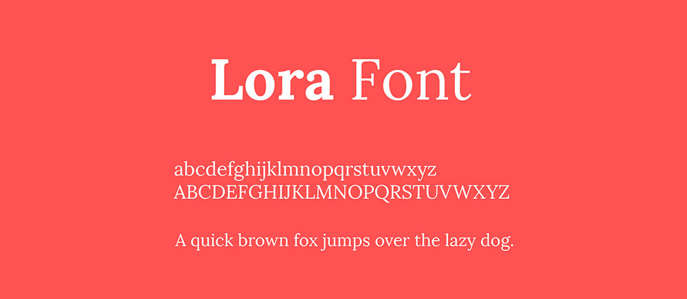
The Lora font pairing examples you should try using
Imagine staring at a canvas, your mind buzzing with visions of color and form. Now, replace that canvas with a screen, and swap those paints for fonts.
That’s where we dive into the art of Lora font pairing, crafting a digital masterpiece with each stroke of type.
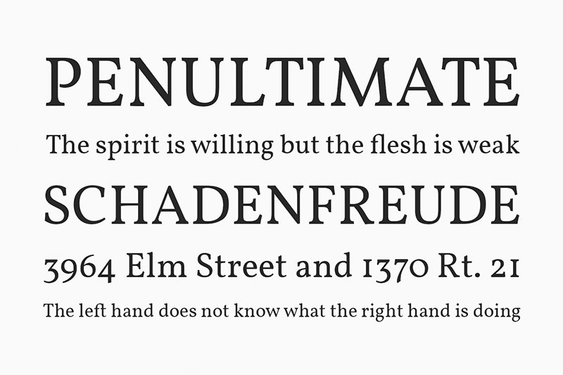
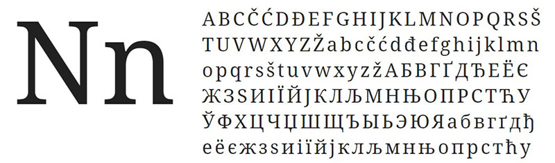
In the dance of design, not all typefaces lead. Enter Lora — a serif that sings of elegance yet demands a partner to echo its chorus in visual harmony.
As a web designer, I’ve spun many a tale through typography, knowing the power fonts have to set mood, convey messages, and breathe identity into a brand.
This article is your front-row ticket to orchestrating the perfect duet with Lora.
You’ll learn how to pair it with precision, enhancing both readability and aesthetic appeal, whether it’s for web design or printed stories.
I’ll unfold secrets for complementary fonts that build off Lora’s unique tone, guidelines for typography combinations that resonate, and tips to ensure user interface delight.
It’s more than matching; it’s about harmonizing a visual narrative that captivates at first glance. Prepare to transform the ordinary into the extraordinary.
Best Lora Font Pairing Options
Cinzel
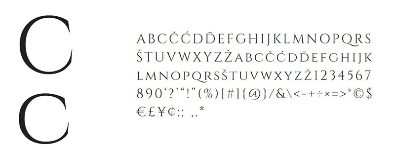
Inspired by roman writing from the first century, Cinzel is a modern take on the roman scripture. It is not merely a renovation of the scripture from that era, but it is, rather, a modern take on it all, as it has plenty of contemporary features in its design.
Why would it be good with Lora? Because they present a package that would go really well together: Cinzel’s roman qualities and the slightly historic look to it, and Lora’s curves and elegance would make a perfect Lora font pairing.
Montserrat
Montserrat is a good option for combining it with Lora, especially if you are looking for a body text font for more feminine projects like blog posts and various similar projects. This is a very modern Lora font pairing.
Open Sans condensed
We already know Open Sans – it is a very versatile font with some neutral qualities. The condensed version is even cleaner and more succinct, which could go well with Lora’s elegance.
If you are looking for a combination that is easy to read and elegant and classy, then this combination is for you. Besides, these fonts are both free, and you can combine these two free Google fonts now to make a classy combo.
Fjalla One
Fully adjusted to various screen sizes, Fjalla One is a medium-contrast display font that you can use to combine it with Lora. Even though Fjalla One was primarily made as a display font, it can be used in various other ways. One good thing to make that happen is to combine it with another font, and the versatility of Lora makes a great Lora font pairing.
Roboto
Roboto is a good font combination option for Lora, because it has a slightly geometric feel to it, but at the same time, it feels very friendly because of its gentle curves. Letters settle themselves down into natural widths, which makes Roboto feel very natural, despite its name. It is a great font for body text, as it is very easily legible and feels very nice to read.
Istok Web
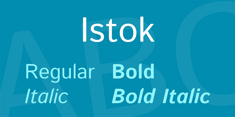
Istok Web has been in development ever since 2008, and some of its features are loosely based on the METAFONT, and its primary use is for rendering onto LCD displays. Combine it with Lora to create an attractive Lora font pairing.
Poppins
Poppins is a geometric sans-serif with plenty of international recognition, as it features support for Latin and Devanagari. Set in the popular geometric sans-serif genre, the Poppins font is a newer take on this style of writing, and is very attractive.
The reason that Poppins and Lora would make a good pairing is that they complement each other very well, both in their style and their character, plus it creates something pleasurable to read.
Nunito
Nunito has two basic versions of the font: the basic Nunito font, and the Nunito Sans version. The basic version was first developed by Vernon Adams as a rounder sans-serif terminal font. The basic version was later improved and built on by Jacques le Bailly, who created the much-improved Nunito Sans version. You can combine both with Lora to make a great Lora font pairing.
Source Sans Pro
Designed by Paul D. Hunt, the Source Sans Pro is one of the first open-source fonts within the Adobe library of fonts. It works best for user interfaces.
Lustria
Since 1999, Lustria has been one of the best display fonts. That is thanks to its friendly rounded edges, as it is a rounded-serif, and it is also very good for text uses. Whatever your use might be, you can combine it with Lora to create an amazing combination.
Patua One
If you are looking for a Lora font pairing option that offers you the chance to work at smaller sizes, then Patua One is the right option. It is used to create a visual impact with its low contrast and with strong serifs.
Bree Serif
This font is a close relative to the Bree font, but the difference is that this font features an upright italic design. It was designed by VeronikaBurjan and Jose Scaglione, and you can easily combine it with Lora to create an interesting and very functional combination.
Vollkorn
It is an open-source serif that was first released in 2006. It was designed by a German designer Friedrich Althausen, and was only added to the Google Fonts library in 2010. Primarily, the font was designed as a text font, but it has some heavyweights that make it a good display font as well. You will surely create a unique character with Lora and Vollkorn’s combination.
Noto
Noto is the ultimate font that supports a large variety of languages, scripts, alphabets and other elements. It is especially useful if you are frustrated by some characters not appearing because they are not featured in a font, which results in small boxes to be shown or displayed instead of characters that were meant to be there.
Noto supports over 30 scripts, and with it, you will surely not get that box effect that we call the “tofu” effect. It supports Greek and Latin characters, and it has several styles like bold, regular, italic, and bold italic. The font maybe loosely based on the Droid font, but it is still a very good, versatile choice that can help your design massively.
Proxima Nova
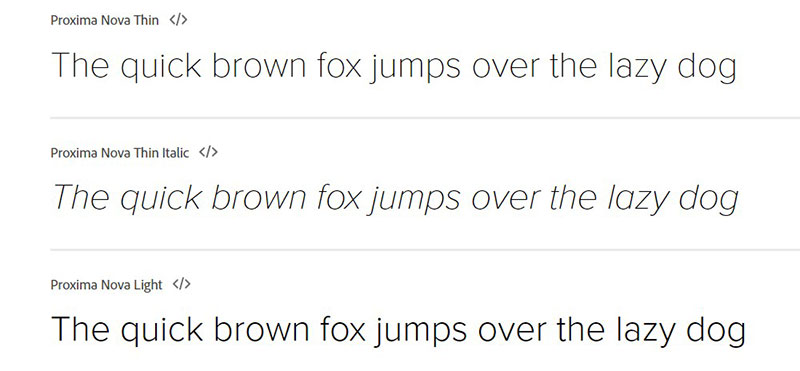
Proxima Nova is a font that was released in 2005, and designed by Mark Simonson. In general, it is a combination of geometric qualities and modern appearance, which led people to describe it as a combination of Futura and AkzidenzGrotesk, two fonts that combine those two qualities.
Avenir
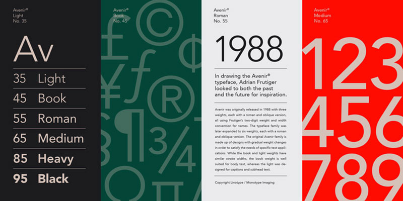
1988 was the year that this font was released, which makes it one of the older fonts on this list. Nonetheless, you can create a pretty nice Lora font pairing with Avenir, as it combines qualities of a linear font like Avenir and Lora.
AktivGrotesk
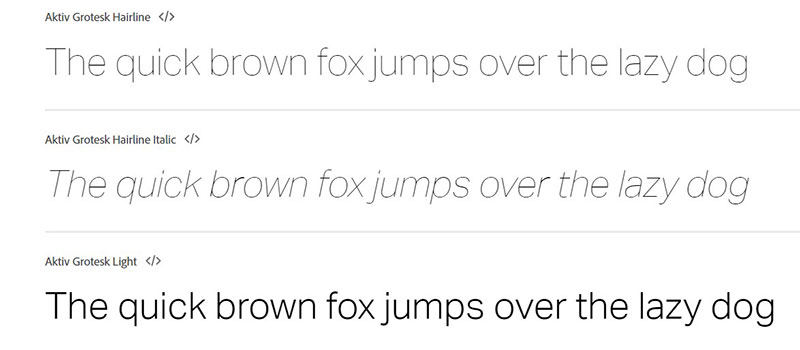
This grotesque sans-serif font was released in 2010, and is very similar to Helvetica, which led it to get a nickname “the Helvetica killer”.
GT America
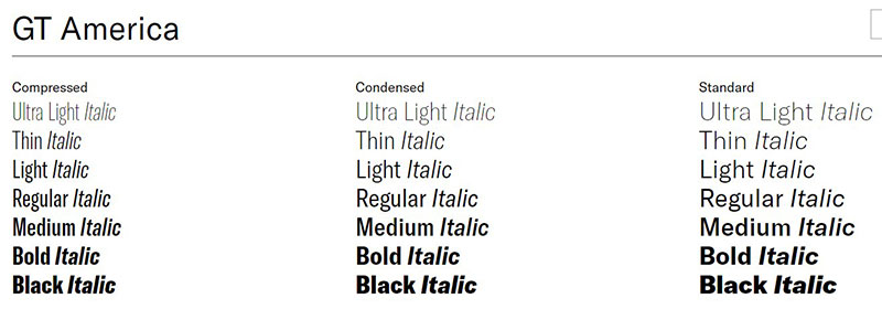
The font features five widths and seven weights, and contains qualities from both Swiss and American grotesque fonts.
Texta
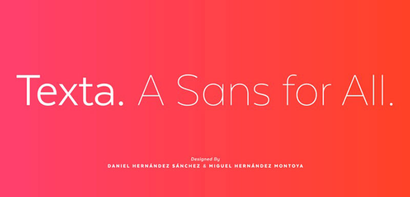
If you are looking for Lora font pairing options, then Texta is the one to go with.
FAQ about Lora font pairing
What fonts pair well with Lora?
Lora’s a classic with a modern twist. Best buds for this font are clean-cut sans-serifs like Open Sans or Roboto. These guys are like jeans with a dress shirt — timeless. They bring balance to Lora’s elegance, making your web design sing with readability and style.
How do I choose a font to pair with Lora for a website?
Start by thinking mood. Lora’s all about that serious but warm vibe. To complement it, peek at sans-serifs for body text — they’re like the steady bassline to Lora’s lead vocals. And keep those user interfaces smooth with fonts that share a similar x-height.
Can Lora be used for both headings and body text?
Absolutely. Lora’s versatile, like a Swiss Army knife for typographers. It reads well as a heading — bold and inviting. In body text, it’s comfortably legible, thanks to its slightly condensed letterforms. Perfect for longer reads or an aesthetic font combination worth staring at.
Where can I find the best Lora font pairings?
Google Fonts is your treasure chest. It’s packed with pairings that just click. Design blogs and font pairing tools also offer curated combos. They’re like matchmakers for typefaces, introducing Lora to potential partners that bring out the best in each other.
What are some common mistakes in pairing Lora with other fonts?
Think mismatched socks — jarring, right? Common blunders include mixing with overly decorative fonts or those with clashing styles. It’s about finding a complementary font that doesn’t overshadow Lora’s character. Keep harmony and balance in check for a readable typeface pairing.
How does font pairing with Lora affect the user experience on a website?
When Lora’s paired right, it’s a symphony for the eyes. Get it wrong, and it’s cacophony, sending your UI Design into disarray. The right pairing invites readers in, offering them a comfy seat for their digital journey. It’s all about that aesthetic font combination.
What pairing would work best for Lora in a formal setting?
In a formal gig, you want to waltz with class. Fonts like Merriweather or Playfair Display share Lora’s high-end vibe. They’re the polished shoes to Lora’s sharp suit, exuding sophistication. Ideal for your readable typeface pairing in swanky web design layouts.
Is there a rule of thumb for pairing fonts with Lora?
Sure thing. Think peanut butter and jelly — opposites that attract. Contrast is key. Lora’s got curves and serifs, so seek out a partner that’s straight-lined and sans. It’s a visual yin-yang that gives typography design its punch.
What is the best Lora font pairing for a modern website design?
For the modern touch, go bold. Pair Lora with a geometric sans like Montserrat or Futura. They’re the avant-garde to Lora’s tradition, a font duo that’s set to turn heads and keep eyeballs on-screen. Sleek, minimal, and fresh — a combo that screams now.
Can Lora font pairing enhance brand identity?
Spot on. Fonts talk without speaking. Partner Lora with a font that echoes your brand’s voice, and it’s like a visual handshake. Consistent font pairing infuses personality, cements recognition, and wraps your brand in authenticity. It’s typography design with a purpose.
Conclusion
Wrapping things up, Lora font pairing isn’t just about slapping two fonts together and calling it a day. It’s a curated process, a creative jam session where each font brings its own vibe to the mix. Think of Lora as that indie band with a classic sound—you want to pair it with a bassist that complements, not competes.
We’ve waded through the do’s, the don’ts, and those try-it-you’ll-love-it suggestions. From the sleek appeal of sans-serifs to the structured formality of fellow serifs, it’s clear that Lora’s dance card is full of potential partners.
And hey, remember, each pairing sets a mood, tells a story, and can turn a browsing session into more than just skimming—it becomes an experience. So, whether you’re crafting a blog or branding a business, those font pairings, especially with a distinguished partner like Lora, can be the final flourish that signs your design with unmistakable flair. Keep it harmonious, and let those letters sing.
If you enjoyed reading this article about Lora font pairing options, you should read these as well:
- The Nissan logo. What the symbol means and the company history
- The Fortnite font or what font does Fortnite use?
Bogdan Sandu, a seasoned designer with 15 years of diverse experience, has been designing websites since 2008.
Renowned for his expertise in logo design and visual branding, Bogdan has developed a multitude of logos for various clients.
His skills extend to creating posters, vector illustrations, business cards, and brochures. Additionally, Bogdan's UI kits were featured on marketplaces like Visual Hierarchy and UI8.
Latest posts by Bogdan Sandu (see all)
- Navigating Brand Crisis Management Successfully - 20 April 2024
- The Sega Logo History, Colors, Font, And Meaning - 19 April 2024
- Light Up Your Designs with These Light Color Palettes - 19 April 2024