Gotham font pairing options that you must know
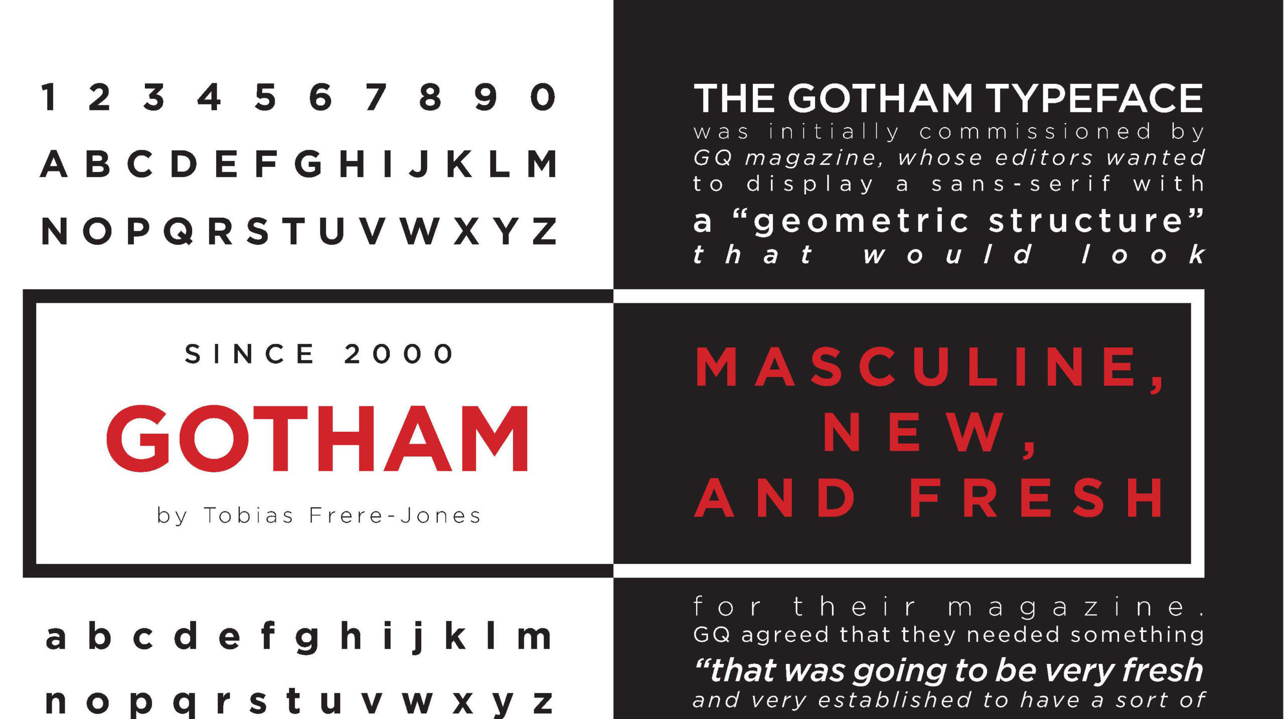
When you’re working with Gotham, you’re playing with one of the big guns in the type world. It’s like the Swiss Army knife of fonts: sleek, versatile, and fits almost everywhere.
But do you know what spices up this all-rounder even more? A perfectly paired sidekick. We’re talking about Gotham font pairing, people.
Now, why should you listen to me? Well, as a web designer, I’ve played this font-matching game countless times. Fonts are to design what spices are to food; get it wrong, and you’ve ruined a perfectly good dish. But get it right? It’s culinary—or, in our case, visual—magic.
By the end of this article, you’ll know how to expertly pair Gotham with other fonts to elevate your designs to something akin to a Michelin-star dish.
Gotham font pairing options
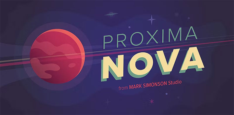
Proxima Nova
The Proxima Nova font family is a comprehensive overhaul of its predecessor, Proxima Sans (1994). As part of the typeface redesign, it evolved from an initial set of six fonts (three weights and their respective italics), to now encompass 48 fully-equipped OpenType fonts, becoming a font stack to be reckoned with.
This family is divided into three widths: Proxima Nova, Proxima Nova Condensed, and Proxima Nova Extra Condensed. Each width offers 16 font weights, comprising eight weights and their corresponding italics, adding typographic variety to any web design or print design project.
In terms of style and visual identity, Proxima Nova bridges the design space between typefaces such as Futura and Akzidenz Grotesk. It merges humanistic dimensions with a touch of geometric flair.
Open Sans
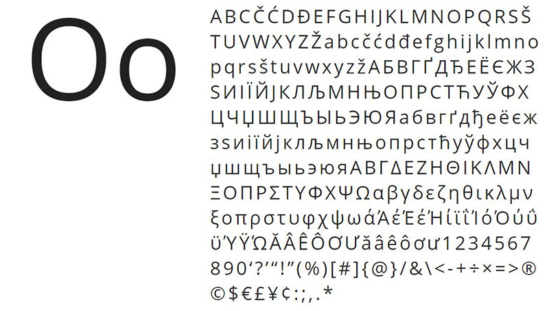
Organic and humanist Sans-Serif letters are not so common, particularly when the geometry of shapes tends to dominate this category. However, Open Sans emerges as a jewel in typography, demonstrating that open characters and neutral shapes also work to achieve a formal appearance.
Open Sans is a Gotham font pairing that includes 897 glyphs, useful for a global audience with ISO Latin 1, CE Latin, Greek, and Cyrillic, so it covers a wide range of text layouts and font hierarchies.
Archer
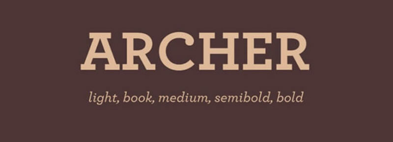
Designed by Tobias Frere-Jones, this time in conjunction with Jonathan Hoefler, Archer was originally commissioned for Martha Stewart Living magazine. At the design level, it is inspired by other Sans-Serif geometric fonts such as Rockwell, maintaining a 20th-century dignified appearance.
Unlike the Gotham family, Archer adopts a more European tone, enhancing readability and font contrast. It also incorporates unique aesthetic details in its design.
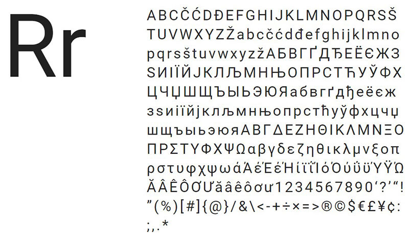
Roboto
The Roboto font family represents modern mechanized letters in web typography. Despite having a strongly geometric framework, it is complemented by some subtle curves in key places, which enhances its readability and text layout.
Times New Roman
When it comes to printed works and branding, there’s nothing that surpasses Times New Roman.
This Sans-Serif typeface has become one of the most iconic in the world, setting the standard in academia and informational content for its elegance and legibility.
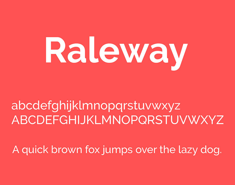
Raleway
Raleway is another font alternative that adheres to the typical geometric style of the Sans-Serif letters, offering a neo-grotesque style variant.
This font family received an update in 2012, adding diversity in font weights to its repertoire.
Bitter
Thanks to the nature of pixels and digital design, the best letters maintain a consistent design throughout.
Bitter is ideal for print design thanks to its wide thickness and font readability. Its design also considers pixel shape, ensuring crisp edges in visual communication.
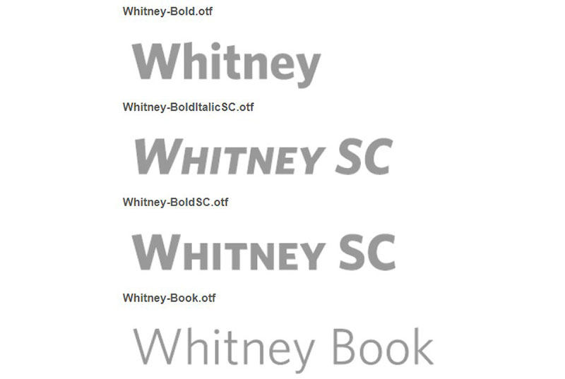
Whitney
Another work by Tobias Frere-Jones, Whitney matches very well as a Gotham font pairing for branding or web design.
It was commissioned for the Whitney Museum in New York, which demanded a versatile yet institutional style, achieved through its thick strokes and subtle curves.
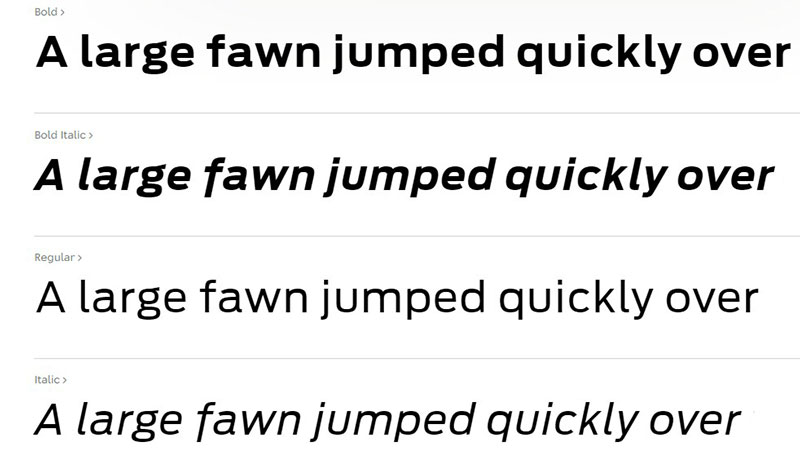
Antenna
Designed by Cyrus Highsmith, Antenna offers wide spacing and typographic flexibility with its numerous alternative weights and font combinations, making it adaptable to a wide range of visual identity projects.
Futura
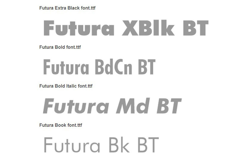
Futura serves as an excellent Gotham font pairing, sharing many typographic features, such as thick strokes, geometric shape, and font uniformity.
Designed by Paul Renner in 1927, it has become a world-renowned typeface, used in numerous brand identities such as the Volkswagen brand since 1960.
Sentinel
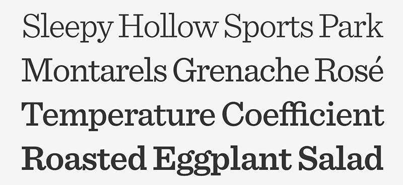
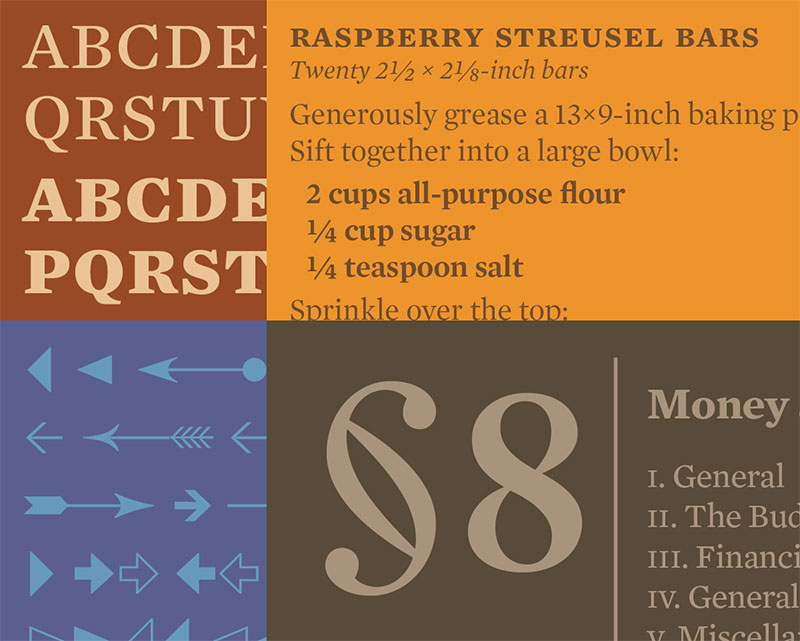
Another collaboration between Tobias Frere-Jones and Jonathan Hoefler, Sentinel aims to refresh classic Sans-Serif fonts like Clarendon.
This font solves the limitations of type variants, offering six weights with corresponding italics, making it a flexible choice for headlines or body text in both print and digital media.
Mercury
Yet another Tobias Frere-Jones and Jonathan Hoefler collaboration, Mercury was specifically designed for newspaper typography, ensuring ink efficiency and font legibility.
It offers four unique variants, each with a different hue, allowing for controlled ink usage.
Lucida Grande
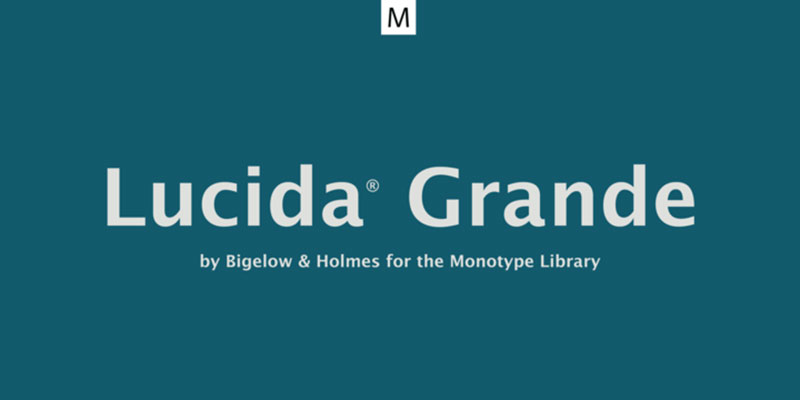
A cornerstone in UI design, Lucida Grande was the default typeface for Mac OS X systems until recently.
Its simple and understandable letterforms make it an ideal choice for digital interfaces, also available on Windows as Lucida Sans Unicode.
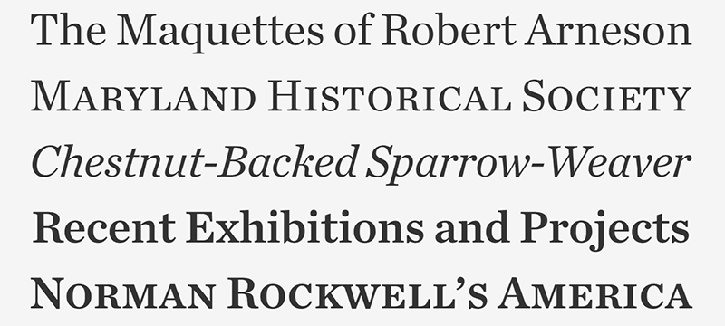
Chronicle Text
Launched in 2002 but with origins dating back to the 18th century in Scotland, Chronicle Text is an excellent choice for Gotham pairing in print formats.
For digital displays, you can opt for its variant, Chronicle Display, which maintains high readability and elegance in text layout.
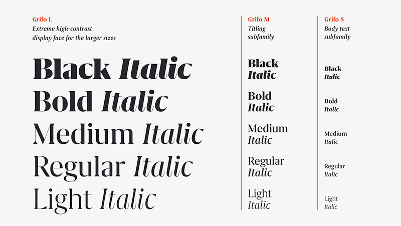
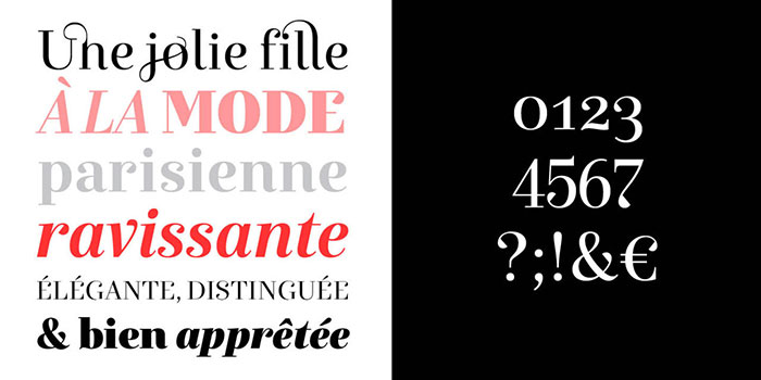
Grifo
Of Portuguese origin, Grifo adds sharp, claw-like details to its glyphs, providing a distinctive typographic style.
Designed by Rui Abreu, it comes in three different sizes, each with five different weights and corresponding italics, making it extremely adaptable for various applications.
FAQ about Gotham font pairing
What’s the deal with Gotham font pairing?
Well, you see, Gotham font is a versatile and modern typeface that can be easily paired with other fonts, much like how Futura serves as an excellent Gotham font pairing.
The idea is to create a visually appealing combination that enhances the overall design, employing typographic features to achieve a harmonious look and feel.
What other fonts pair well with Gotham?
Oh, there are plenty of good pairings! Some popular options include Montserrat, Merriweather, Playfair Display, Lato, and Roboto.
Much like how Sentinel and Chronicle Text can be paired for print formats, the choices here depend on the vibe you’re going for, but these options are a great starting point.
Can Gotham be used for body text?
Absolutely! Gotham is an excellent choice for body text because of its font uniformity and ink efficiency, much like the Mercury font designed for newspaper typography.
It’s a great option for both print or digital materials, as it can adapt to various sizes and resolutions.
What’s the best way to test different Gotham font pairings?
Testing font pairings is pretty simple. You can use online tools like Font Pair, Google Fonts, or Adobe Fonts to experiment with different combinations.
Alternatively, you can try designing mockups in design software, perhaps using something like Lucida Grande, known for digital interfaces, to see how the fonts look together.
How can I choose the right font pairing for my project?
That’s a great question! Start by considering your project’s purpose, audience, and overall aesthetic. Then, choose a complementary font that enhances your message and maintains legibility, considering typographic styles like Grifo’s distinctive glyphs.
Don’t forget to test a few combinations, perhaps even mixing with historically rich fonts like Chronicle Text, before making a final decision!
Are there any specific industries or niches that prefer Gotham font pairing?
Gotham is a versatile font, so it works well in many industries. However, it’s particularly popular in tech, fashion, and editorial design due to its modern and clean appearance, much like how Futura has been utilized in brand identities such as Volkswagen.
Can I pair Gotham with script fonts?
You bet! Pairing Gotham with a script font can create a stunning contrast, much like the sharp, claw-like details seen in the Grifo typeface.
Just make sure to choose a script font that complements the overall design and maintains readability.
What are some common mistakes when pairing Gotham with other fonts?
Some common mistakes include pairing with fonts that are too similar or overly decorative, which can create visual clutter.
Much like how you wouldn’t combine two very thick stroke fonts, the key is to find a balance between contrast and harmony to ensure a pleasing design.
How important is font pairing for my project?
Font pairing, with emphasis on elements like font legibility and ink efficiency, plays a significant role in creating a cohesive and visually appealing design.
A well-thought-out font pairing can enhance your message, evoke emotions, and create a memorable experience for your audience.
Are there any rules or guidelines for Gotham font pairing?
While there aren’t strict rules, there are some general guidelines to follow. Aim for a balance between contrasting and complementary fonts, consider the project’s purpose and audience, and test different combinations to find the perfect fit.
And, of course, ensure your pairing, like the three sizes offered by Grifo, remains legible and visually appealing!
If you enjoyed reading this article about Gotham font pairing options, you should read these as well:
- Baseball font examples that you can download for your project
- Check out this chalkboard font collection with cool options
- Fonts similar to Times New Roman
- Earth Color Palettes Grounded in Nature: 40 Examples - 26 April 2024
- The EA Logo History, Colors, Font, And Meaning - 25 April 2024
- Nature Color Palettes Inspired by the Outdoors - 25 April 2024


