

The Chrysler logo history and how the brand evolved over the years
No brand that is respected can exist without a logo. They tell a story, and they make people understand what are the company’s intentions. For example, we have Aston Martin vehicles, they are eccentric, just one look at the badge to know that they are not everyday cars. There is Mercedes Benz, which reflects elegance and a lot of money. Finally, we have the Chrysler logo, whose best description would be “ambitious” and “persevering”.
Why would we use these words to refer to this brand? Well, for that we have to understand its history and what this badge means. Chrysler is now an Italian-American company based in Michigan. Walter Chrysler founded it in 1925, and today they are a FIAT’s subsidiary.
Throughout its history, multiple companies and brands were created, such as Dodge Brothers, Fargo Trucks, DeSoto, and Plymouth. Like the company, its logo has undergone significant changes, which has allowed it to maintain a high interest in consumers. These changes have not been arbitrary, so everyone has their own story.
Drastic changes in the Chrysler logo
The Chrysler logo history is extensive, accounting for a large number of changes and alternative versions. The first logos were stamps and wax seals. Gradually it would evolve to be a pair of wings, and with the acquisition of FIAT, the colors would be changed to go according to the rest of the products of the manufacturer. With a small analysis, we can see how we still find traces of the original idea.
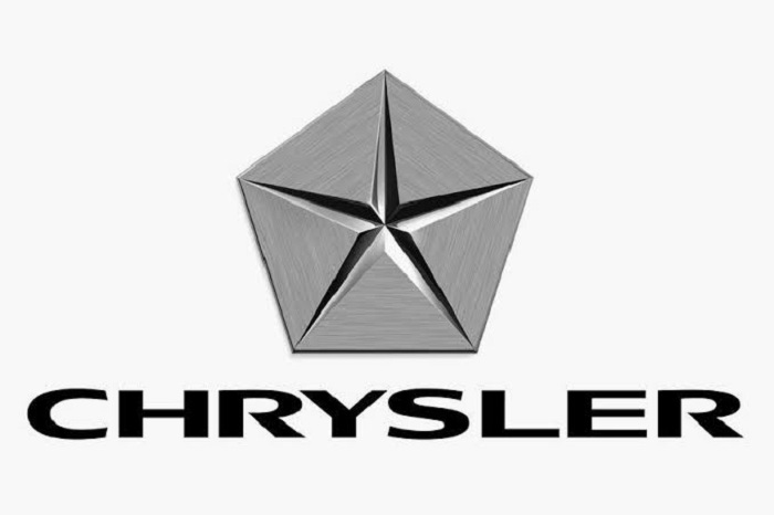
– Shape: currently the Chrysler emblem is a pair of royal silver wings. These have been retouched to eliminate unnecessary details, so they are now flaps. Thanks to this simplicity, they have been able to include the name Chrysler in the middle of the wings.
– Color: the warm color palette was abandoned in favor of silver, gray and navy blue. Currently, the brand name is in two places with different shades: the one on the top uses a light silver, while the one on the center is darker. The touch of navy blue is very discreet, working only as a contrast.
– Font: in this aspect, the fans are not very satisfied with the logo. The font used for the name is very common among other car brands, making it look like a very corporate brand. In the previous logos, we could see more charismatic letters, typical of the luxury vehicles of the last century.
– Inspiration: the fundamental concept of Chrysler’s current wings is simple to understand. These are constantly related to the Greek god Hermes (known as Mercury in Roman mythology).
This was the messenger of the gods, which stood out for its impressive speed and the confidence it gave when delivering messages, in addition to having winged sandals. In this way, they want to imply that the vehicles they manufacture are similar to Hermes in quality and speed.
Achieving perfection through the logo
The Chrysler logo is undoubtedly one of the emblems that have undergone most changes throughout its history. This, more than a marketing strategy, is a way for the company to show that they are always in the pursuit of perfection, constantly renewing themselves to adapt to modern times (although it has often meant the loss of the previous concept).
The first’s years
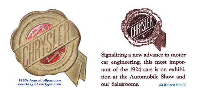
The Chrysler car logo pioneer dates from 1924/1925. It was designed by Oliver Clark and used in the Chrysler Six. This was a gold and red wax seal where the name of the brand was seen diagonally. His success among the public was incredible, but they could not get used to it since it would be extremely modified in the following years, although some would still include the seal.
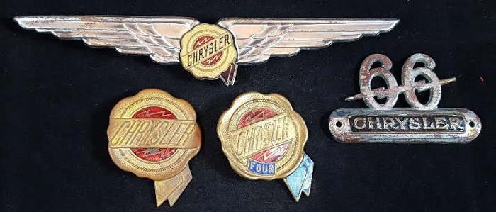
During the 40s, an emblem would adorn the wax seal. This heraldic shield was a mixture of the previous design with the addition of the word Chrysler over a pair of wings, a long red and silver metallic sheet, and a top with a crown. This was a large logo for trying to preserve the elements of the first versions.
From the simple to the complex, and back to the simple
In 1950, the Chrysler logo took a different path, being represented by a pair of interlocking boomerangs. The colors were also modified to be dark blue and red. The idea was of the designer Virgil Exner, who was strongly inspired by the space race that was happening at that time.
This symbol sought to make consumers understand the fact that the company was walking to the future. Although that time passed very quickly, and in 1955 another emblem was created, this time very similar to a coat of arms. One of its versions included a golden lion holding a smaller red shield.
In 1962, and selected through a contest, the Chrysler logo was changed again. Out of 700 proposals that reached the presidential office of the company, the winning option was the Pentastar by Robert Stanley. As the name implies, the logo consists of a five-pointed star circumscribed within a pentagon.
The then director of the company, Lynn Townsend, was in charge of selecting it, who was looking for a less pretentious and more modern replacement for the coat of arms. As a curious fact, the logo designer indicated that it did not have any symbolism related to the brand, and was simply selected because it looked good for the time.
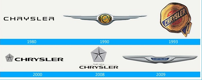
Another redesign occurred in 1980, although this was simpler since it consisted merely of a change in the name’s font. To give it a modern feel, they kept it as simple as possible, with a couple of details in the letters where they removed some lines to make them more interesting.
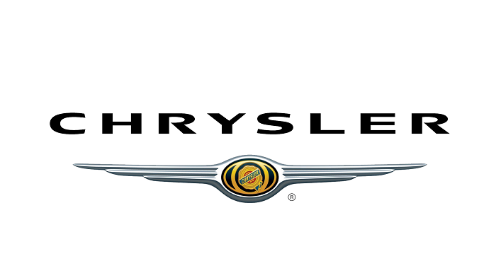
In 1990, silver wings began to be used as an emblem on cars. Later, in 1993, they would embed in the middle of these wings the classic wax seal. This was simplified to perfectly enter the emblem without making it unrecognizable. They presented a full version where the new blue, gold and red finishes could be seen in detail.
The new millennium
In 1998, because of a merger with Daimler-Benz, the logo was redesigned again. This time it had to be different from that of Mercedes, so they chose to return the wings and the stamp.
2007 was a stage of changes for the company for the sale of 80% of its shares to private equity Cerberus Capital Management, L.P, and as a result, they adopted the Pentastar again, but with a facelift.
It gained volume with the addition of lines that went from the vertices to the center of the star, new colors were added to accompany this growth, and now the triangles that formed the pentagon had a meaning, these being the strength, precision and high quality of their products.
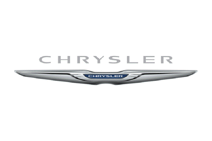
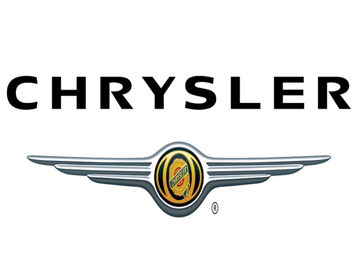
Finally, we arrive at the current Chrysler logo. Introduced in 2009 because of the purchase by FIAT, this was a redesign of the winged logo with the wax seal. The wings became homogeneous, eliminating the design of several parallel lines, and the seal was replaced by the name Chrysler on a dark blue background. This has been compared several times with the Aston Martin logo.
An endless tale
Chrysler’s history as a company has not been easy. However, they have managed to overcome adversities and adapt to different times. Although not everyone has liked some changes, these have always been made with the sense of continuing to move towards the future.
Regardless, Chrysler has always been one of the most recognized luxury brands in the world, and the constant changes only represent its commitment to the consumer.
If you enjoyed reading this article on the Chrysler logo, you should read these as well:
- The Amazon logo: Its meaning and the history behind it
- The Pepsi Logo: The old, the new, its meaning and history
- The Disney logo: All there is to know about the Walt Disney brand
Bogdan Sandu, a seasoned designer with 15 years of diverse experience, has been designing websites since 2008.
Renowned for his expertise in logo design and visual branding, Bogdan has developed a multitude of logos for various clients.
His skills extend to creating posters, vector illustrations, business cards, and brochures. Additionally, Bogdan's UI kits were featured on marketplaces like Visual Hierarchy and UI8.
Latest posts by Bogdan Sandu (see all)
- The Sega Logo History, Colors, Font, And Meaning - 19 April 2024
- Light Up Your Designs with These Light Color Palettes - 19 April 2024
- How to Measure Brand Loyalty Effectively - 19 April 2024